THE SEVENTEENTH CENTURY
teenth century. Enschedé would have had to cut new punches to make the types
conformable with the practice of his day, and he would know that to do so would
be unprofitable. The fashion of the characters was out of date, and printers would
insist on a more modern design. Moreover, the books printed by Erpenius show
that the three Arabic founts were used as one : the ligatures of the two-line English-
bodied are found in both the Great Primer types, and it is by no means easy to tell
one fount from another. And if there was confusion in the lifetime of Erpenius, it
must have grown far worse in the course of a century and a half of neglect.. It was
reasonable for Enschedé to be content with putting the larger size in fairly good
order without troubling to refurbish the two on Great Primer body.1
The Hebrew and Rabbinical types, judging by the specimens still in our pos¬
session, were in such poor condition and so far from complete that the matrices
were valueless. It is not surprising that they were discarded and sold as metal.
We have, therefore, of the types that once belonged to the Elseviers the two
described in the following paragraphs.
Two-line [Large] Enßlish-hodied Arabic No. 15. (fig. 45). As I have said Johannes Enschedé was
able to make up a tolerably complete set of punches and matrices for an Arabic
on this body, but it was unlikely to appeal to the printers of his day. The chief
defect, of the type was that the founder cast sorts that the compositor had to make
into the required letters by cutting away unwanted strokes or points.
An example of these factotum sorts is o, used for Во о, Ta ö, or тко ù, which
had to be made into one of the three by removing some of the dots. There are
many such in the fount, both single and tied letters.
Jo* \j ¿u__ЛИ y> \,_»3 \ JjJÜuJj
Fig. 45. Two-line English-bodied Arabic no. 15.
Resetting of part ofthe Elsevier type-specimen, 1658.
Reproduced from the Fonderies de caractères, 1908.
[i] Some of the statements in this paragraph seem to me
disputable. The two smaller Arabics could be used with
floating vowel-points. Charles Enschedé thought them old-
fashioned because they needed a double alignment: medial
Ha, Kha, and Djim required letters on two different levels be¬
fore and after them. But this is essential to an adequate
rendering of Arabic script; and the distortion of these three
letters to save the two alignments, which he considered a
technical advance, is a' makeshift and not countenanced in
good Arabic setting. I think type on the two bodies was de¬
liberately mixed in the books printed for Erpenius as a means
to the double alignment, just as lines of music are set with
types of different bodies (H.C.). Charles Enschedé's opinion
was, no doubt, based on the note in Enschedé's supplemen¬
tary specimen-book of 1773, Vermeerdering van meest nieiiw gesnedene
Ietterai, in de Haarlemsche letter-gietery van Johannes Enschedé. Zedert
1768 tot 1773. See List of type-specimens No. 119. This note, to
be found on the page showing 'Kleine Canon Taróte' and
'Augustyn Linien en Strikken', informed the customers that
there were, besides the one shown (i.e. the two-line English-
bodied Arabic of Erpenius), two other Arabic typefaces from
Erpenius in the typefoundry : the vette Text, and the magere Text
which was also suitable for the Persian language.
74
ORIENTAL TYPES FROM ERPENIUS
The synopsis of the fount shows how difficult and slow the setting of this type
must have been. For Erpenius these disadvantages were not very serious, because
he was his own customer. But his Arabic types were also defective in comparison
with more modern types in needing a second alignment for letters preceding Djim,
Ha, and КІіа. The double alignment reproduced Arabic calligraphy more faithfully
than a single one, but added to the labour of the founder and compositor. The
sorts marked with an asterisk were added at a later date.
Detached forms: 5
Final forms :
(_>
o*
Ъ
І (J <іГ* J
г w
У ^
и
* s*
Initial forms :
Medial forms :
... * . * t. * *
■Ш .О
ли. .ѵП
à Іл я. i. Х.Х ж л я'
^ ^ -• ' * • TS
Floating vowels and signs: ^ ^* , <, , m ^ %* ф ^* ___s,¿ $ c $ $ % , „ % ц
Figures (3,4,5,7,8): у» v= о v a
Ligatures: J ¿__ J^_ ^ y> J £__ .___j ceXftf^^J^—^J^
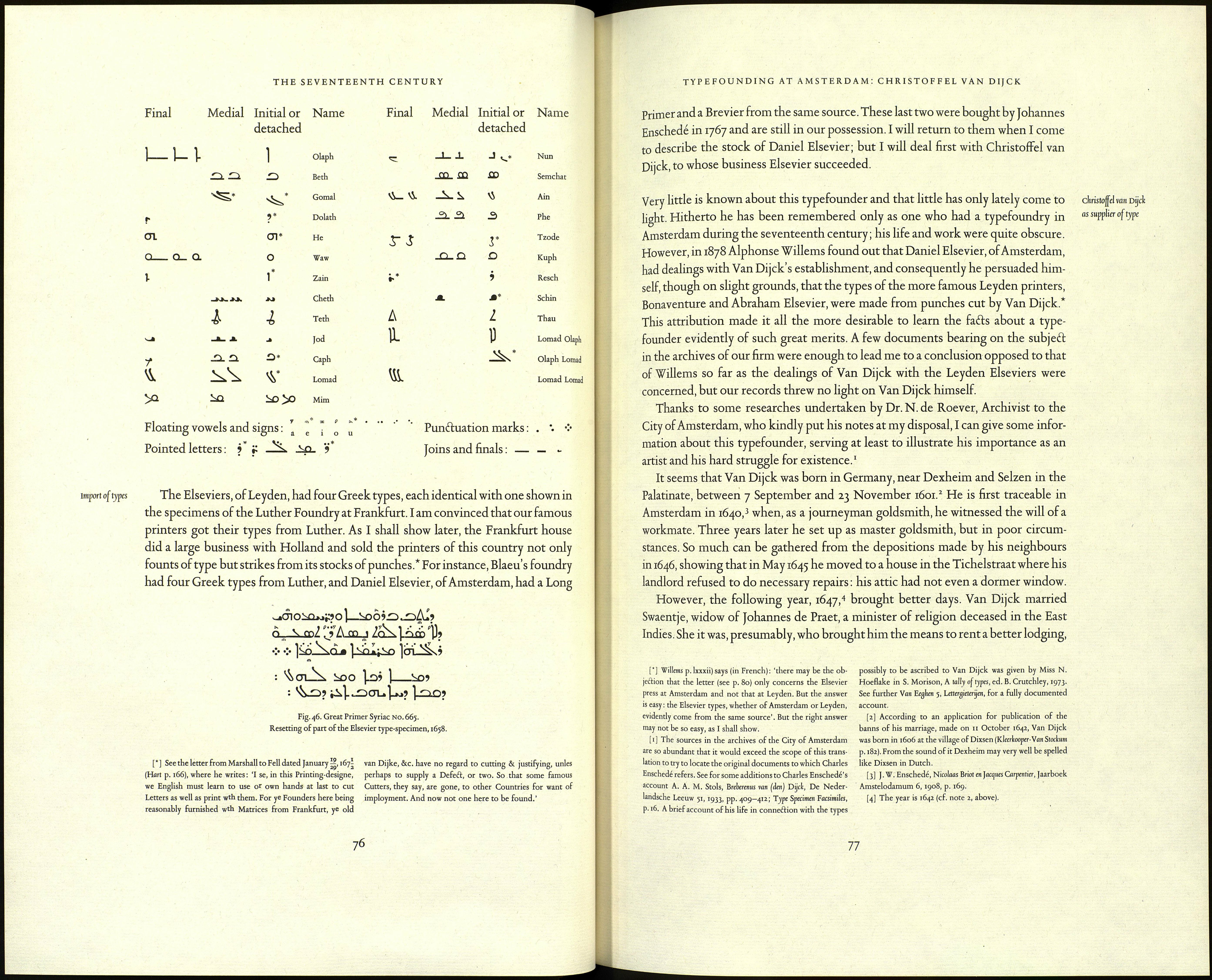
Great Vrimer Syriac No. 665 (fig. 46, p. 76).x This set of matrices, also, was far from com¬
plete ; but the characters being fewer and less complicated than those of Arabic
script, Johannes Enschedé undertook to put the fount into saleable condition.
With the help of Professor Scheidius, of the Athenaeum of Harderwijk, he had
punches cut for the sorts marked with an asterisk in the list below. He was not
much concerned with restoring the fount to its original state, rather with making it
an asset in his business. Certain letters are for this reason unlike those of Erpenius;
nevertheless, most of the sorts are careful copies, and the type is still perfectly
suitable for reprinting the works of the Oriental Press of Leyden.
[1] Erpenius bought a fount of Plantin's Syriac (cut by was sold by the executor of Arend van Hogenacker to the
Granjon) in 1619 (see p. 70); but it must be supposed that University of Oxford (Reed p. 133; S. Morison, John Fell, 1967,
he found it inadequate for his needs and that he had a new p. 239). The three Syriacs are distinguishable, though with
face cut. Nothing is known about the origin of the type. It difficulty,
is evidently a copy of Granjon's. Later, in 1637, another copy
75
