Lida Lopes
Cardozo
This slate house sign, painted
off-white, shows Lida's Italic
letterforms as she likes to make
them, and reflects some of the
fun she gets out of them.
It was cut for the Nelsons, of
California, who later took a
rubbing, reduced it and printed
it on their hundred year old
press for use as a letterheading.
A deceptively simple, but
distinctively designed and
engraved bowl.
Lida was born in Holland and trained in The Hague,
where she was a student of Gerrit Noorzij. Now she is
firmly Cambridge-based as David Kindersley's partner.
She says that she is a letterer first and foremost. 'The
techniques for making them must of course be
perfected if one is to be a letterer. But a technique can
be mastered comparatively quickly. Technically
shaping a letter does not necessarily make a beautiful
letter; it needs mental development and "feel". All
three must work.' In her booklet Glass and Engraver,
David says of her, 'Glass is only one of the arts that
she does superbly.' Actually, Lida says she finds
working on glass almost frivolous compared to stone; it
takes less time and it is bound to last less time. She
feels strongly the advantage of being together in a
workshop atmosphere; 'Different people have different
strengths, they rub off on to each other. Also different
points of view lead to battles, and that keeps you alert.'
Orange (jrove Cottage
100
Lida talks about the special attributes of glass as a
material. You can start off with relatively cheap glass
and work upwards, not forgetting that some glass is
best left unadorned. Then, she says, 'The great
excitement of glass is its transparency, and to make
this work one has to work all round and through the
glass.' So get away from the idea of a vignette, a small
design or label that only works when seen from one
view. Consider and take advantage of the reflections
from the engraving. As for the letters, with a drill or
diamond stylus (Lida uses a dentist's drill) you can get
the finest, most sensitive of lines. But, says Lida,
'However beautiful your letterforms are, it is the
spacing that matters above all else. A beautiful letter is
ruined spaced badly. A rotten form well spaced is more
tolerable.'
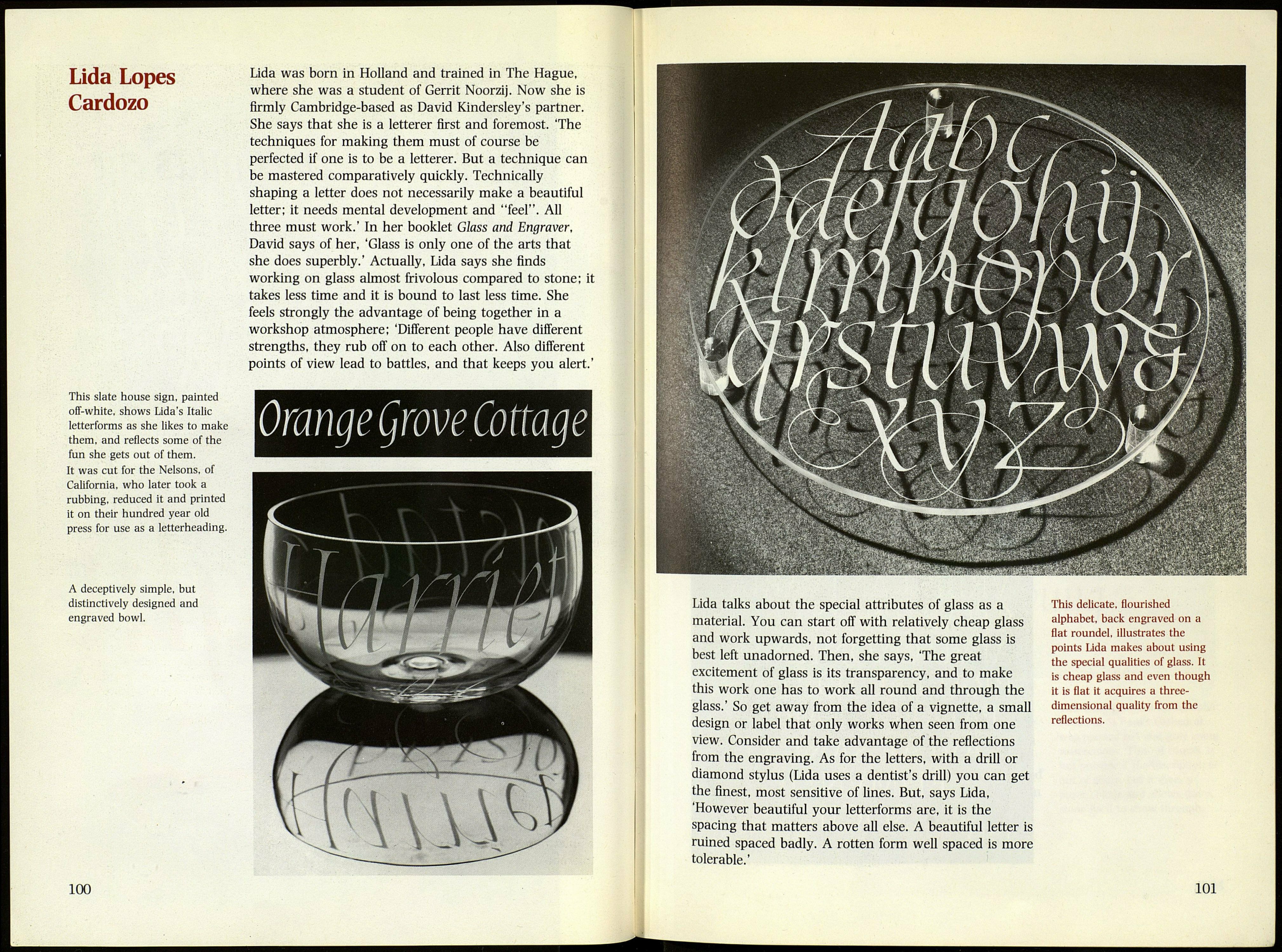
This delicate, flourished
alphabet, back engraved on a
flat roundel, illustrates the
points Lida makes about using
the special qualities of glass. It
is cheap glass and even though
it is flat it acquires a three-
dimensional quality from the
reflections.
101
