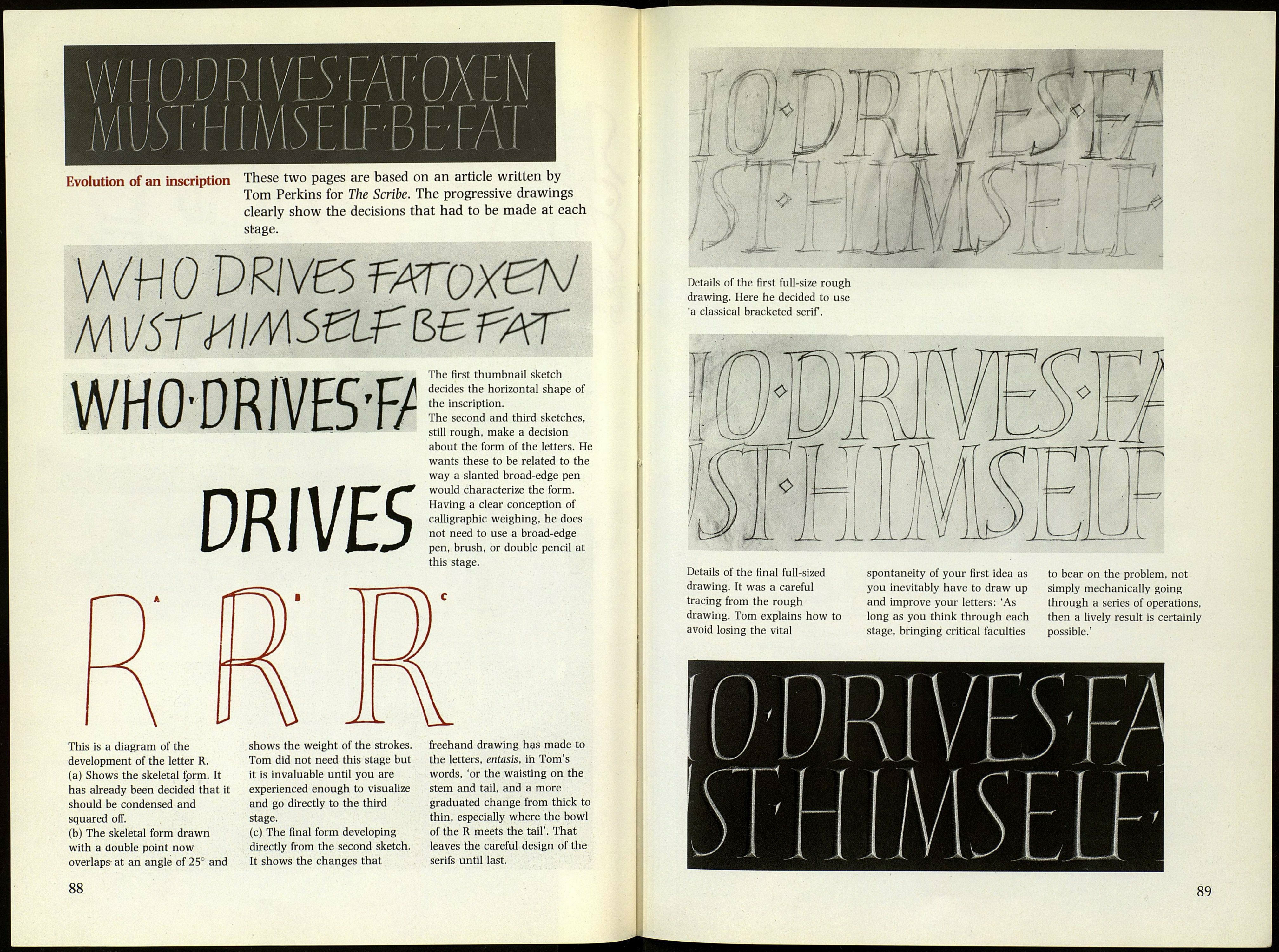
Evolution of an inscription These two pages are based on an article written by
Tom Perkins for The Scribe. The progressive drawings
clearly show the decisions that had to be made at each
stage.
WH 0 VRIVE5 TATOXeN
NWJSTHlMStlf&BfAr
WHODRIVESf/
DRIVES
This is a diagram of the
development of the letter R.
(a) Shows the skeletal form. It
has already been decided that it
should be condensed and
squared off.
(b) The skeletal form drawn
with a double point now
overlaps-at an angle of 25° and
shows the weight of the strokes.
Tom did not need this stage but
it is invaluable until you are
experienced enough to visualize
and go directly to the third
stage.
(c) The final form developing
directly from the second sketch.
It shows the changes that
The first thumbnail sketch
decides the horizontal shape of
the inscription.
The second and third sketches,
still rough, make a decision
about the form of the letters. He
wants these to be related to the
way a slanted broad-edge pen
would characterize the form.
Having a clear conception of
calligraphic weighing, he does
not need to use a broad-edge
pen, brush, or double pencil at
this stage.
freehand drawing has made to
the letters, entasis, in Tom's
words, 'or the waisting on the
stem and tail, and a more
graduated change from thick to
thin, especially where the bowl
of the R meets the tail'. That
leaves the careful design of the
serifs until last.
88
Details of the first full-size rough
drawing. Here he decided to use
'a classical bracketed serif.
Details of the final full-sized
drawing. It was a careful
tracing from the rough
drawing. Tom explains how to
avoid losing the vital
spontaneity of your first idea as
you inevitably have to draw up
and improve your letters: 'As
long as you think through each
stage, bringing critical faculties
to bear on the problem, not
simply mechanically going
through a series of operations,
then a lively result is certainly
possible.'
89
