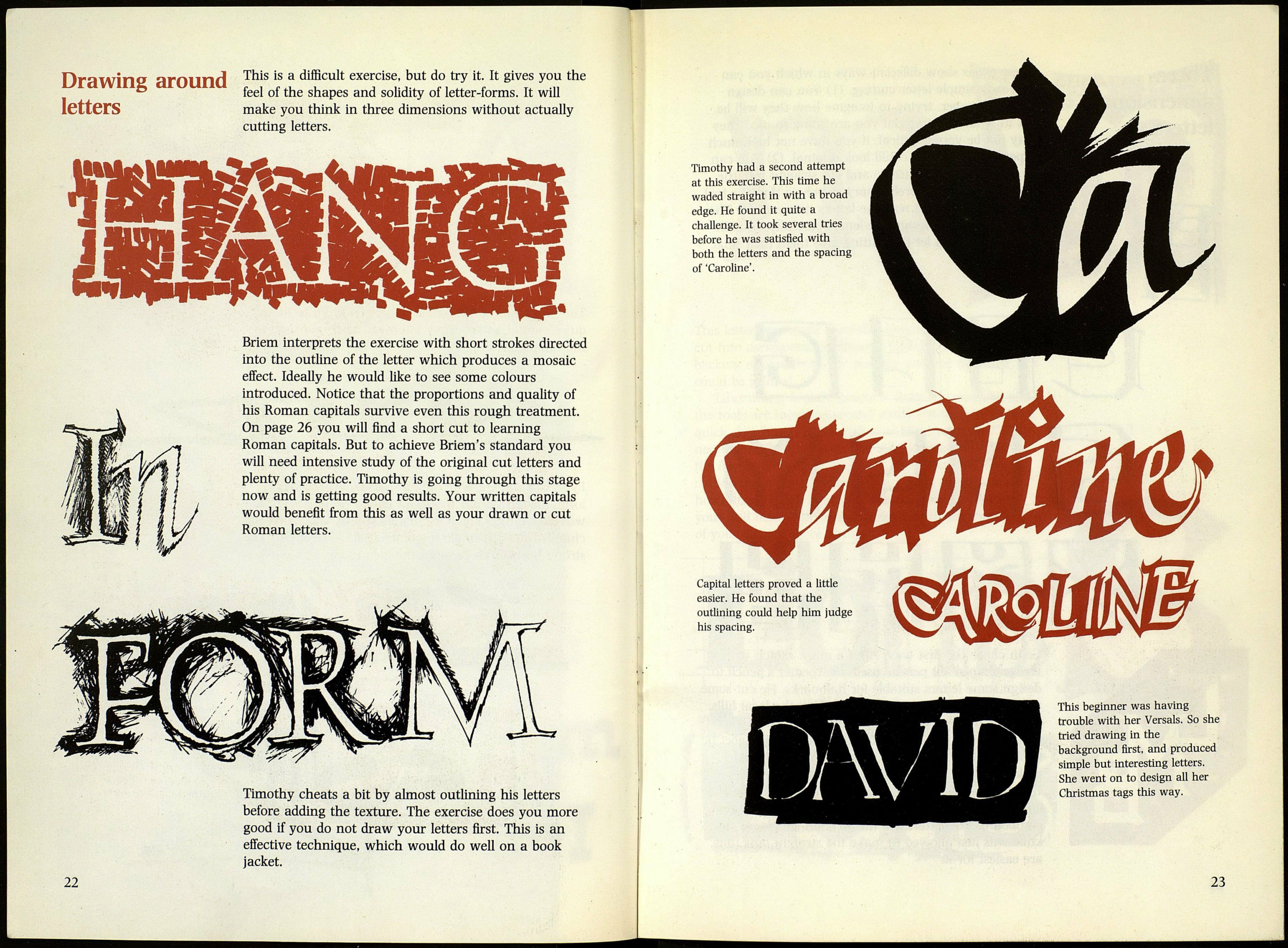
Briem interprets the exercise with short strokes directed
into the outline of the letter which produces a mosaic
effect. Ideally he would like to see some colours
introduced. Notice that the proportions and quality of
his Roman capitals survive even this rough treatment.
On page 26 you will find a short cut to learning
Roman capitals. But to achieve Briem's standard you
will need intensive study of the original cut letters and
plenty of practice. Timothy is going through this stage
now and is getting good results. Your written capitals
would benefit from this as well as your drawn or cut
Roman letters.
Timothy cheats a bit by almost outlining his letters
before adding the texture. The exercise does you more
good if you do not draw your letters first. This is an
effective technique, which would do well on a book
jacket.
22
Timothy had a second attempt
at this exercise. This time he
waded straight in with a broad
edge. He found it quite a
challenge. It took several tries
before he was satisfied with
both the letters and the spacing
of 'Caroline'.
Capital letters proved a little
easier. He found that the
outlining could help him judge
his spacing.
This beginner was having
trouble with her Versals. So she
tried drawing in the
background first, and produced
simple but interesting letters.
She went on to design all her
Christmas tags this way.
23
