108
THE NON-DESIGNER'S TYPE BOOK
Kerning definitions
These are brief definitions of the variety of terms related to kerning.
| What it is What it means Why use it
Letter spacing
Adding or decreasing the same
amount of space between all the
letters. Letter spacing is applied to
a range of text; kerning is applied
to individual pairs.
Usually used to change the
spacing of a large amount of
text to open the face or tighten
it, depending on the natural
characteristics of the typeface
and its purpose on the page.
Kerning
General term for adjusting the space
between letters.
Kern to create a visually
consistent look.
Pair kerning
The special kerning built into certain
combinations of letters when the
typeface was designed. You can also
use special programs to add more
kerning pairs to your fonts.
This is built into your fonts—
don't worry about it.
Auto kerning
When an application is capable
of automatically finding and using
the pair kerns built into the font.
You can turn auto kerning
on or off in your application.
Leave it on.
Manual kerning
Adjusting the fit of two characters
by "hand" (computer "hand").
Use this for the final
fine-tuning.
Range kerning
Selecting a range of text and
applying an overall kerning
value to all the pairs of letters.
Use this to tighten a range of
text in preparation for manual
fine-tuning.
Tracking
Means by which the computer adjusts
the letter spacing, depending on the
point size of the type and the auto
kern pairs (PageMaker only; XPress
"tracking" is really "range kerning").
Use this for large or very small
type as a start for better letter
spacing. For large type, you
will still have to manually fine-
tune the type.
•"' '"N
J). . Û J.
inespacinq [ieadinq
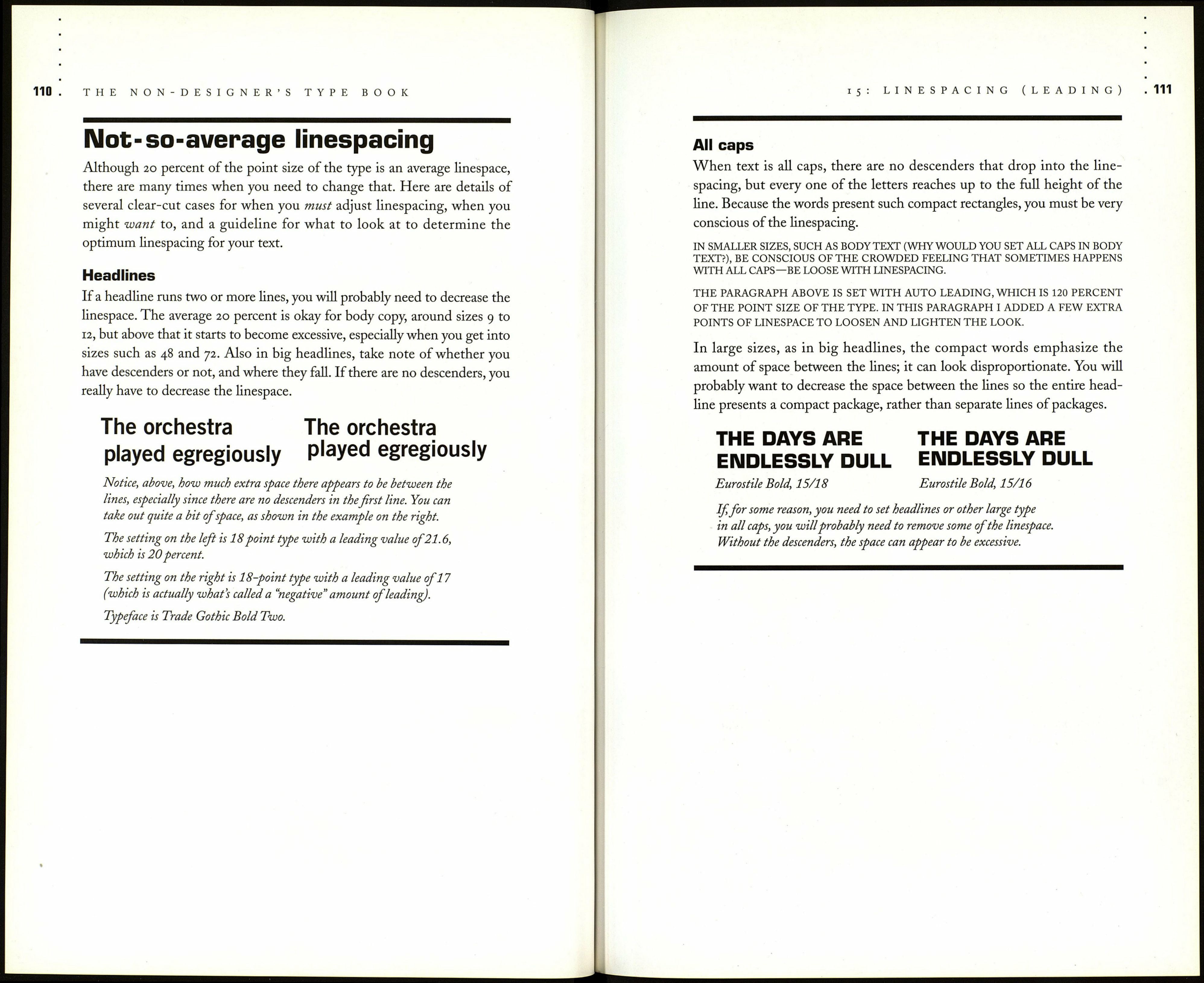
Linespacing is the space between the fines of type. When type was set in
metal (which wasn't that long ago), compositors would insert thin strips of
lead between the lines of metal characters, which is why the space is called
"ledding," not "leeding." Leading is measured in points, just like type. The
measuring system works like this:
You take the point size of your type, say 12 point.
You take a (metaphorical) thin strip of lead, say 2 points.
12-point type — You add the 12 points of the type size
\-2 points of 'lead' Гto the 2 points of lead, and you then say
=14 points of total that you have a leading value of 14 points.
space, called leading; т-., . • .„ . i •
r ь 1 his is written as 12/14 and is
pronounced "twelve on fourteen."
+j
The phrase 12/14 used to mean that text should be set at 12 point
and the typesetter should then drop down 14 points
to the next baseline,
but now it simply means that there are 14 points of space
surrounding the line of type,
and various applications
apply that space differently,
above and below the baseline.
Traditionally, an average leading is 20 percent
of the point size of the type.
Thus for 10-point type,
the average leading is 2 points,
added to the 10
for a 12-point leading value.
For 30-point type,
an average leading is 6 points,
for a 36-point leading value.
So now if you look at a type specification that calls for 10/16,
you instantly know there is a lot of space between the lines.
If you see type that is set with the same number for the
leading value as for the type size, such as 24/24, which is called
"set solid," you know there is very little space between the lines.