130 SHADY CHARACTERS
Zapfs “disturbingly wide holes” occur when a line of text cannot be
stretched to meet both margins without unreasonably wide word
spaces. This usually happens when a line contains many long words
and consequently few spaces, which in turn may lead to unsightly,
straggling “rivers” of white space meandering up and down the page:
a string of short words is easier to justify than an interminable con¬
catenation of polysyllabic sesquipedalianisms.
Gutenberg had an arsenal of techniques at his disposal—some
subtle, others distinctly not—to combat this problem. At the finer
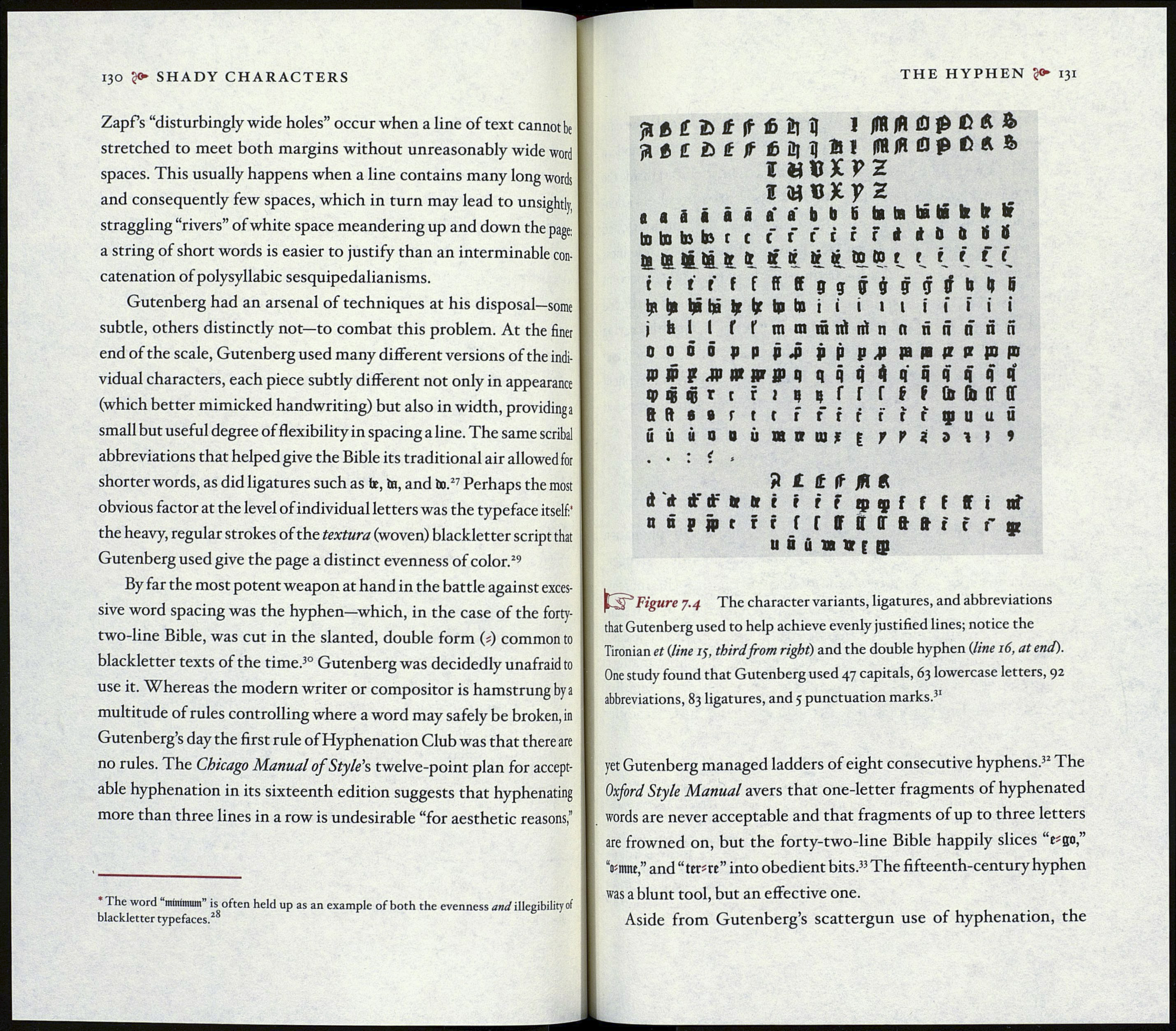
end of the scale, Gutenberg used many different versions of the indi¬
vidual characters, each piece subtly different not only in appearance
(which better mimicked handwriting) but also in width, providinga
small but useful degree of flexibility in spacing a line. The same scribal
abbreviations that helped give the Bible its traditional air allowed for
shorter words, as did ligatures such as be, in, and in.27 Perhaps the most
obvious factor at the level of individual letters was the typeface itself:’
the heavy, regular strokes of the textura (woven) blackletter script that
Gutenberg used give the page a distinct evenness of color.29
By far the most potent weapon at hand in the battle against exces¬
sive word spacing was the hyphen—which, in the case of the forty-
two-line Bible, was cut in the slanted, double form (i) common to
blackletter texts of the time.30 Gutenberg was decidedly unafraid to
use it. Whereas the modern writer or compositor is hamstrung by a
multitude of rules controlling where a word may safely be broken, in
Gutenberg’s day the first rule of Hyphenation Club was that there are
no rules. The Chicago Manual of Style's twelve-point plan for accept¬
able hyphenation in its sixteenth edition suggests that hyphenating
more than three lines in a row is undesirable “for aesthetic reasons,”
The word mínimum” is often held up as an example of both the evenness and illegibility of
blackletter typefaces.28
THE HYPHEN 131
ft ft £ 2>£ if iß Ь «1 IflUjAlQpßÄft
aiCôfJffiM!*! ff«/Я Op ß A &
I «ttXPZ
i
to to to le t t f f fir f i * П í Í
te te fr tr » ir 1 in й. f. (. С (.
tttfffffffggç$çr
j fai I f f mmmntirinnänärin
00П p p M pppjjppajrapjpo
Ю jp p jjj да jpr ffq qqq'Kqqqqqq
q> qj qj г с r i n ц Г Г f f f Û» (h ff ff
8 ft в в r t с f f if ftrçuuû
ú ú i il i ù an пн t r M n i »
. • : i »
Я £ t If 1П A
ft й ft" df tr tt i t r F ф ç f f f ff i of
oepfftrr f f ff ft (Г ft ft t f f p
u ô u n » с Qj
Figure 7.4 The character variants, ligatures, and abbreviations
that Gutenberg used to help achieve evenly justified lines; notice the
Tironian et (line 15, third from right) and the double hyphen (line 16, at end).
One study found that Gutenberg used 47 capitals, 63 lowercase letters, 92
abbreviations, 83 ligatures, and 5 punctuation marks.31
yet Gutenberg managed ladders of eight consecutive hyphens.32 The
Oxford Style Manual avers that one-letter fragments of hyphenated
words are never acceptable and that fragments of up to three letters
are frowned on, but the forty-two-line Bible happily slices
Vmnc,” and “ ter*re” into obedient bits.33 The fifteenth-century hyphen
was a blunt tool, but an effective one.
Aside from Gutenberg’s scattergun use of hyphenation, the
