72 ?<► SHADY CHARACTERS
many of its letters required several individual pen strokes to draw,
and deciphering the closely packed letterforms, with their extreme
contrasts between light and heavy strokes, was an exercise in perse¬
verance. For many readers, blackletter was inextricably linked with
the Church: not only was its architectural regularity redolent of the
vaulted cathedrals at Rheims and Notre-Dame, but the painstaking
effort required to create and consume blackletter works may actually
have been welcomed by its most ardent practitioners.47 As one modern
commentator suggested:
When writing, monks were not in a hurry. They wrote in
honor of God. This is the only explanation of the forms
of textura [a type of blackletter], so difficult to read but so
decorative.4®
Thus, when Johannes Gutenberg first printed his forty-two-line Bible
in the mid-i45os, blackletter was the obvious alphabet in which to set
it.49 And though the first competing roman type was cut only a few
years later by printers from Gutenberg’s own hometown, blackletter
type continued to dominate German books for centuries.
Among the different families of handwritten scripts and printed
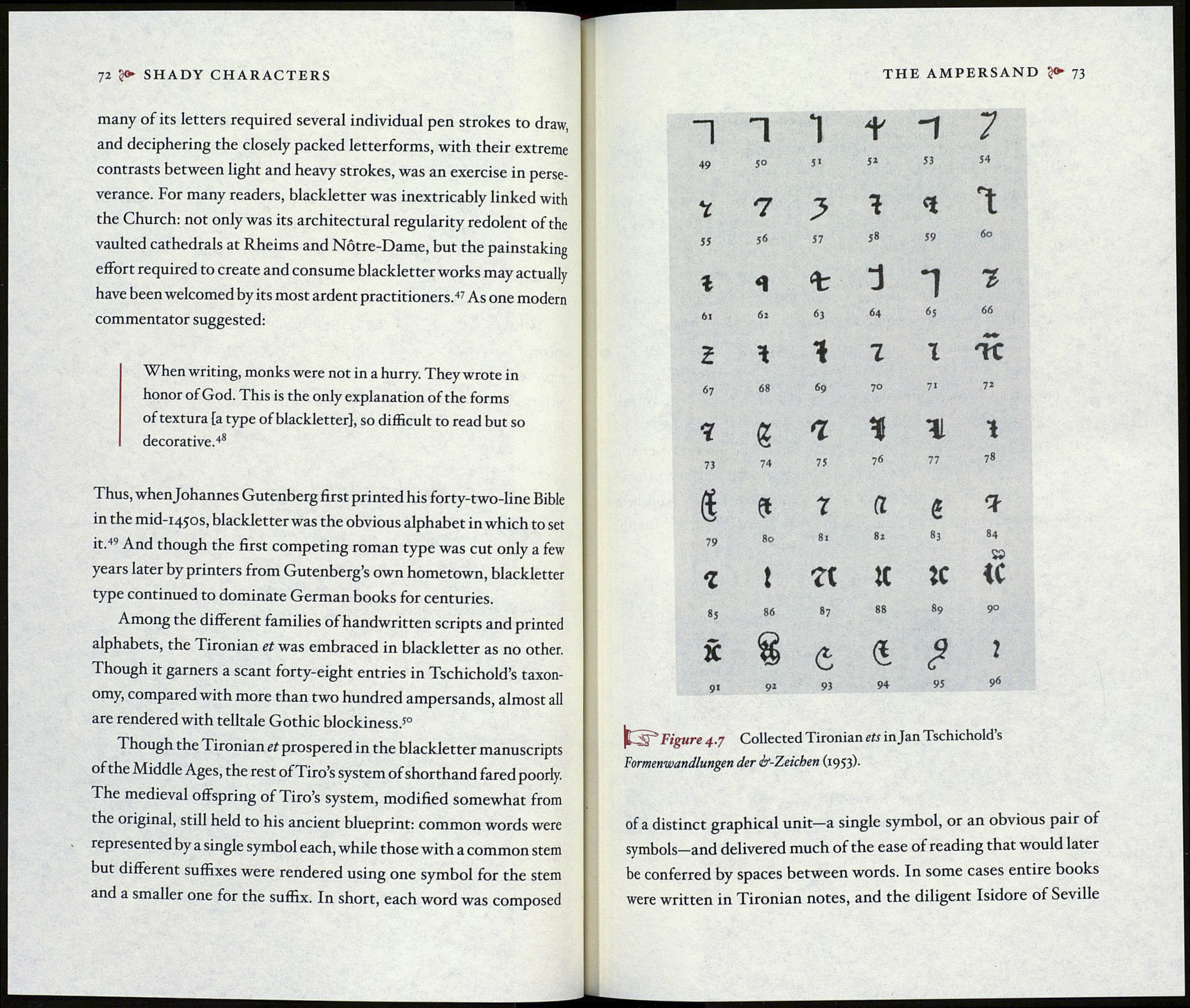
alphabets, the Tironian et was embraced in blackletter as no other.
Though it garners a scant forty-eight entries in Tschichold’s taxon-
omy, compared with more than two hundred ampersands, almost all
are rendered with telltale Gothic blockiness.s°
Though the Tironian et prospered in the blackletter manuscripts
of the Middle Ages, the rest of Tiro’s system of shorthand fared poorly.
The medieval offspring of Tiro’s system, modified somewhat from
the original, still held to his ancient blueprint: common words were
represented by a single symbol each, while those with a common stem
but different suffixes were rendered using one symbol for the stem
and a smaller one for the suffix. In short, each word was composed
THE AMPERSAND 73
1
1
1
t
-1
7
49
5°
h
5*
53
54
7
7
У
4
*
1
55
56
57
58
59
бо
г
<1
%
d
1
г
6i
6i
63
64
65
66
2
*
i
7
I
67
68
69
70
71
72
4
£
7
ч
г
1
73
74
75
76
77
78
i
et
r
a
ê
?
79
80
81
82
83
84
г
t
X
к
»
ІС
»5
86
87
88
89
9°
X
8
6
4
?
2
91
92
93
94
95
96
Figure 4.7 Collected Tironian ets injan Tschichold’s
Formenwandlungen der ¿/-Zeichen (1953).
of a distinct graphical unit—a single symbol, or an obvious pair of
symbols—and delivered much of the ease of reading that would later
be conferred by spaces between words. In some cases entire books
were written in Tironian notes, and the diligent Isidore of Seville
