38 ?<► SHADY CHARACTERS
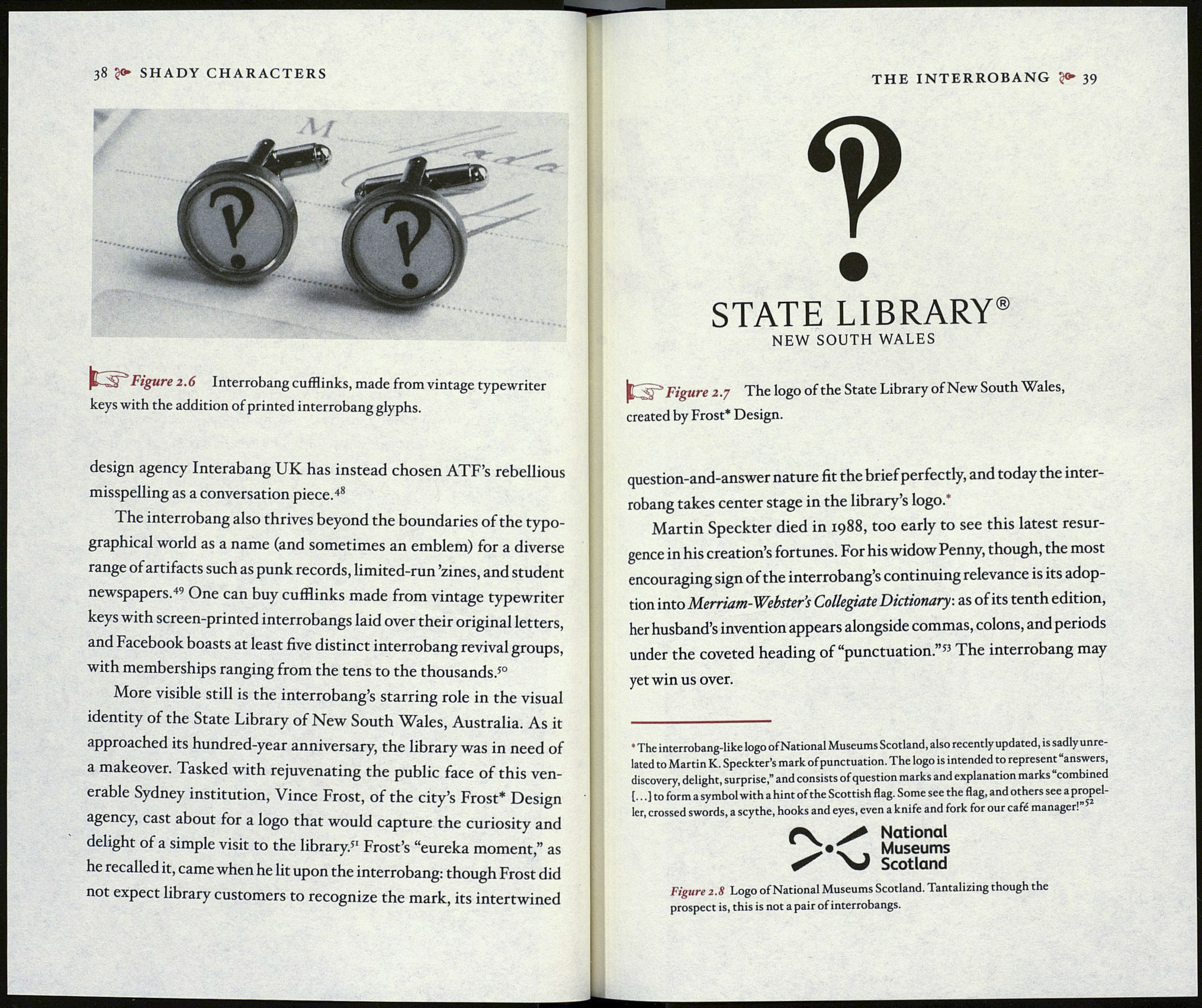
PSi Figure 2.6 Interrobang cufflinks, made from vintage typewriter
keys with the addition of printed interrobang glyphs.
design agency Interabang UK has instead chosen ATF’s rebellious
misspelling as a conversation piece.48
The interrobang also thrives beyond the boundaries of the typo¬
graphical world as a name (and sometimes an emblem) for a diverse
range of artifacts such as punk records, limited-run ’zines, and student
newspapers.44 One can buy cufflinks made from vintage typewriter
keys with screen-printed interrobangs laid over their original letters,
and Facebook boasts at least five distinct interrobang revival groups,
with memberships ranging from the tens to the thousands.50
More visible still is the interrobang’s starring role in the visual
identity of the State Library of New South Wales, Australia. As it
approached its hundred-year anniversary, the library was in need of
a makeover. Tasked with rejuvenating the public face of this ven¬
erable Sydney institution, Vince Frost, of the city’s Frost* Design
agency, cast about for a logo that would capture the curiosity and
delight of a simple visit to the library.5' Frost’s “eureka moment,” as
he recalled it, came when he lit upon the interrobang: though Frost did
not expect library customers to recognize the mark, its intertwined
THE INTERROBANG 39
9
STATE LIBRARY®
NEW SOUTH WALES
£ Figure 2.7 The logo of the State Library of New South Wales,
created by Frost* Design.
question-and-answer nature fit the brief perfectly, and today the inter¬
robang takes center stage in the library’s logo.*
Martin Speckter died in 1988, too early to see this latest resur¬
gence in his creation’s fortunes. For his widow Penny, though, the most
encouraging sign of the interrobang’s continuing relevance is its adop¬
tion into Merriatn-Webster’s Collegiate Dictionary, as of its tenth edition,
her husband’s invention appears alongside commas, colons, and periods
under the coveted heading of “punctuation.”53 The interrobang may
yet win us over.
* The interrobang-like logo of National Museums Scotland, also recently updated, is sadly unre¬
lated to Martin K. Speckter’s mark of punctuation. The logo is intended to represent “answers,
discovery, delight, surprise,” and consists of question marks and explanation marks “combined
{...] to form a symbol with a hint of the Scottish flag. Some see the flag, and others see a propel¬
ler, crossed swords, a scythe, hooks and eyes, even a knife and fork for our café manager.
^ National
, Museums
^ V Scotland
Figure 2. S Logo of National Museums Scotland. Tantalizing though the
prospect is, this is not a pair of interrobangs.
