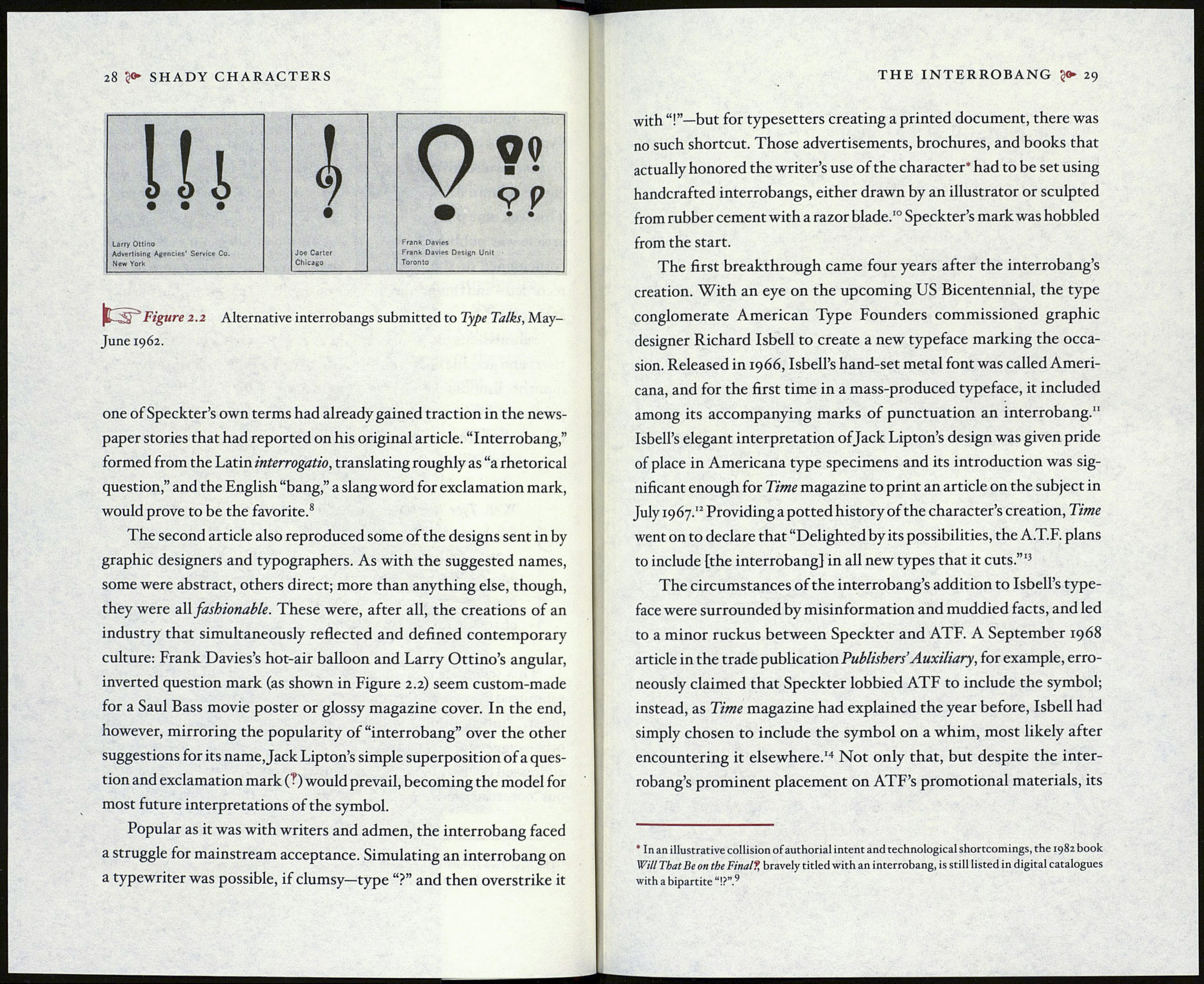
28 50» SHADY CHARACTERS
Ui
• •
Larry Ottino
Advertising Agencies' Service Co.
New York
Ì
Joe Carter
Chicago
Q?»
Y
Frank Davies
Frank Davies Design Unit
Toronto
'Figure 2.2 Alternative interrobangs submitted to Type Talks, May-
June 1962.
one of Speckter’s own terms had already gained traction in the news¬
paper stories that had reported on his original article. “Interrobang,”
formed from the Latin interrogano, translating roughly as “a rhetorical
question,” and the English “bang,” a slang word for exclamation mark,
would prove to be the favorite.8
The second article also reproduced some of the designs sent in by
graphic designers and typographers. As with the suggested names,
some were abstract, others direct; more than anything else, though,
they were all fashionable. These were, after all, the creations of an
industry that simultaneously reflected and defined contemporary
culture: Frank Davies’s hot-air balloon and Larry Ottino’s angular,
inverted question mark (as shown in Figure 2.2) seem custom-made
for a Saul Bass movie poster or glossy magazine cover. In the end,
however, mirroring the popularity of “interrobang” over the other
suggestions for its name, Jack Lipton’s simple superposition of a ques¬
tion and exclamation mark ( ?) would prevail, becoming the model for
most future interpretations of the symbol.
Popular as it was with writers and admen, the interrobang faced
a struggle for mainstream acceptance. Simulating an interrobang on
a typewriter was possible, if clumsy—type “?” and then overstrike it
THE INTERROBANG 29
with but for typesetters creating a printed document, there was
no such shortcut. Those advertisements, brochures, and books that
actually honored the writer’s use of the character* had to be set using
handcrafted interrobangs, either drawn by an illustrator or sculpted
from rubber cement with a razor blade.10 Speckter’s mark was hobbled
from the start.
The first breakthrough came four years after the interrobang’s
creation. With an eye on the upcoming US Bicentennial, the type
conglomerate American Type Founders commissioned graphic
designer Richard Isbell to create a new typeface marking the occa¬
sion. Released in 1966, Isbell’s hand-set metal font was called Ameri¬
cana, and for the first time in a mass-produced typeface, it included
among its accompanying marks of punctuation an interrobang.11
Isbell’s elegant interpretation of Jack Lipton’s design was given pride
of place in Americana type specimens and its introduction was sig¬
nificant enough for Time magazine to print an article on the subject in
July 1967.12 Providing a potted history of the character’s creation, Time
went on to declare that “Delighted by its possibilities, the A.T.F. plans
to include [the interrobang] in all new types that it cuts.”'3
The circumstances of the interrobang’s addition to Isbell’s type¬
face were surrounded by misinformation and muddied facts, and led
to a minor ruckus between Speckter and ATF. A September 1968
article in the trade publication Publishers’ Auxiliary, for example, erro¬
neously claimed that Speckter lobbied ATF to include the symbol;
instead, as Time magazine had explained the year before, Isbell had
simply chosen to include the symbol on a whim, most likely after
encountering it elsewhere.’4 Not only that, but despite the inter¬
robang’s prominent placement on ATF’s promotional materials, its
* In an illustrative collision of authorial intent and technological shortcomings, the 1982 book
Will That Be on the FinaI?, bravely titled with an interrobang, is still listed in digital catalogues
with a bipartite “I?”.9
