20 SHADY CHARACTERS
liberal enough by 1949 that the sculpture could be sold at auction.'6
Even then, Gill’s original title for the piece (as recorded in his private
diary) was still considered too brazen. For public consumption, the
cheerfully direct They (big) group fucking became the rather more cir¬
cumspect Ecstasy.57
Despite frequent forays into then-taboo subjects, after his death
Gill remained well known mainly for his artistic successes and staunch
Catholicism. The Eric Gill known to his close-knit family and follow¬
ers, however, was a startlingly different man. In 1961, twenty-one years
after his death, the BBC broadcast an hour-long radio documentary
about the artist, and in it could be discerned the first hints of the
extraordinary gulf between Gill’s public façade and the reality of his
private life. Interviewed for the program, Gill’s partner René Hague—
now married to Gill’s daughter Joan—spoke about his father-in-law’s
attitude toward evil:
I wonder whether Eric really believed in evil. He would
talk about the evils of industrialism, he would talk about
things going wrong, but he certainly didn’t believe that
there was any “bad thing.” He didn’t believe in evil in that
sense, that anything in nature could be evil. That was
one of the reasons why he was willing to try anything,
anything at all, but quite literally. Either right or wrong,
or supposed to be right or wrong, he’d say “Let’s try it, let’s
try it once, anyway.”58
The awful truth behind Hague’s musings became clear in 1989 when
an unflinching biography revealed adultery, incest, child abuse, and
even bestiality within the Gill household.59 The artist’s posthumous
reputation was rocked by these revelations, yet despite this (or perhaps
partly because of it), Gill remains a resonant name within the typo¬
graphical world and Essay one of his most enduring contributions to it.
THE PILCROW $<► 21
* * *
Despite occasional celebrity appearances as a paragraph mark
(such as in An Essay on Typography), the pilcrow remains largely
alienated from its traditional role. As compensation, perhaps, it has
since acquired a sort of talismanic power for those in the know, espe¬
cially in the worlds of typography, design, and literature. Jonathan
Hoefler of the type design firm Hoefler & Frere-Jones (the company
5 5 f f
11 11Í
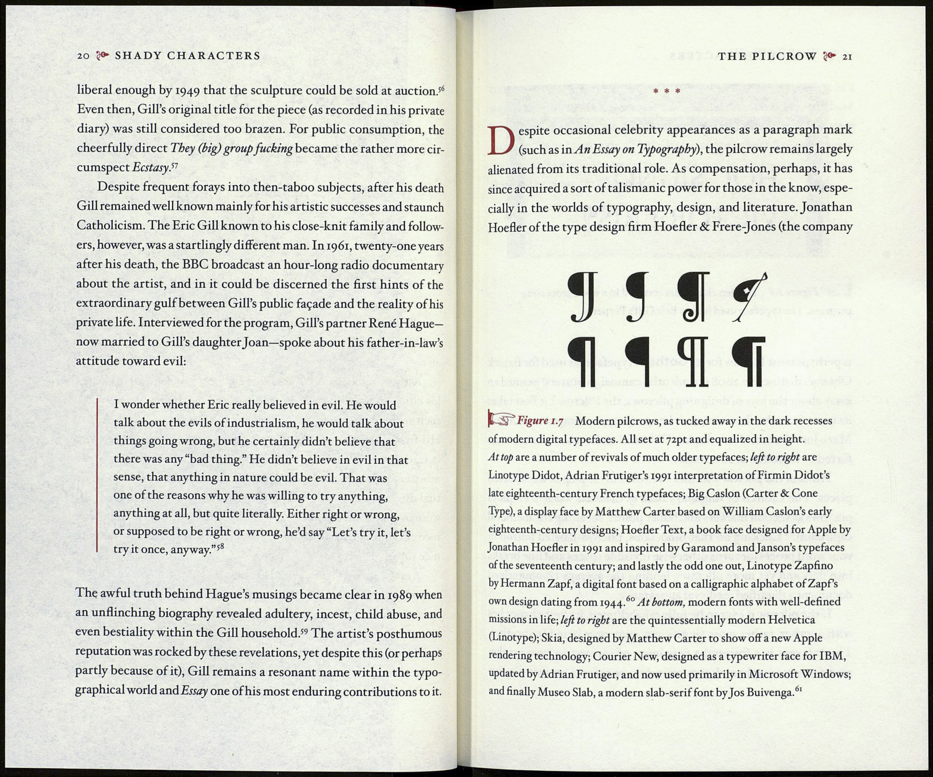
^ : Figure 1.7 Modern pilcrows, as tucked away in the dark recesses
of modern digital typefaces. All set at 72pt and equalized in height.
At top are a number of revivals of much older typefaces; left to right are
Linotype Didot, Adrian Frutiger’s 1991 interpretation of Firmin Didot’s
late eighteenth-century French typefaces; Big Caslon (Carter & Cone
Type), a display face by Matthew Carter based on William Caslon’s early
eighteenth-century designs; Hoefler Text, a book face designed for Apple by
Jonathan Hoefler in 1991 and inspired by Garamond andjanson’s typefaces
of the seventeenth century; and lastly the odd one out, Linotype Zapfino
by Hermann Zapf, a digital font based on a calligraphic alphabet of Zapf’s
own design dating from 1944.60 At bottom, modern fonts with well-defined
missions in life; left to right are the quintessential^ modern Helvetica
(Linotype); Skia, designed by Matthew Carter to show off a new Apple
rendering technology; Courier New, designed as a typewriter face for IBM,
updated by Adrian Frutiger, and now used primarily in Microsoft Windows;
and finally Museo Slab, a modern slab-serif font byjos Buivenga.61
