230 $<► SHADY CHARACTERS
In a case of independent innovation, Hoang, Kim, and Gilmore
claim to have invented the concept of sartalics without prior knowl¬
edge of ironies, though the trio did their homework and name-
checked H. L. Mencken on their home page as a possible progenitor
of the form.62 Sartalics.com was launched just a year shy of the inter-
robang’s fiftieth anniversary, and as Martin K. Speckter had appeared
in print, on television, and on radio to promote his symbol, so Hoang,
Kim, and Gilmore used their twenty-first-century advertising nous to
promote their project. Ironies were rebranded as sartalics for a snarky
online world, and Twitter, YouTube, and the web were all put to work
to spread the word.63
Cognizant of the headwinds that had greeted earlier irony marks,
the aims of the Sartalics.com team were grander than the creation of a
single mark of punctuation or a sarcastic typeface. What was needed,
they said, was for sartalics to become a mere fact of computing and
the web itself; they would have to become as prosaic, essential, and
accessible as italics or bold type.64 Serving as a salutary warning of the
obstacles still to be overcome, their online examples of backward-
skewed text did not display properly in Microsoft’s Internet Explorer,
rendering them nonsensical for more than a quarter of web users, and
their method could be applied only to entire paragraphs at a time*—it
was not yet possible to “sartalicize” individual words or phrases.66
The July 20II launch of Sartalics.com generated a flurry of tweets
and blog posts, though the novelty seemed to have worn off by the
end of the following month.67 Then, in December the same year, a
separate, hitherto obscure attempt to create a similar sarcastic font
was uncovered by the popular social news site Reddit.com; the post
received more than five hundred comments within a matter of days,
* A later tweet from the team suggested using backslashes to surround \sarcasdc\ terms as a
stopgap measure. *
IRONY AND SARCASM У* 231
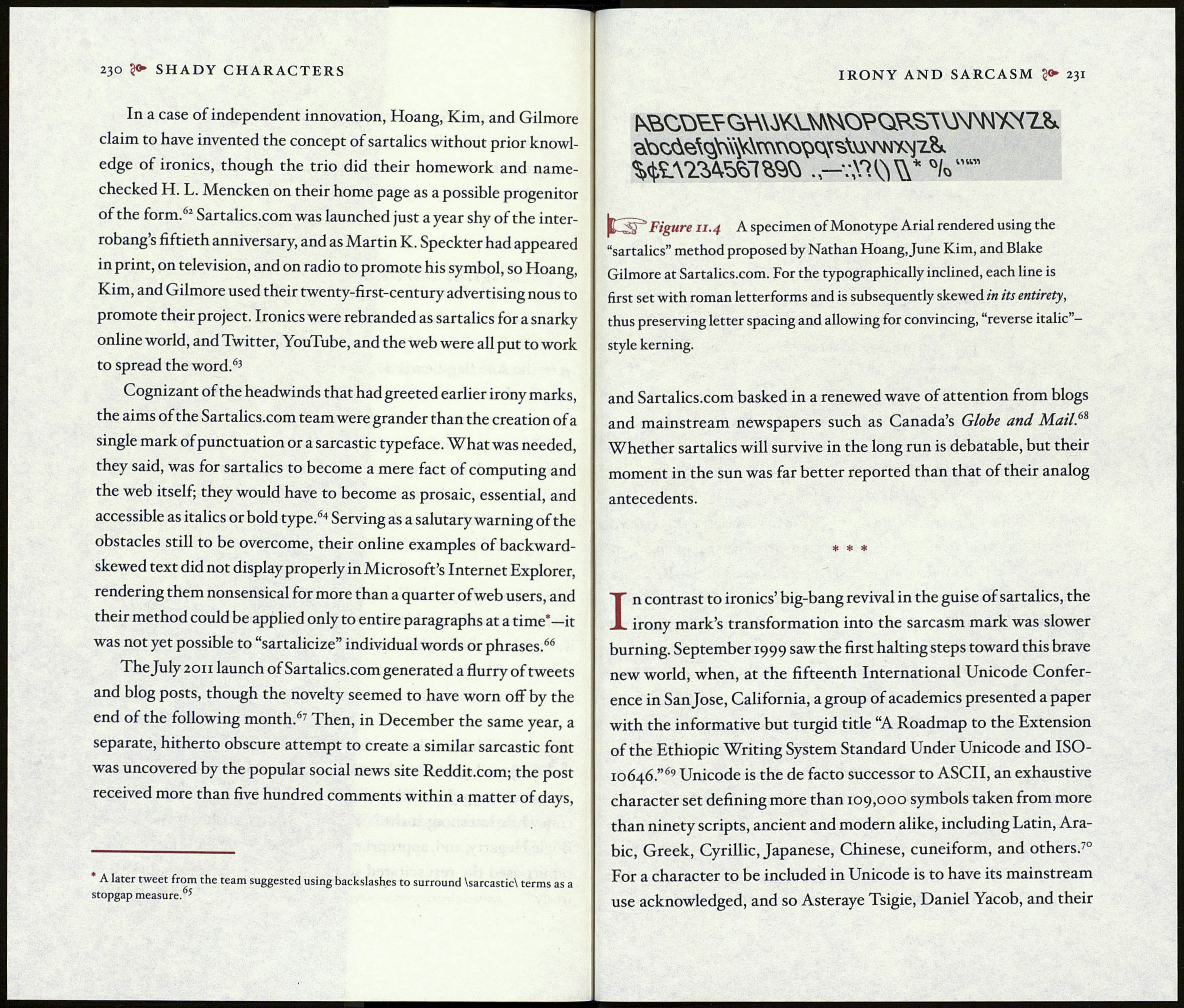
Figu re il. 4 A specimen of Monotype Arial rendered using the
“sartalics” method proposed by Nathan Hoang, June Kim, and Blake
Gilmore at Sartalics.com. For the typographically inclined, each line is
first set with roman letterforms and is subsequently skewed in its entirety,
thus preserving letter spacing and allowing for convincing, “reverse italic”-
style kerning.
and Sartalics.com basked in a renewed wave of attention from blogs
and mainstream newspapers such as Canada’s Globe and Mail.68
Whether sartalics will survive in the long run is debatable, but their
moment in the sun was far better reported than that of their analog
antecedents.
* * *
In contrast to ironies’ big-bang revival in the guise of sartalics, the
irony mark’s transformation into the sarcasm mark was slower
burning. September 1999 saw the first halting steps toward this brave
new world, when, at the fifteenth International Unicode Confer¬
ence in San Jose, California, a group of academics presented a paper
with the informative but turgid title “A Roadmap to the Extension
of the Ethiopie Writing System Standard Under Unicode and ISO-
10646.”69 Unicode is the de facto successor to ASCII, an exhaustive
character set defining more than 109,000 symbols taken from more
than ninety scripts, ancient and modern alike, including Latin, Ara¬
bic, Greek, Cyrillic, Japanese, Chinese, cuneiform, and others.70
For a character to be included in Unicode is to have its mainstream
use acknowledged, and so Asteraye Tsigie, Daniel Yacob, and their
