222 SHADY CHARACTERS
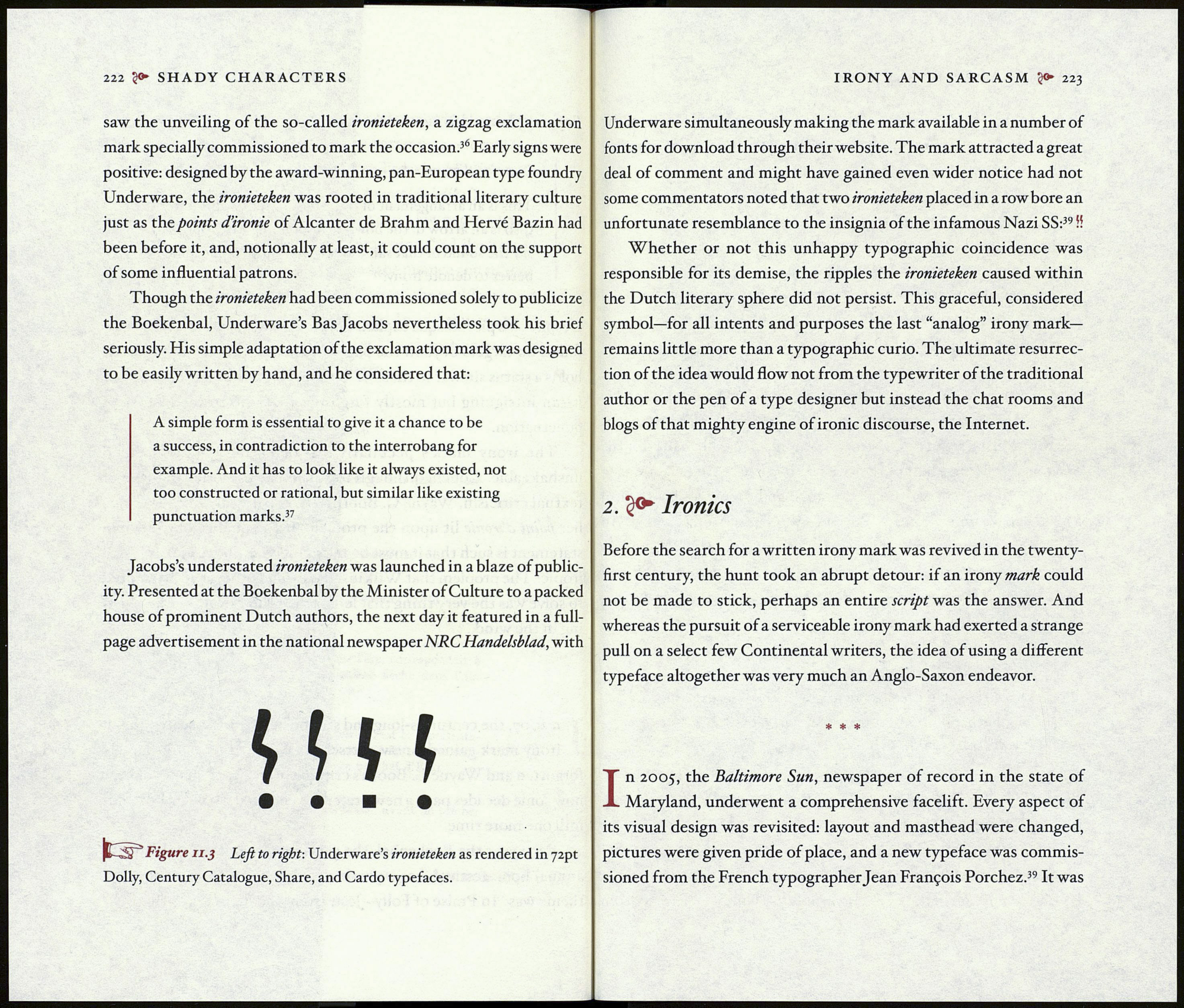
saw the unveiling of the so-called ironieteken, a zigzag exclamation
mark specially commissioned to mark the occasion.36 Early signs were
positive: designed by the award-winning, pan-European type foundry
Underware, the ironieteken was rooted in traditional literary culture
just as the points d’ironie of Alcanter de Brahm and Hervé Bazin had
been before it, and, notionally at least, it could count on the support
of some influential patrons.
Though the ironieteken had been commissioned solely to publicize
the Boekenbal, Underware’s Bas Jacobs nevertheless took his brief
seriously. His simple adaptation of the exclamation mark was designed
to be easily written by hand, and he considered that:
A simple form is essential to give it a chance to be
a success, in contradiction to the interrobang for
example. And it has to look like it always existed, not
too constructed or rational, but similar like existing
punctuation marks.37
Jacobs’s understated ironieteken was launched in a blaze of public¬
ity. Presented at the Boekenbal by the Minister of Culture to a packed
house of prominent Dutch authors, the next day it featured in a full-
page advertisement in the national newspaper NRC Handelsblad, with
ИН
• • ■ •
pUSU Figure 11.3 Left to right: Underware’s ironieteken as rendered in 72pt
Dolly, Century Catalogue, Share, and Cardo typefaces.
IRONY AND SARCASM 223
Underware simultaneously making the mark available in a number of
fonts for download through their website. The mark attracted a great
deal of comment and might have gained even wider notice had not
some commentators noted that two ironieteken placed in a row bore an
unfortunate resemblance to the insignia of the infamous Nazi SS:39 !!
Whether or not this unhappy typographic coincidence was
responsible for its demise, the ripples the ironieteken caused within
the Dutch literary sphere did not persist. This graceful, considered
symbol—for all intents and purposes the last “analog” irony mark—
remains little more than a typographic curio. The ultimate resurrec¬
tion of the idea would flow not from the typewriter of the traditional
author or the pen of a type designer but instead the chat rooms and
blogs of that mighty engine of ironic discourse, the Internet.
2. Ironies
Before the search for a written irony mark was revived in the twenty-
first century, the hunt took an abrupt detour: if an irony mark could
not be made to stick, perhaps an entire script was the answer. And
whereas the pursuit of a serviceable irony mark had exerted a strange
pull on a select few Continental writers, the idea of using a different
typeface altogether was very much an Anglo-Saxon endeavor.
* * *
In 2005, the Baltimore Sun, newspaper of record in the state of
Maryland, underwent a comprehensive facelift. Every aspect of
its visual design was revisited: layout and masthead were changed,
pictures were given pride of place, and a new typeface was commis¬
sioned from the French typographer Jean François Porchez.39 It was
