i84 2°“ shady characters
SIDEWALK
Ultimately, the manicule was the architect of its own demise
Familiarity breeds contempt, and the fist was everywhere in the
advertisements, posters, direction signs, and newspapers of the time(<
Just as nowadays the average Internet user subconsciously ignores
sponsored hyperlinks—the so-called banner blindness dreaded by
online advertisers—so the manicule’s usefulness as an eye-catching
device waned during the second half of the nineteenth century.6* By
the 1890s, the fist was used almost entirely in an ironic capacity; with
consumers wise to the tricks of the trade, when printers reached into
their type cases for a fist it was as a self-conscious revival of this once-
ubiquitous symbol.65
The typographic manicule remains a rare beast in modern
printed works, though its bid for freedom from the margins
of books has seen it prosper in certain niches. The pointing fist as
directional sign is a stock in trade for businesses wishing to affecta
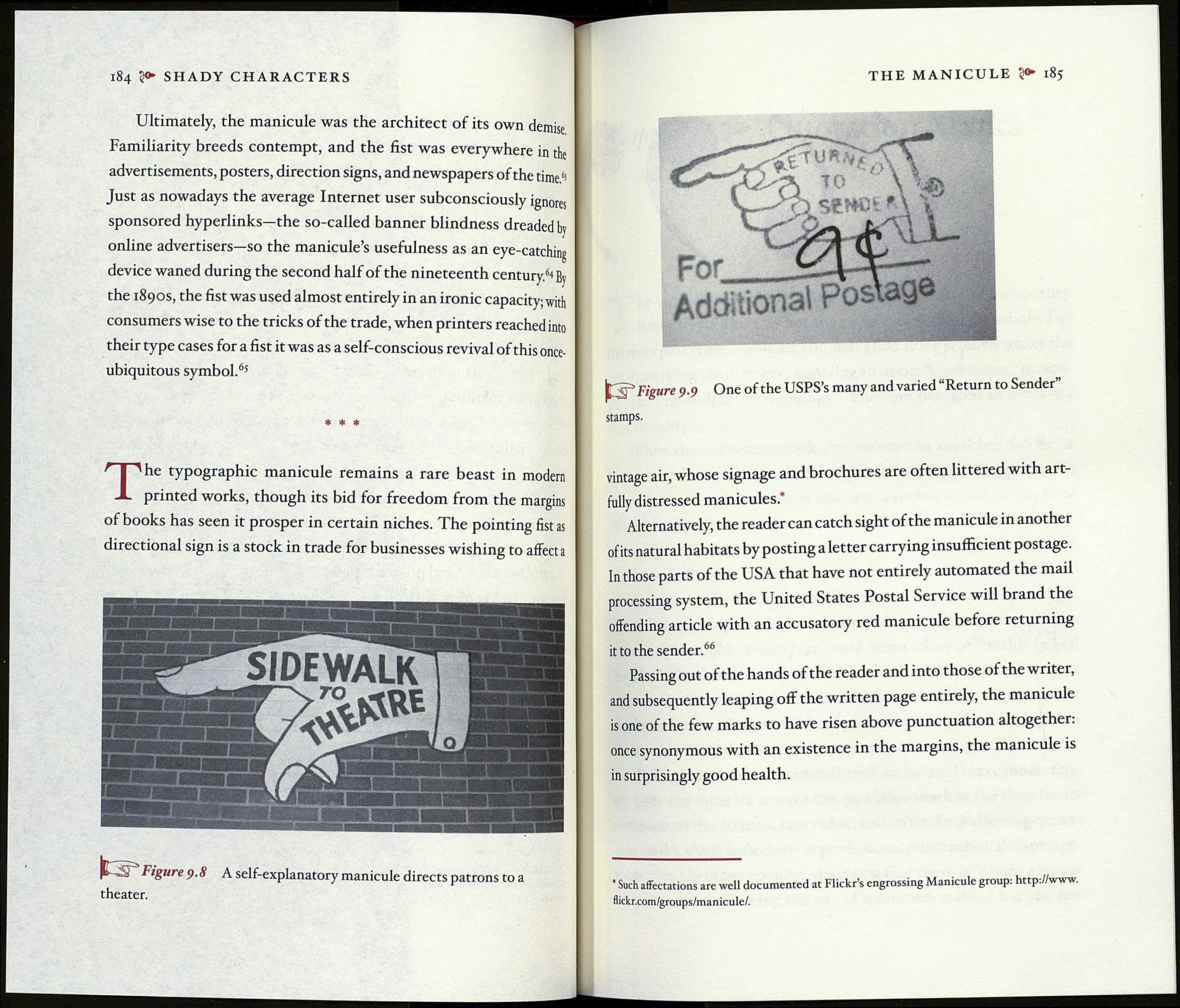
çure 9.8 A self-explanatory manicule directs patrons to a
theater.
THE MANICULE 2»* 185
Figure 9.9 One of the USPS’s many and varied “Return to Sender”
stamps.
vintage air, whose signage and brochures are often littered with art¬
fully distressed manicules*
Alternatively, the reader can catch sight of the manicule in another
of its natural habitats by posting a letter carrying insufficient postage.
In those parts of the USA that have not entirely automated the mail
processing system, the United States Postal Service will brand the
offending article with an accusatory red manicule before returning
it to the sender.66
Passing out of the hands of the reader and into those of the writer,
and subsequently leaping off the written page entirely, the manicule
is one of the few marks to have risen above punctuation altogether,
once synonymous with an existence in the margins, the manicule is
in surprisingly good health.
' Such affectations are well documented at Flickr’s engrossing Manicule group: http://www.
flickr.com/groups/manicule/.
