-I90- though Dwiggins might have felt inhibited by his own Caledonia,
Some designers and which was, after all, an exercise in the 'modern' manner. What
their types Dwiggins seems to have done was to take the familiar so-called
Bodoni face of Morris Fuller Benton and rework it by a combin¬
ation of plastic surgery and cosmetic treatment. The stems were
given entasis; the interior of round letters was abrupt in one
quarter, smooth in another; the italic О had sides of unequal
thickness, while N had an obtrusive blob attached to one corner;
and there were other features that force one to the conclusion
that Dwiggins's view of the task was too superficial to have any
likelihood of success. It is a measure of Griffith's willingness to
allow Dwiggins a free hand that he did not demur at the project.
Dwiggins's last venture in type design is interesting on two
counts: it was potentially a very distinguished book type, but its
purpose and development were confused by an ill-conceived
linguistic theory which Griffith should have dismissed, politely
but firmly, at the beginning of the work.
In short, Dwiggins's theory was that the roman letter was
satisfactory for the visual representation of Latin, for which it
was created, but not for the English language, which had once
had its own style of letter, the 'English-Irish book hand'. He
pointed out that eleven of the normal roman lowercase letters
have ascending or descending strokes: b, d, f, g, h, j, k, 1, p, q and
y; and he thought that their frequent occurrence in printed
English means that the language looks less graceful on the page
than Latin, where they are less frequent and к and у never occur.
Some years before he had written, 'It is surprising how little
descenders and ascenders have to do with legibility as such. Their
function seems to be largely aesthetic: to compel a good-looking
amount of paper between lines . . .' - a curious notion. In fact,
legibility derives from the differences in letter forms, and the
ascenders and descenders (particularly the former) are important
aids in the recognition of words. Dwiggins's proposal was to
replace the common form of some of those letters by an uncial
form, similar to their capital counterparts, so as to achieve a
more pleasing texture on the page. In the text of a trial proof he
refers to the King's Fount designed by Charles Ricketts for his
Vale Press in 1903. All through 1945 punches and matrices were
made, proofed and revised, for a new type face in roman and
italic, called Winchester, which would embody these ideas. The
letters b, d, f, g and h were made in conventional form and also in
uncial form; at one stage there were uncial versions of к and t,
too. (Goudy had experimented with similar letters in his
Newstyle type in 1921, though for a different theory.) In March
1946 a specimen was printed. It included Dwiggins's explanation
of the idea, pages in English and Latin for comparison, and two
pages in English, one of them including the uncial sorts and the
other the familiar lowercase letters. (With my copy there is a
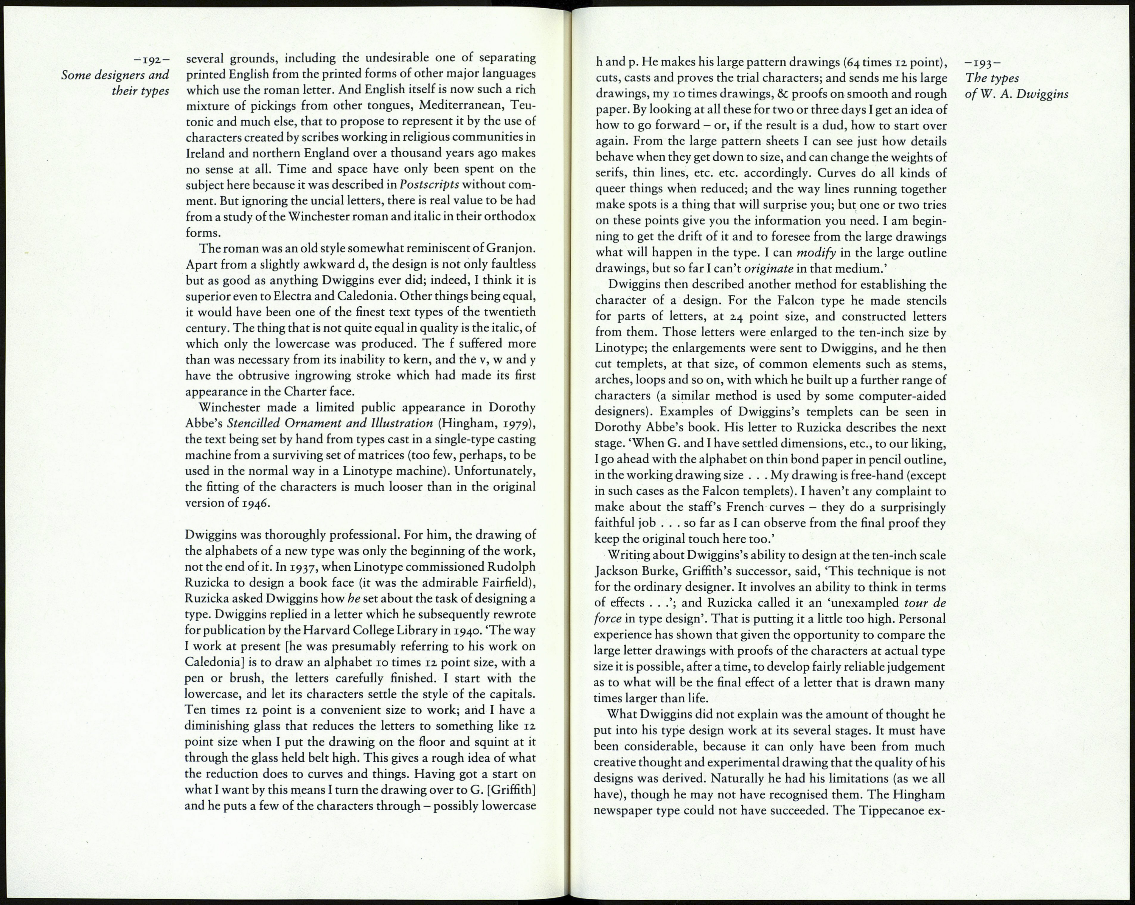
ABCDEFGHIJKLMNOPQRSTUVWXYZ -191-
The types
abcdefghijklmnopqrstuvwxyz ofW. A. Dwiggins
abcdefghijklmnopqrstuvwxyz
aBCDepqHijklmnopqrstuvwxyz
aBcdefçHijkhnnopqrstuvwxyz
Winchester: the regular characters
and the uncial alternatives.
Тнеге is no reason to pear tHat ше printinq traDe will
trample out ѵаіиавіе lives in its stampeDe to aDopt tHis
(or any otHer) revision op EnqlisH. No traDe is more con¬
servative шап ше printinq traDe. . . AnD yet . . a time
op plux . . letter porms (anD otoer porms) alreaDy наѵе
unDerqone consiDeraele moDipication . . It miqHt pos-
siely ве tHat we are movinq into some Anqlo-American
reqion WHere a new kinD op Enqlish script woutan't ве
so unreasonaele. . .
Winchester with its uncials.
There is indeed one set of men our inveterate enemies;
they are those whom the madness of P. Clodius has trained
up, and supported by plunder, firing of houses, and every
species of public mischief; who were spirited up by the
speeches of yesterday, to dictate to you what sentence you
should pass. If these should chance to raise any clamour,
it will only make you cautious how you part with a citizen
who always despised that crew, and their loudest threat-
enings, where your safety was concerned. Act with spirit
Winchester in traditional form.
pencilled note by Griffith: 'The uncial d is not successful and
should not have been used.') Visually, the uncial characters in the
'English' page, as it was called, make the page look lighter than
the 'Roman' page, because there are fewer ascending strokes; but
that hardly makes it more 'graceful'. In economic terms, the
'English' page loses eleven words (a full line) because the uncial
letters are wider than the roman. The two versions were used in
the setting of a limited edition of Matthew Arnold's Tristram and
Iseult, issued by the Golden Eagle Press in 1946.
Such mild interest as there may now be in all this, as showing
something about the effect of ascenders and descenders on the
texture of type in mass, cannot really be justified by the amount
of effort that was put into what can only be called a futile project:
feeble in its execution by comparison with Victor Hammer's
American Uncial type, which was at least a thorough-going
scheme of letter forms; and as a reform, an unrealistic one on
