-174- that owes its characteristics to a tool, such as pen or brush scripts.
Some designers and Indeed, some may say that the only logical design tool today is the
their types light pen or the cursor spot on a display screen. Perhaps we must
wait for the day when vectorising is an automatic process, editing
is unnecessary, and the result is a true facsimile. When the
designer's work can be reproduced directly and with complete
fidelity, without any sort of doctoring, we may hope to see, just
occasionally, type faces with something of the originality and
craftsmanlike quality that were Koch's particular contribution to
twentieth-century type design.
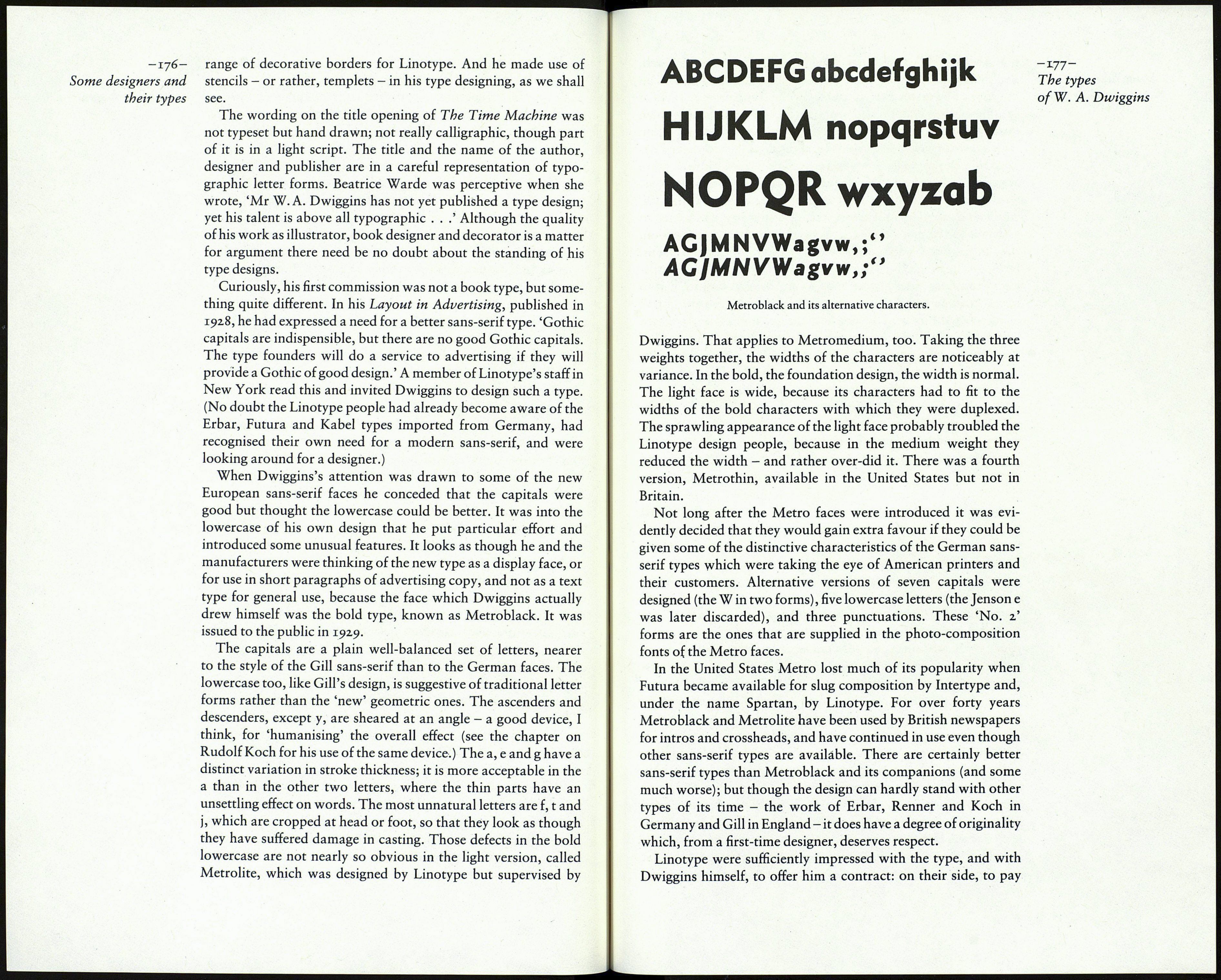
l6: The types of W. A.Dwiggins
Of the five designers whose work is discussed in these pages
W. A. Dwiggins is the one who most closely engaged himself
with the manufacturing processes of type faces for mechanical
composition, accepted their limitations and made use of their
possibilities. He is the only American designer to create a sans-
serif type of any merit; he created one of the best book romans of
the twentieth century, and also one of the most popular; and he
produced a number of designs which, though they were not put
on the market, are of considerable interest, and some would have
been a positive asset to the printer.
Dwiggins's career is as well known to the American typo¬
grapher as is Goudy's. In Britain his work is not so well known,
though his Metro type has been a constant favourite in British
newspaper printing for over forty years, and his Caledonia is
frequently seen in the text of modern publicity matter.
William Addison Dwiggins was born in Martinsville, Ohio, in
1880, the son of a doctor. At the age of nineteen he moved to
Chicago to study art at the Frank Holme School of Illustration.
He met Goudy there, became interested in lettering, and did some
miscellaneous work for advertisers. In 1903 he removed to Cam¬
bridge, Ohio, and started a small printing office, but it proved
inadequate as a means of making a living. When Goudy announ¬
ced his intention to move east to Hingham, Massachusetts, in
1904, and invited Dwiggins and his wife to join in the venture,
Dwiggins agreed, and lived there until his death in 1956. For his
first twenty years or so there he had a successful career as a
designer and illustrator in advertising. Amongst much else he did
some work for a music publisher in close imitation of the
elaborate cartouches to be seen in French and Italian engravings
of the second half of the seventeenth century. It has been said that
he had a liking for the chinoiserie fantasies of Jean Pillement, a
predilection which sometimes shows itself in the head and tail -175-
pieces he used in his book work. The types
By 1928 he had become dissatisfied with the ephemeral nature ofW. A. Dwiggins
of publicity work, and he decided to concentrate on the designing
and illustrating of books. He had already met Alfred Knopf, the
eminent publisher of the Borzoi titles, for whom Dwiggins
eventually designed nearly three hundred books. In 1932 he de¬
signed and illustrated Daudet's Tartarin of Tarascón for the
Limited Editions Club, and he was responsible for a further seven
books for that distinguished imprint before his death. He worked
for Random House, the Lakeside Press and other publishers of
note, and gained a considerable reputation in that field.
In regard to the illustrating of books Joseph Blumenthal, the
eminent American printer, has expressed an interesting view. 'As
a general rule I do not believe in book illustration . . .Illustration
in the literal sense can only portray, at best, the artist's personal
view of the text.' But suppose the artist's mind is in perfect accord
with the author's, as, for example, George Cruikshank's was
with Dickens's: is not the reader's enjoyment of the writer's work
immensely increased? I think so. Applying that criterion to the
limited amount of Dwiggins's book work I have seen, I do won¬
der if his reputation was wholly justified. To me his drawings
lack vitality, and his line is not expressive. Added to that, his
amiable cast of mind, which by all accounts made him a very
agreeable man to know, may have prevented him from respond¬
ing fully to some of the literature he was asked to illustrate. For
instance, in his treatment of Gulliver's Travels for the Peter
Pauper Press he loaded the book with devices and images quite
alien to the spirit of Swift's satire, and not at all interesting in
themselves. His double-page title for the Random House edition
of The Time Machine (1931) has been much admired; but it
seems to me to be entirely out of touch with Wells's bleak fable of
the end of all life, and to be no more than a self-indulgent display
of ill-arranged and disparate elements. Some of them are the
decorative units which he assembled from home-made celluloid
stencils. Beatrice Warde, writing as 'Paul Beaujon' in 1928, made
much of these, and quoted Dwiggins about them: 'The thing is
not to draw the working machine, but the curve that is in the
mind of the engineer before he designs the thing.' That is just
fancy talk, and would have brought an emphatic comment from
the engineers I used to know. Some of the stencil units are arcs of
various sizes and thicknesses, drawn with a compass; others are
simplified leaf shapes; some are geometric forms. With these, and
with lines and shapes added for the occasion, he would produce
two-dimensional constructions suggestive of plants or buildings,
or abstractions like the work we now call art deco. Their novelty
is undeniable, and they evidently charmed the publishers of the
time. Later on he used the stencil technique to create an attractive
