Kabel light.
'Construction' grid letters from the Kabel specimen.
Both Neudorffer (see preceding page) and Koch probably drew
their letters without constraint, and 'rationalised' them afterwards.
and to each other. The explanatory text speaks of the great
variety of letter widths which can be made from a straight line at
various angles, circles large and small, and sections of them. This
variety of widths, says the text, is stimulating to the reader; it was
always understood in the past, but recently the designers of 'grot¬
esques' have regulated the widths of capitals and produced a
monotonous effect unsuited to today's needs. It all looks as
though there is a module, the square divided into a certain num¬
ber of vertical parts, and that the width of the capitals is deter¬
mined by it. But it does not take long to discern that the square is
not really the controlling element in the diagrams: that the widths
of B, D and U have been decided visually, not geometrically, and
that the diagrams are simply an attractive piece of window dress¬
ing to influence people into accepting Kabel as a rational design.
But Koch was evidently not a man to be bound by arbitrary rules.
In Kabel Light the arms of E are actually of three different
lengths; the bowl of R is deeper than that of B, and in P it is deeper
still; the U has a full-length vertical at the right; and Y does not
have the vertical stem shown in the diagram. In short, Koch's
sense of style is in command, rather than any geometric formula.
The result is an alphabet of capitals that relate perfectly without
need of the 'mathematical harmony' that Moholy-Nagy spoke
of. They are, for my taste, the most attractive of all sans-serif
capitals.
The lowercase is not quite so pleasing. The x-height is little
more than half the height of the ascenders, which certainly makes
The firm, the enduring, the simple
and the modest are near to virtue
THAT IS THE QUESTION
for a pleasant effect in text sizes. But there are some unfortunate -171-
letter shapes. The narrowness of m is very noticeable against Three types
round letters. The w is too wide for h, and looks awkward in the by Rudolf Koch
'wh' association which is frequent in English words. There are
wayward details in some letters: the shortened bar in f (t is better
looking), the inadequate ear on r, the cropped head of a - though
in later specimens an a with a wider top made an unannounced
appearance in some sizes of some of the faces of the family. Most
particularly, there is the excessive angle of the bar in the e.
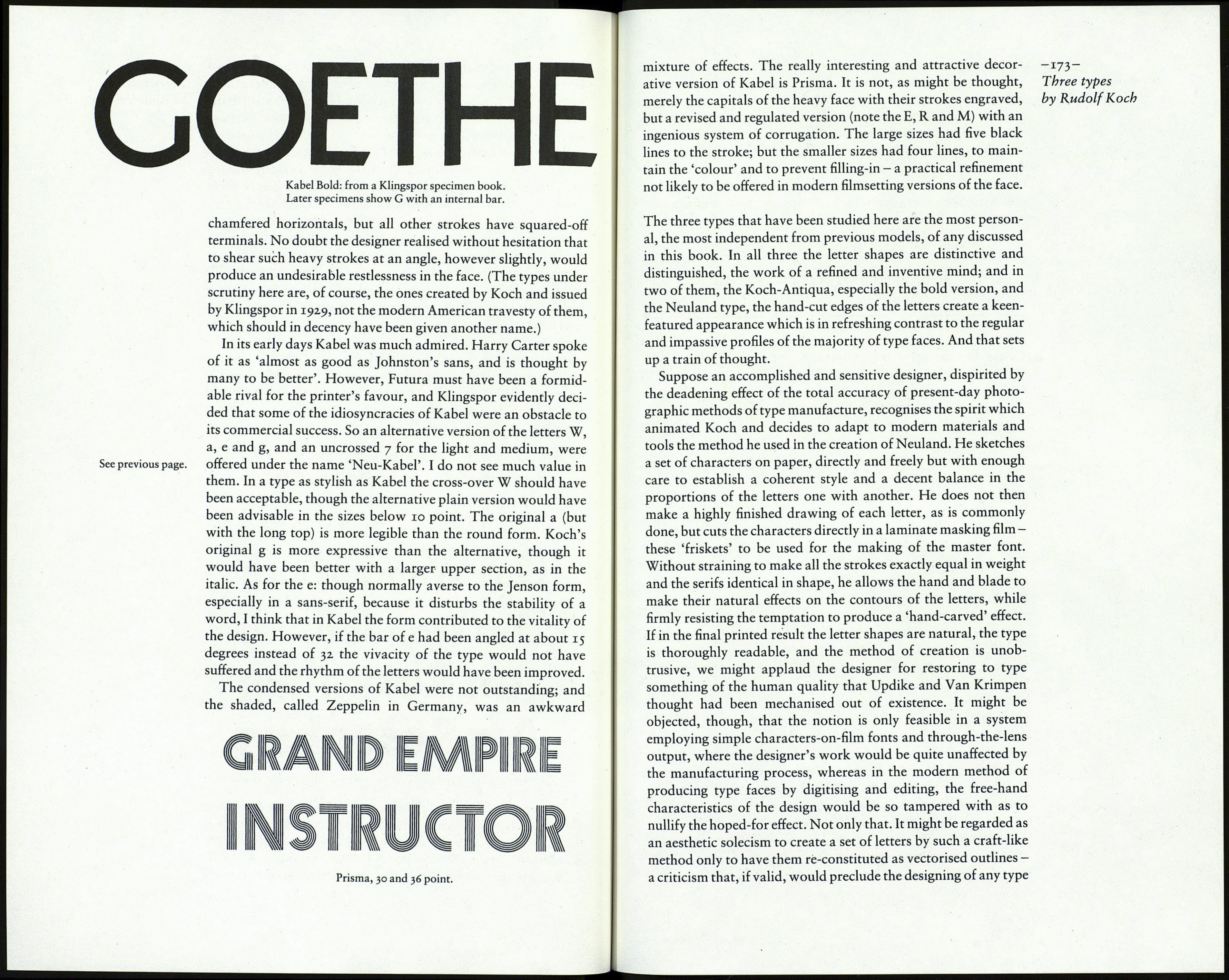
The medium weight of Kabel also shows those obtrusive char¬
acteristics; but the bold version (actually hardly more than semi-
bold) has some interesting differences. There are changes in
proportion: for instance, the D - see the specimen below on this
page - is wider, and the r and some other lowercase letters are in
better relationship. Only the e is a disturbing character, too 'ac¬
tive' for this class of design. The sheared terminals of the straight
strokes, clearly visible on the H in the specimen overleaf - a
feature which owes nothing to geometry - ingeniously increase
the liveliness of the design. (As noted earlier, Eric Gill wanted to
do something like it in the descender characters of his sans-serif
type, but was dissuaded. Dwiggins had the same idea, and got
away with it.)
Della stessa famiglia del primo premio,idue lavori
IL RISORGIMENTO GRAFICO 12345678
Dellastessa famiglio del primo premio,idue lavori
IL RISORGIMENTO GRAFICO 12345678
Das Wanderbuch
Das Wanderbuch
Am Rosenhag
Am Rosenhag
Kabel medium, bold and heavy, showing the alternative characters.
The heavy version is different again. Because of the consi¬
derable increase in weight (the strokes are about 75 per cent
thicker than those of the bold version) the lowercase x-height
is necessarily larger. Several letters have a new shape: A, M, R,
S, W and a are notable. The E, F, L and T retain the distinctive