-148- good one, an old style without quirks, the x-height small, the
Some designers and ascenders and capitals unusually tall, the whole looking remark-
their types ably similar to the Estienne type, based on an early sixteenth-
century French old style, made a few years later by the English
Linotype company under the direction of George W. Jones. The
absence of Goudy's usual hall-marks - the curly-tailed Q, the
Jenson e, the awkward S, the fanciful Z - and the general
reticence of the design, make Marlborough a puzzling item in
Goudy's corpus of work. It would be interesting to know if he
had a model for the design.
As described at the beginning of this essay, Goudy certainly
See page 12z. had a model for the Deepdene roman, at least to start with.
Perhaps that provided the discipline which ensured that the
design ended up as an orthodox face with no idiosyncracies -
though one wishes he had thought again about the S and s, and
the disparate proportions of m and w. The uneven fitting in the
Lanston Monotype version was not Goudy's fault. In the italic
the lowercase letters are as good as those in the Old Style italic;
but the capital G and U have not enough vitality for such a
graceful type.
ABCDEFGHIJKLMNO
PQRSTUVWXYZ&ABCD
EFGHIJKLMNOPQRSTUVWXYZ&>
abcdefghij klmnopqrst
uvwxyzcififfmflffl. ,';:!?-
1234567890
It is in the early printed books that the printer
may find the sort of help he needs ; there all the
elements of type, ink, paper and 1234567890
Kaatskill.
In the Kaatskill design of 1929 it was again the capitals which
needed more attention. The squareness of С and G is acceptable,
but their serifs are weak. The R is below Goudy's usual stan¬
dard; so is W. If those letters had been improved it would have
been worth while for the English Monotype company, which
acquired the design, to produce a range of normal book sizes,
because the lowercase is a good plain design, better than
Deepdene, I think, and one of the few romans in which Goudy
gave the e a horizontal bar.
Goethe, number 80 in Goudy's list, has been described earlier,
in the context of Goudy Modern. Its roman was designed in 1932..
ABCDEFGHIJ KLMNOP
QJR.STUVWXYZ&ABCDE
FGHIJKLMNOP Q.R STUVWXYZ
abcdefghijklmnopqrstuv
wxyz, fiffffl flffl 1234567890
In choice of types, those should be sought that
are sturdy, legible and easily discerned ; but stur-
diness need not necessarily mean &r 1234567890
In choice of types, those should be sought that are sturdy,
legible and easily discerned ; but sturdiness in type does
not necessarily mean faces over-bold or rough. Utility &
AB CDEFGHIJRLMNOP
QRSTUUWXYZ& abedefg
hijklmnopqrstuvvjxyzâ. slffffl
Village No. z and italic.
In the same year Goudy designed the second Village type, for
use in his own Press. He later sold the reproduction rights to
Lanston Monotype. The lowercase is fairly broad; the z is a
repetition of the spurred z in Goudy Lanston. In the capitals the
unusual bias of the curves is tolerable in C, G and О but less so in
B, P and R. The Z is too exuberant a companion for the other
capitals. Goudy said, 'To my mind Village No. 2 is an excellent
type.' The roman is certainly good; but that cannot quite be said
of the italic, which has a fine lowercase, but four capitals, K, U, V
and W, which are deplorable. (In practice composition in italic
which did not contain those letters would look pleasant enough.)
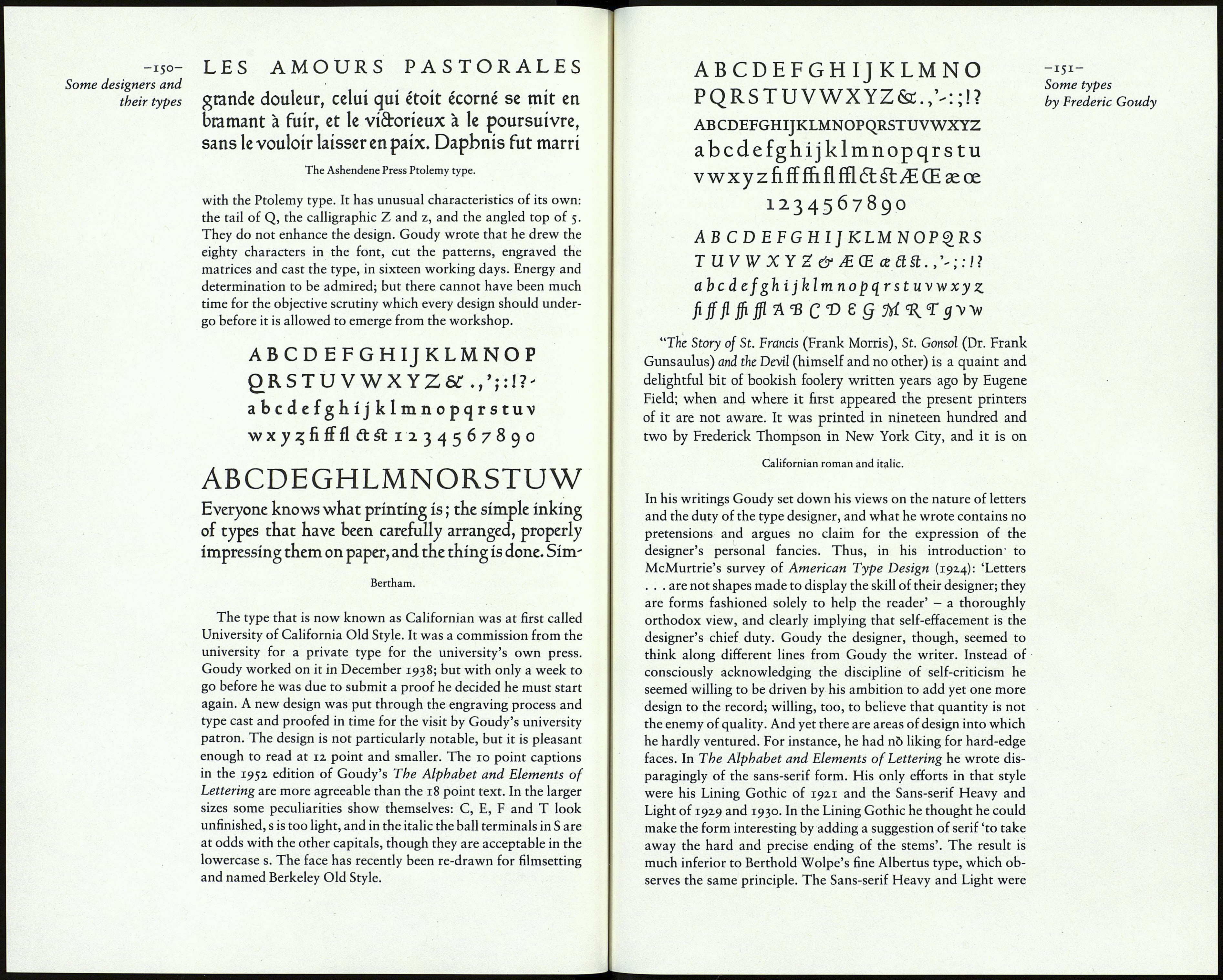
Bertham, named in memory of Goudy's wife, was his hun¬
dredth type face. It was designed in 1936, when he was in his
seventy-first year. Like Deepdene it began with Goudy's interest
in a design by another hand: in this case, the type used in a book
he had recently purchased, said to be based on the hybrid roman-
gothic face in a Latin edition of Ptolemy's guide to geography,
printed by Leonard Holle at Ulm in 148z. Goudy must have been
referring to one of the Ashendene Press books composed in the See overleaf.
Ptolemy type which had been drawn for that Press in Emery
Walker's office and which made its first appearance in the Don
Quixote of 1927.
Apart from the two-way serifs on M and N and a vague sugges¬
tion of fraktur in с and s, Goudy's design had little in common
-149-
Some types
by Frederic Goudy
