ABCDEFGQHIJJKL
MNOPQRSTTUVW
XYYZ&fiffffifljfldShé
abcdefghijklmnopqrstu
vwxyz.,,;:l?'$i2 345678ço
Fourscore and seven years ago our fathers
brought forth on this continent a new na~
tion,conceived in liberty,and dedicated to the
Goudy Old Style italic.
The italic is more interesting than the roman. At that date
Goudy had designed only two italics, those for Pabst and 38-E (he
had drawn an italic for the existing Cushing roman in 1904, but it
hardly counts as an original design). He therefore studied the
Aldine and other early sixteenth-century italics, and he seems to
have recognised two important facts: that the angle of an italic
need be only a few degrees from the vertical, and that the
lowercase letters should be narrower than the roman (the latter
was a precept he forgot in later italics, to their disadvantage). The
result of his studies was one of his finest designs - an excellent
secondary type when used with the roman, yet with a grace and
rhythm which made it very suitable as a text type in books of
verse (the lyric sort rather than the epic) and for advertising of
elegance. I am referring to the original version; there is a version
in present-day photo-composition which is wider, and the worse
for it.
The Goudy Old Style roman and italic are positive evidence of
Goudy's ability as a type designer. They were better than the
types being produced in Europe at that time (compare De Roos's
Zilver type of the same year) though the Imprint face, an adap¬
tation of Caslon distinctive enough to be judged original, is an
exception; and they are better than Morris Benton's dull Cloister
Old Style of the year before.
The faces were promoted vigorously and a number of vari¬
ations were developed - Bold, Extra Bold, Catalogue, Hand-
tooled, and so on - none of them by Goudy himself.
The next type selected for attention here is Goudytype,
designed for the American Type Founders Company in 19x6. It is
interesting not as a design but for what Goudy said about his
frame of mind at the time. Thirty years after the event he wrote in
his Half-Century: '. . . I felt it presented a liveliness of handling
not hitherto expressed in type ... but that in itself was not
enough to make it a good type. At that time I was beginning to
find myself; but as yet neither my studies nor my conclusions had
-138-
Some designers and
their types
ABCDEFGHIJKL
MNOPQRSTUVW
XYZabcdefghijklm
nopqrstuvwxyz$£r
.:;,.!?,1234567890
Goudytype.
given me the sureness and authoritative grasp of type problems
that I hope I command today . . .' It is difficult to accept that,
considering the confidence he had already exhibited in the Old
Style roman and italic. He went on: '. . . I fear I allowed matters
of mere technique to influence me - often mistaking excellence in
the handling of details for excellence of design'. It is plain that in
Goudytype there is a conflict of styles. The capitals and the
lowercase v, w, y, z are calligraphic; the rest of the lowercase
is typographic - the two graphic modes being essentially anti¬
pathetic. This is evidence, I think, not of an uncertain grasp of the
nature of type but of that search for novelty by which Goudy
allowed himself to be driven, not always wisely.
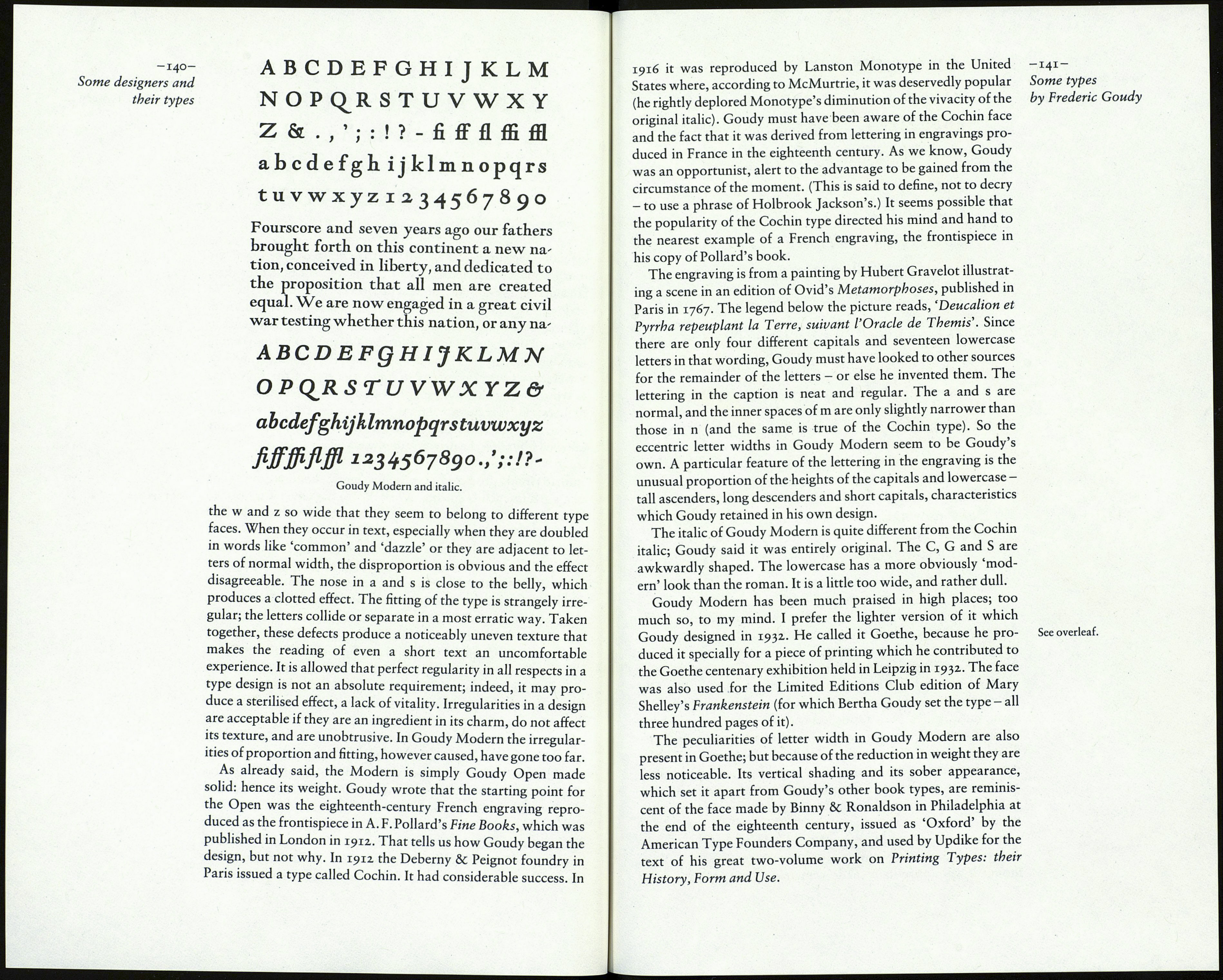
In 1918 Goudy produced a type which many people regard as one
of his greatest achievements. When the Goudy Open was finished See page 131.
he took a proof, filled in the white lines in the letters, and decided
the result would make a good text type. He called it Goudy
Modern - though he later said the name was not really accurate
because the face contained some old-style tendencies.
Stanley Morison drew attention to the design in his article
'Towards an Ideal Type' in the second volume of The Fleuron,
which was published in 1924. He commended Goudy Modern as
'an admirable letter', and amplified his approval in a review of
the type in The Fleuron vii (1930) and again in A Tally of Types
(1953). Morison's enthusiasm may have influenced Francis Mey-
nell; he used the face for three of the Nonesuch Press books,
including the complete Shakespeare of 1953.
In 'Towards an Ideal Type' Morison named his two require¬
ments for a satisfactory type face: that the essential form should
correspond with that handed down (that is, that the shapes and
proportions of the letters should be familiar), and that the letters
should compose agreeably into words. With due respect, I do not
think Goudy Modern meets the second of Morison's require¬
ments, and I think he would have perceived that if he had not
been so interested in what he imagined was the unusual source of
the design. The fact is that a number of the lowercase letters are
decidedly out of proportion with the rest. The m is so narrow and
-139-
Some types
by Frederic Goudy
