-114-
Some designers and
their types
possible to enlarge the interior spaces in the bold lowercase. And
no doubt he would have adjusted the weight of the capitals.
ABCDEFGHIJKLMNOPQRSTUVWXYZ
abcdefghijklmnopqrstuvwxyz
12345 fbfffnfflfifhfkfl 67890
ABCDEFGHIJKLMNOPQRSTUVWXYZ
abcdefghijklmnopqrstuvwxyz
12345 rbffffifflfnfifkfl 67890
ABCDEFGHIJKLMNOPQRSTUVWXYZ
abcdefghijklmnopqrstuvwxyz
12345 fbffffifflfhfk 67890
ABCDEFGHIJKLMNOPQRSTUVWXYZ
abcdefghijklmnopqrstuvwxyz
12345 fbffffifflfhfk 67890
Romulus sans-serif faces: light, normal, semi-bold, bold.
ABCDEFGHIJK
LMNOPQI
tuvwxy:
Romulus Open.
Not long before his retirement in 1956 Raedisch engraved a
white line in the large sizes of Romulus roman capitals, under
Van Krimpen's direction. In the Lutetia Open the white line had
been cut through the edges of the letters. In the Romulus Open
the profiles are intact. Van Krimpen said the effect pleased him
more.
About his Haarlemmer type of 1938, which was to be a private
type for the printing of a Bible for an association of bibliophiles in
Holland, Van Krimpen's book has nothing to say. I think the
design had more promise than John Dreyfus's account of it sug¬
gests. Apart from an awkward W, due to an existing machine
layout, there were no disturbing letter shapes. Certainly the
narrow h, n, u and rather wide о and с were out of proportion
and needed revision; and if the italic lowercase could have been
made a little narrower it would have seemed to gain weight and
would have harmonised better with the roman. The design -115-
would then have become an effective book type. But circum- The types
of Jan van Krimpen
Gutenberg equipped the scholar
with the accuracy of type. Pre¬
judiced connoisseurs in the fif¬
teenth century deplored the new
mass-production of books, but
men of letters eagerly hailed the
The invention of Printing from
THE INVENTION OF PRINT
Haarlemmer, Series 531.
By courtesy of the Monotype Corporation Ltd.
stances were against it. With the threat of war in Europe the bible
project was abandoned, and the Haarlemmer type with it. The
distinct contrast between its thick and thin strokes and the mark¬
edly oblique stress in its curves were to be fully realised in the
later Spectrum face.
The war and the occupation of Holland by an enemy did not stop
all creative endeavour. Like Haarlemmer, Spectrum was inten¬
ded to be a private type for the publishing house of that name, to
be used first for the composition of a Bible and later for other
publications, as soon as Monotype were able to produce a series
of sizes. The type was designed in the period 1941-43, and trial
alphabets were cut and cast in 14 point in the Enschedé foundry.
In the event, the Spectrum company relinquished its rights in the
design to Enschedé who, in 1950, arranged with Monotype that a
range of sizes should be developed jointly for general distrib¬
ution.
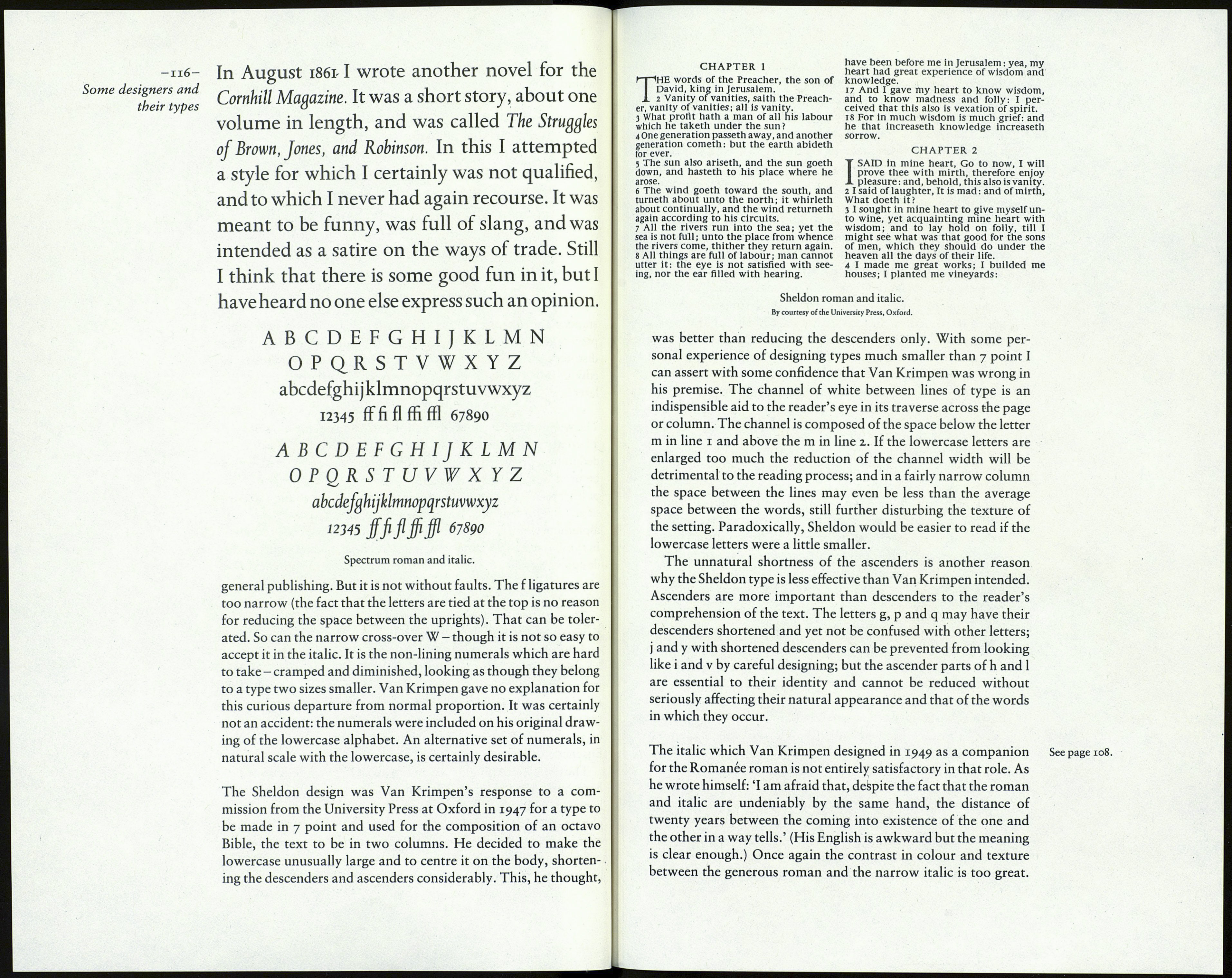
The differences between the roman of Spectrum and Van
Krimpen's earlier romans are plain to see: the x-height is larger
and there is greater contrast between the main and thin strokes.
The tops of the arches in m and n are sharply defined, and the
upper serifs in those and other letters are wedge-shaped. The
effect is crisp and positive, like that of seventeenth-century book
types; indeed, the face seems to have some of the characteristics
of the old style type cut by Hendrik Claesz which is in the
Enschedé collection.
The italic is a distinguished design in itself, but it does not quite
harmonise with the roman, being too narrow and a little too
heavy compared with the broad-countered roman. A foreign
phrase or a longish book title in a page of Spectrum becomes
over-emphatic and the texture of the page becomes patchy.
Spectrum is the most practical of Van Krimpen's book types
because it has proved itself suitable for a fair range of work in
