characters and symbols for mathematical text books. In the event
only the alphabets were produced. The capital delta and ksi look
too large and the phi too small. But these are minor faults; the
Antigone type is one of the best of Van Krimpen's designs. The
où ßpocouva KUpiOÇ TfjÇ ¿ТГОСѴ-
уеАіосс, lûc, tiveç ßpocovrrfjToc fjyo-
övtoci, dcÂÂà цоскроЭииа £Îç uuôcç,
(Л] (3ouÀÓU£VÓC TLVOCÇ СОгоАшЭои
(xXXà TTOCVTOCÇ £ÎÇ ЦЕТ0СѴОЮСѴ VCÛ-
pfjaoci. "H£,£l Ó£ rjuépoc Kupíou (bç
КА£ТГТГ]С,£ѴГ] OÎOÙpOCVOi pOlCnÓÒV
ABTAEZHeiKAMN
ЕОПРХТУФХУО
ос(ЗуО£^пЭікАцѵ^отгрости(р)(\4усо
Antigone Greek.
Open capitals, roman and Greek.
lowercase is distinctly calligraphic, so the type is nearer to
Wiegand's type for the Bremer Presse of 1923 than to Scholderer's
New Hellenic face of 1926; it is better suited to literary than to
mathematical texts. To work with the Antigone Van Krimpen
added ten Greek letters to the handsome set of open capitals he
had already designed for use in title lines.
The house of Enschedé possesses a remarkable collection of
punches and matrices. Many of them were acquired by purchase
during the eighteenth century. Others were created by punch-
cutters who worked for them, including Fleischman and Rosart.
-106-
Some designers and
their types
Amongst the collection there had been a roman and italic -107-
attributed to Christoffel van Dijck, 'greatest of Dutch letter cut- The types
ters', as Harry Carter described him. The faces were included in a of Jan van Krimpen
type specimen book issued by Enschedé in 1768, but only the
punches and matrices of the italic had survived, in the 16 point
size only. It was decided to create a roman to work with the italic.
It is not clear who made the decision. Van Krimpen himself,
writing in 1957, said that he had never been in favour of the
copying or adapting of historic type faces. If that had been his
view in 1928 he was probably in no position to oppose the plan.
There is only one way to accomplish such a task easily and
successfully. It is to use the method suggested by Emery Walker
and adopted by William Morris for his Golden type and by Bruce
Rogers for his Centaur: that is, to make bleached-out photo¬
graphic enlargements of passages from books composed in the
type to be imitated, to paint over the characters, modifying them
as little or as much as seems desirable, and to give the resulting
collection of enlarged characters to the punch-cutter. Photo¬
graphic enlargements of the Van Dijck roman were indeed
studied by Van Krimpen, but he did not work over them. Instead,
he drew a roman - and did little more than retain the proportions
and some of the features of the original. The result, as could
surely have been predicted, was a roman which, as a companion
for the existing Van Dijck italic, was 'a distinct failure', as Van
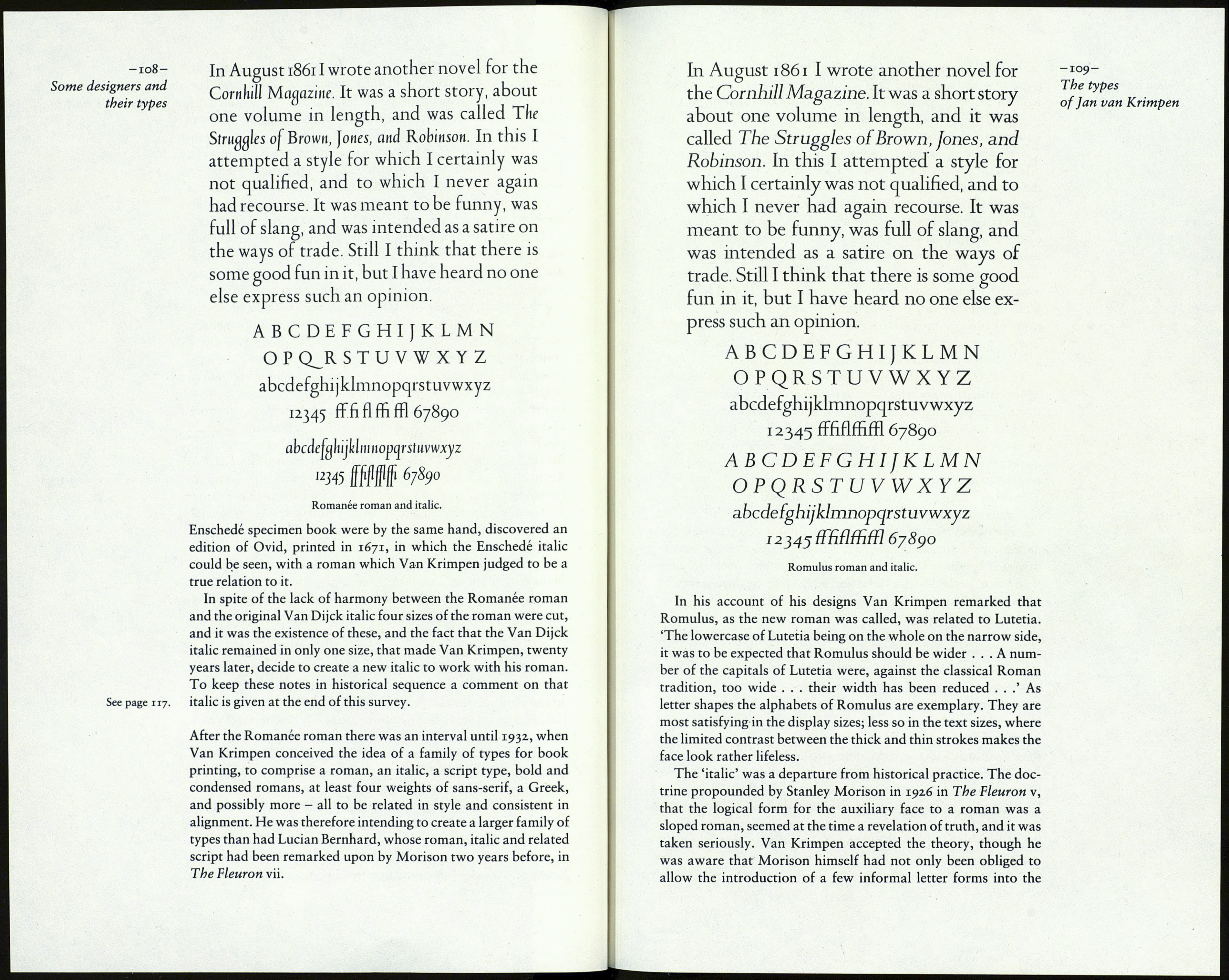
Krimpen frankly admitted. Considered by itself, the Romanee Romanee is shown overleaf,
roman has great merit. Except for the w and y, which are rather
cramped, the lowercase letters are in better proportion to each
other than in the original version of Lutetia. This second type is
therefore an advance on the first. This may be due to the influence
of the Porter Garnett revisions of Lutetia; but that cannot be said
of the punctuations and the dots on i and j, which are too light to
be effective. The r and g look well enough, though they have been
criticised by others. The ligatures are excellent (they were not
always so in Van Krimpen's types). The numerals are the best he
ever designed. The capitals, always his strong point, are very fine,
except for W, which is a little obtrusive. In all the characters the
thin strokes are fairly firm - no doubt because the designer was
attending to a model, the print of the lost seventeenth-century
roman. The reviewer in The Fleuron vii said, 'The general form,
proportion and relation of upper to lowercase remind us of
the Bembo . . .' This is going a little high - Romanee is rather
bland in comparison with Bembo - but the type is certainly a dis¬
tinguished design, and it makes a fine effect in the text of
Typefoundries in the Netherlands (1978), Harry Carter's edition
of Charles Enschedé's great work. It is ironic that when about ten
years later the Monotype Corporation decided to make their own
version of the missing roman (Van Dijck Series 203), it was Van
Krimpen who, doubting now that the roman and italic in the old
