-92-
Aspects
of type design
WEIN
KARTE
Jakob Erbar's Feder-Grotesk.
the use of precise grids, the limitation of decoration to the 'pure'
elements of geometry, the line, the square and the circle, and
sans-serif as the type best suited to express the ideals of the mod¬
ern creed. There were many sans-serif types to choose from; the
1926 volume of the Handbuch der Schriftarten shows well over
three hundred of them in current manufacture. But most of them
were dull and lifeless, inadequate to express the spirit of the age.
The form must be re-created. The type founders recognised a
promising field for enterprise, and the type designers responded
to the challenge. The fundamental elements of geometry, the
straight line, the circle and the arc, would provide the basis for
the new types which, purified of any traces of the past, would
speak for the aspirations of 'our time'.
Three of the new German sans-serif faces became internation¬
ally famous: Jakob Erbar's eponymous design, Paul Renner's
Futura, and Rudolf Koch's Kabel (which will be discussed at
length in later pages). All three of them are frequently in use at the
present time.
The Erbar face was first in the field. Jakob Erbar had already
designed a serifless type in 1919, though it was not a sans-serif in
the full sense. Its main and secondary strokes were visibly differ¬
ent in thickness, because the type was meant to reflect the action
of a broad pen - hence its name, Feder (quill) Schrift. (Erbar knew
something of calligraphy; he had attended the class conducted by
Anna Simons, one of Johnston's pupils.) The Feder type was
undistinguished; Erbar's later Koloss, a heavier face on the same
lines, was a much better design. There is no obvious connection
between those faces and the sans-serif design that later made his
name internationally known. He wrote that he did the first rough
ÄBCDCEFGHIJKLMNQ
PRSTÜVWXYZ
abcdefghijklmnöpqrst
Erbar:
the 1922 drawing.
uvwxyz
1234567890 i)
drawings for a modern sans-serif type as early as 1914, but his
service in the First World War interrupted the work. A set of
capitals was drawn in 1920, and another drawing of 1922 shows a
complete font, on which the letter forms are not greatly different
from the type as it appeared in 1926. 'My aim,' he wrote, 'was to
design a printing type which would be free of all individual char¬
acteristics, possess thoroughly legible letter forms, and be a pure¬
ly typographic creation.' He went on to say that it was clear to
him that the task would only be accomplished if the type face was
developed from a fundamental element, the circle. The letters с
and e, and the bowls of lowercase b, d, g, p and q all relate to the
circular o, which was fairly small compared with the capital O. In
the supplement to the Handbuch for 1927 the new type is shown
in full alphabets in light, medium and heavy weights, the light
and medium having an alternative lowercase of reduced x-height,
which was not exported. The type was introduced in 1926,
-93-
The sans-serif
ABCDEFGHIJKLMNO ABCDEFGHIJKLMN
PQRSTUVWXYZ abcde OPQRSTUVWXYZ
fghchijkcklmnopqrsifjtu abcdefghchijUclmnopqrsfljrh.
vwxyzäöü 1234567890 uvwxyz äöü 1234567890
Erbar: the normal and small x-height versions.
From the Handbuch der Schriftarten.
though the related inlined bold version, called Grotesk Lichte
Fette but known as Phosphor in Britain and America, had already
been available for three years, if the date given is to be believed. In
the same supplement three weights of the Futura face were shown
in one-word samples.
Paul Renner evidently found the creation of a sans-serif on a
geometric basis a stimulating task. In the light version of Futura
as it first appeared his lowercase m had a flat roof (there was an
existing Grotesk called Roland that had the same feature). The r,
made of a pillar and a separate ball, is a typical art deco device;
and in the bold version the a is an ingenious play on the tradi¬
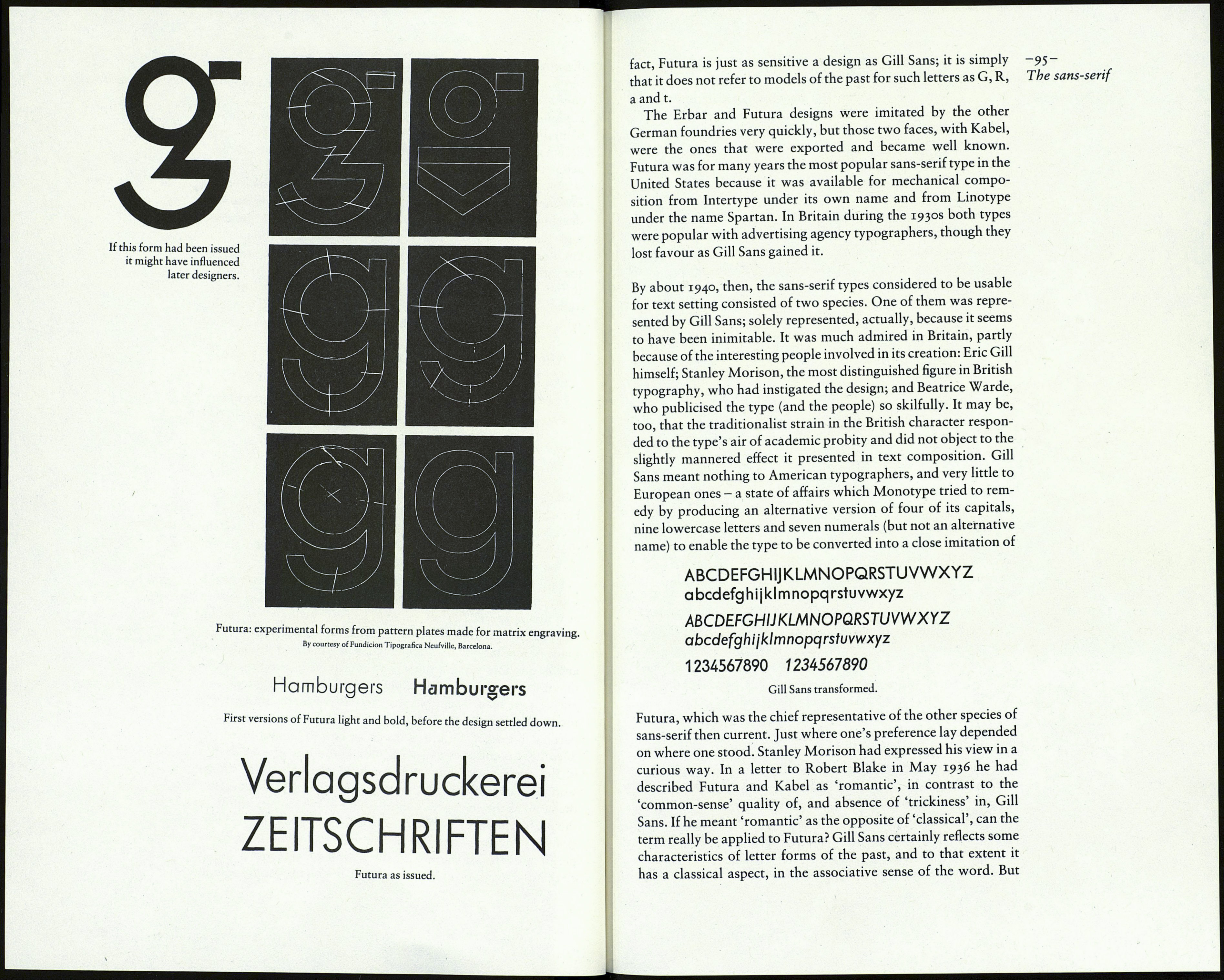
tional shape. The g, a lively exploitation of geometric forms, was
one of two such inventions, as the pattern plates shown here
reveal. (I prefer the other.) The pattern plates are interesting for a
particular reason. Futura is taken to be representative of the
'Germanic compasses-and-set-square school', as one writer has
it. But these plates show four versions of the familiar single-
storey g. They differ by the amount of modelling in the curves of
the bowl as they enter the stem - a sign of refined perception in
the person responsible. That is not all. The three cancelled ver¬
sions have a 'compassed' counter in the upper section; but in the
permitted version, the one finally adopted, the counter is not
circular but oval, as in the p and q - and it is all the better for it. In
The early versions
of these characters
are shown overleaf.
