-74-
Aspects
of type design
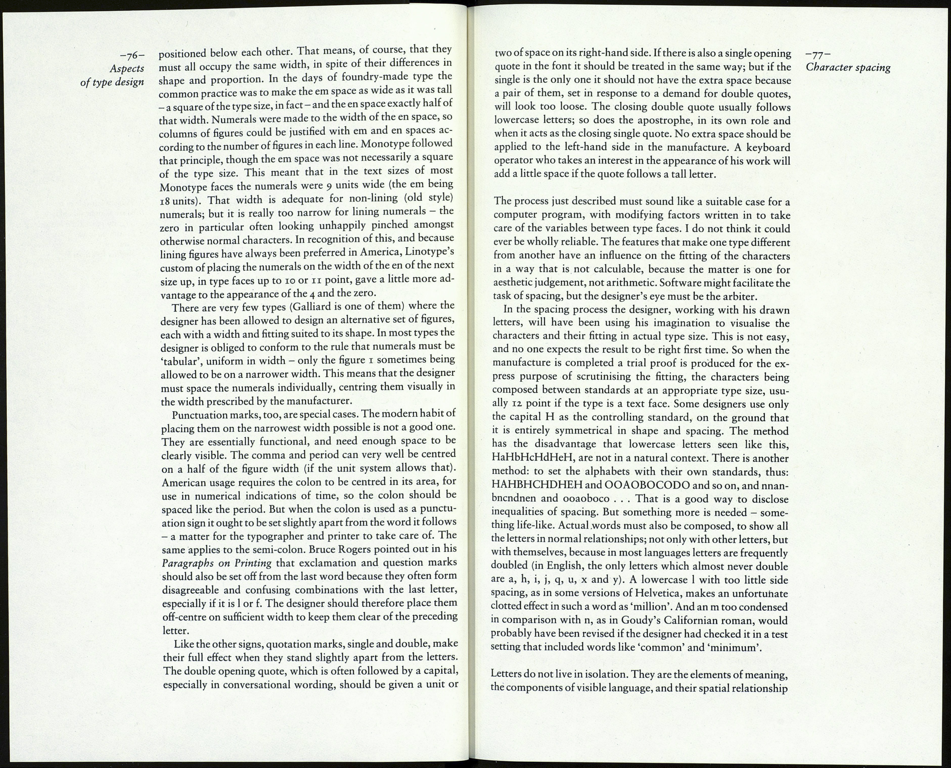
a Same as H
b Slightly less than a
с About half of a
d Minimum space
e Same as О
.117 mm- The capital H and О as so far designed and spaced are
either an exact number of units, or up to half a unit astray; that is,
the adjustment to be made to each of the side spaces cannot be
more than .02 mm in 54 units or .03 mm in 36 units. The amount
is small; but it is better to alter the width of the letters themselves
(not a difficult task) as well as the side spaces, so as to regain the
ideal fitting of the standards.
With the spacing of H and О now known precisely, it is possi¬
ble to finish the drawing of the rest of the alphabet, by taking note
of the groups of letters listed earlier and spacing them as in-
dl\d
bNb
*B< eCc *De *Ec eP
-I* ]a °Kd aLd hMa
d*j
«P- -Q- "R, äT -U»
V W Xj y z«
must be spaced visually, between standards
dicated above - modifying the letter widths (but not the side
spaces) to the unit width values as necessary.
As the work proceeds the designer's eye becomes 'educated' to
the relationship of the capitals one with another; but even a
designer with long experience in the fitting of characters will not
rely solely on the formula, but will check a letter between the H
and О standards whenever uncertainty occurs.
The same method is used for the fitting of the lowercase, the
standards being the n and o. (Fournier specified the m; but since
that is often untypical, being designed after the n, with narrower
interior spaces than those in n, h and u, the n seems a better choice
for the standard.) The width between the uprights of n is meas¬
ured, and a half of that amount is given to the left side of the letter
and slightly less on the other side, because the arched corner
seems to add to the space. Thus if the left side is given 10 the right
hand side will be 9 or pf. The four copies of n are marked up and
set in a row. If the type is a bold face the strong verticals and
narrow interior may mean that the side spacing needs no alter¬
ation; but it if is a normal roman face the spaces between the four
letters will have to be decreased (and the serif length adjusted)
until the eight uprights look equally spaced. Then the lowercase о
can be dealt with, and checked in combinations with n, like this:
nnonn nnonon nnoonn
If the type is a sans-serif that test will often reveal that n is too
tightly fitted.
When the two letters look well regulated they are measured
against the units gauge and the widths of the letters and their side
spaces modified so as to maintain the ideal balance of black to
white. With the n and о established as standards, the rest of the
alphabet is organised by this scheme:
ді a
ь\\ь d\rd *o »m* dw° dyd The essential thing is that the space between letters should never To see how well the spacing of roman type was done in the past The fitting of an italic type follows the same principles and Numerals are a different case. Almost any type, seriffed or sans- -75- Character spacing a Same as left side of n b Same as right side of n с Slightly more than left side of n d Minimum space e Same as о f Slightly less than о
be greater than the space inside n or m. (Some versions of Times
Bold show the unhappy effect of that error.)
I recommend a study of the excellent photographic enlargements
reproduced in Philip Gaskell's article in the Journal of the Print¬
ing Historical Society No. 7,1971.
method, and the same four letters, H, O, n and o, are prepared
first, as the standards by which the rest of the alphabet will be
controlled. The measuring of the side spaces must always be done
at the precise centre of the vertical aspect of the letters. As in the
roman, the side spaces will be derived from the interior spaces.
The italic capitals, which are usually simply sloped versions of
the roman capitals, though not so wide, present no difficulty. The
lowercase may not be so easy if its letters are narrow, as in many
of the old style italics; the two side spaces of n may then have to be
nearly equal to a half of the width of its counter - which is a
strong reason for making the serifs quite long, to hold the letters
together.
serif, of normal weight and appearance, may be required at some
time to be used in the setting of text matter which includes
columns of figures, and it is essential that the figures are properly
