-68- By the second half of the fifteenth century, when printing had
Aspects started to develop, numerals had discarded most of the signs of
of type design their Eastern origin and had assumed the shapes with which we
are familiar. Type founders followed the style used by pro¬
fessional scribes, who had chosen to form the figures in a mode
1234567890
The old style numerals used for Monotype Bembo
and Van Dijck.
similar to that of the lowercase letters. So 3, 4, 5, 7 and 9 were
descender characters; 6 and 8 were ascending; and 1,2 and о were
of normal x-height. The zero was usually made as a circle with¬
out modelling, to prevent confusion with the lowercase о - a
practice which was not noticeably affected when, to facilitate the
spacing of columns of figures in printed tables, type founders
regulated the width of all the numerals to the width of the en
space, one half of the em.
These numerals of varying heights are called 'old style' or
'non-lining'. They are hardly ever seen in sans-serif types, though
De Vinne referred to a light 'gothic' face (presumably the Bruce
foundry's Gothic No. 4) as having old style figures that were
'often selected for tables in which the greatest distinction is
desired'.
Old style numerals remained the only kind in printing until the
second half of the eighteenth century, when inventiveness in
typographic letter forms became vigorous, and numerals were
included in the type founders' experiments. The French raised the
3 and 5 to stand on the baseline - a reform that was even applied
to Baskerville's types about 1782 after they had been removed
to Kehl on behalf of Beaumarchais. That particular reform did
not travel beyond France, but it persisted there for a long time;
the first version of Perpetua, cut by Charles Malin in Paris in
1927, had 3 and 5 in the full-height style. A more thorough and
significant change in the design of numerals occurred with the
regulating of all of them to a common size, standing on the base¬
line. They were first seen in Britain in 1780, in William Caslon IPs
specimen of large types. Stower, writing in 1808, thought these
'lining' figures an improvement. T. C. Hansard disagreed strong¬
ly. He thought, rightly, that some of them were capable of confu¬
sion, and wrote with feeling of an imaginary navigation officer,
H 1234567890 m
The lining numerals of Monotype Bell are shorter than the
capitals, so they blend well with the lowercase.
The 'angle' of some of the figures suggests that Richard Austin,
who cut the punches in 1788, faithfully followed a written
example, not an engraved or printed one.
poring over tables of logarithms (which had in fact been set in -69-
lining figures since 1785) in the dim light of the ward room, trying Numerals
to calculate the ship's reckoning, and fearful of making what
might be a fatal error. Hansard had a point; but no doubt some of
his readers took pleasure in remarking that throughout the book
in which his criticism appeared - his excellent Typographia of
1825, produced in his own printing house - all the numerals were
of the lining style.
'Lining', which simply means that the numerals stand on the
baseline, is preferable to 'ranging', which suggests they are the
same size as the capitals. To my eye, lining figures look best when
they are somewhat shorter than the capitals; see, for example, the
figures in ChappelPs Trajanus type.
Lining numerals became a permanent feature of type face de¬
sign, and will continue to be so. They are necessary; but they are
not invariably better than the old style kind, which are always
legible, for the same reason that lowercase letters are legible, the
variations in size being a valuable factor in the process of recog¬
nition. In non-lining form the 3 and 8, though of similar shape,
cannot be confused with each other, even in low-grade printing.
And old style figures are aesthetically satisfying when they are in
the company of lowercase letters in normal text matter, and
blend into the texture of the page in a properly unobtrusive way.
But, unfortunately, they are far from satisfactory in a line of
capitals, when a date like 1972 can look incongruous - which is
why the printer of A Tally of Types, in which the typesetting is
impeccable, thought it necessary to use the lining numerals of
Goudy Old Style for the dates in lines of Centaur capitals and
Times Roman figures for the capitals of Poliphilus.
It is certainly beneficial to have lining numerals to accompany
capitals, but the design of them tends to suffer more from the
tabular width condition than does that of old style figures. In
particular, the zero becomes a condensed oval, out of keeping
with the proportions of the other characters in the font. The 4,
too, becomes narrow, and a potential ink-trap in small sizes. The
effect was ameliorated a little when, in the latter half of the
nineteenth century, type founders (the American more than the
British) made the numerals to the width of two-thirds of the em, a
change which also improved the legibility of fractions. Linotype
obtained the effect in a different way. In types up to 10 or 11 point
the numerals were made to the en width of the next size up, with
'fixed' spaces to match. Monotype's practice - at least in Britain -
was to stay with the en width. Perhaps it was dissatisfaction at
the effect of this on the zero in lining numerals which explains the
circular zero, the only non-lining figure, in the early fonts of Gill
Sans.
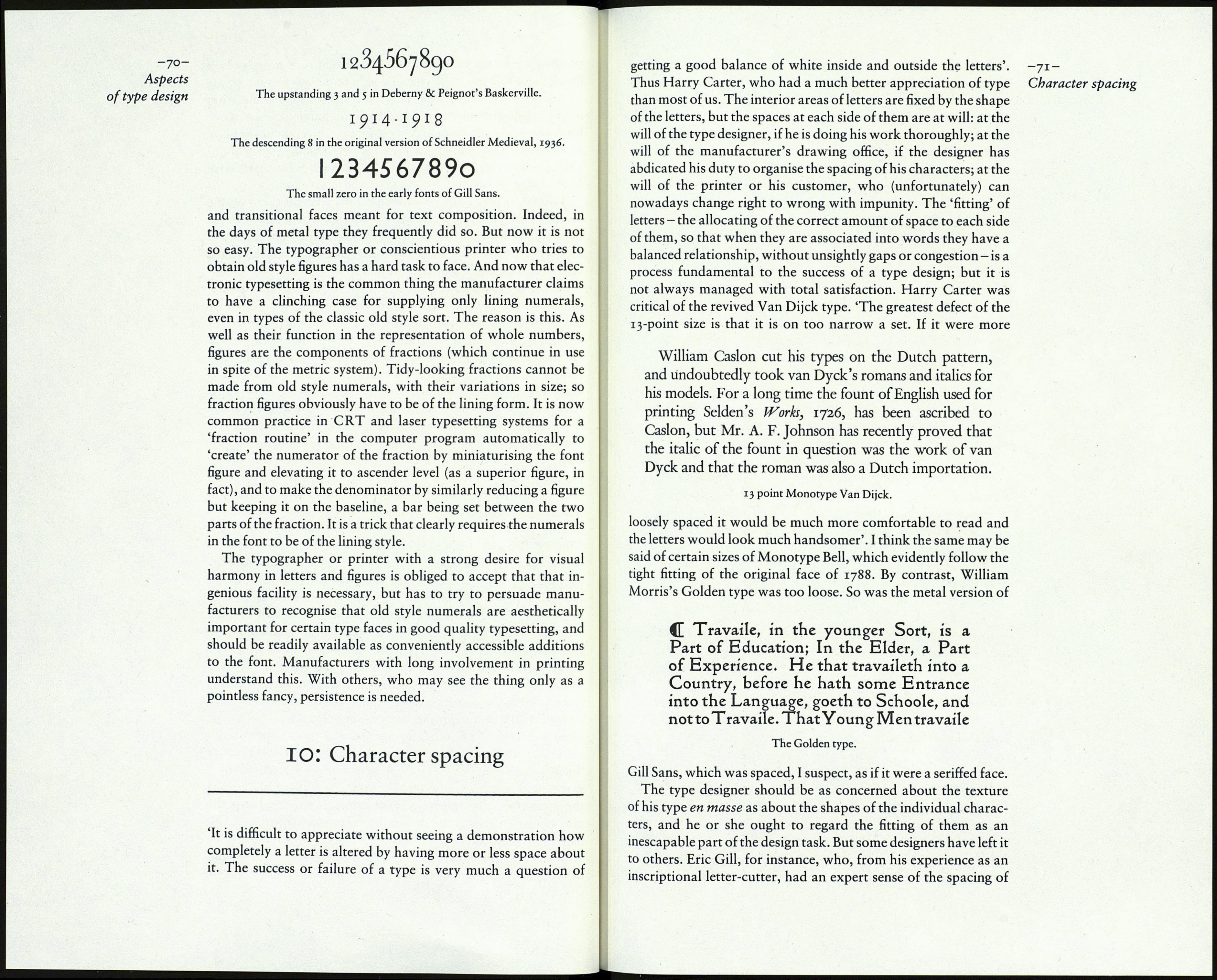
In an ideal world manufacturers of typesetting systems would,
of their own volition, offer both kinds of numerals in old style
