-48- designed to make the best of its limitations. This aesthetic argu-
Aspects ment would not be necessary if people would abandon the as-
oftype design sumption that a type of high quality or popularity (not the same
thing) should be available in its own name in any kind of output-
ting system, however degraded the result. I do not see that the
matter is affected by a printer's requirement for a high-resolution
face for final output and a low-resolution version of it to be used
for high-speed proofing only. In that case the proofing version
need not strive to be a look-alike; a 'rough' version is sufficient.
Experienced editorial people are quite willing to work with a
crude-looking proof, so long as the character count is identical
with the type face actually to be printed.
6: Proportion
The point system of type measurement produced benefits of vary¬
ing significance. One of them, the fact that types and spaces from
different foundries could be mixed together in a line with impun¬
ity, diminished in importance as the use of mechanical compos¬
ing machines increased and the printer became, in effect, his own
type founder. What continued to be an important benefit was the
fact that types of different sizes could be placed together on the
basis of simple arithmetical adjustment: the initial letter at the
beginning of a chapter, the price at the end of a two- or three-line
description in a store advertisement, and so on. And there was
another improvement: In the early years of this century the new¬
found pleasure in the benefits of regularity and dimensional
stability induced the founders to re-cast their types on common
alignments, so that all their romans and their clarendons, bold
latins and antiques (the 'related bold' being yet to come) would
line together accurately and so eliminate the former haphazard
effects of uncalculated baselines. This offshoot of the point
system was called 'point line', which meant, in the words of one
founder, 'that the distance between the bottom edge of the face of
the type and the bottom edge of the type body (in other words,
the 'beard') measures a definite number of points, varying ac¬
cording to the size of the body'. The diagram accompanying that
description showed that the benefit sought for was the easy justif¬
ication of one size with another. It is clear, though, that the effect
on the proportions of the letters must have been crude and ill-
balanced - the length of the descenders in 8 point, for instance,
being proportionately greater than in 10 point, the reverse of
what is visually desirable. Bruce Rogers thought nothing of point
line. Referring to the so-called Fry's Baskerville, which he ad¬
ii
-49-
10
II
12 i
14
16
18
20
24
J0
36
42
48
54
Я
e 1
1
1
•i
■2
■1
■2
:і
:і
.4
:'
»
t
O
ч
м
io
1 1
12
14
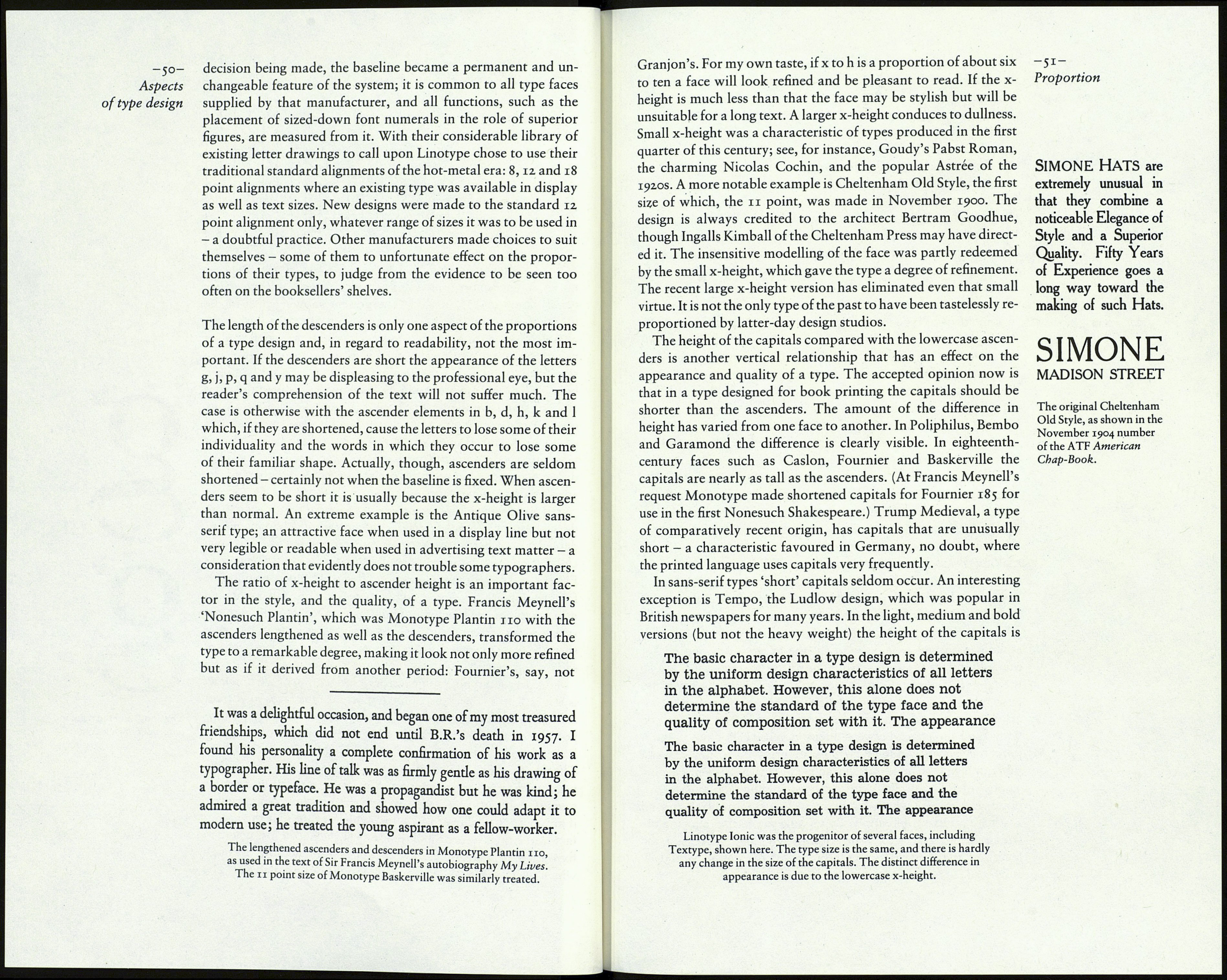
Point line. From a Stephenson Blake specimen book, 1915.
mired, in his Report on the Typography of the Cambridge Uni¬
versity Press (1917), he said 'The present showing of it in the
founder's specimen sheets suffers . . . from having recently been
altered to standard line, a most pernicious practice when applied
to any type and particularly the old style ones.' However, the
significant thing is that the idea of standard alignment had been
born. When the American Linotype company adopted the prin¬
ciple of standard alignment about 1913 each size was given its
own baseline position to which all their subsequent type faces
conformed. Unfortunately, the taste of the time being what it
was, the standard alignments were fixed too low for the kind of
descenders which came to be desired by book designers in the
1920s and 30s, when types of the past were being studied, appre¬
ciated and revived. Linotype therefore found it necessary to pro¬
duce alternative 'long' descender characters (which really means
descenders of better proportion than the regular sort) in such
classic types as Garamond and Janson, and also in Dwiggins's
Electra and Caledonia. George W. Jones, who was responsible
for the English Linotype company's Granjon, Georgian and
other distinguished revivals, would have nothing to do with the
standard alignments, and insisted that the baseline in his types
should be so placed as to ensure that the descenders were of
satisfactory length.
This detail of typographic history, the location of the baseline,
is relevant to the present. Some important type faces in current
use owe a significant aspect of their appearance to rules of pro- упе <[ong> an¿ t^e regular
portion established at a time when the scope of typographic descender in Caledonia,
knowledge was limited and the standard of design was low.
The faces needed the attention of a discerning eye before they
were transferred to filmsetting. Electronic typesetting systems
measure 'film advance' - that is, type size plus inter-line spacing,
if any - from baseline to baseline, which meant that the manu¬
facturers of the systems had to decide at the outset just where to
fix the baseline in the vertical aspect of the 'window' through
which the type would be transmitted to the output material. The
g
g
