-32-
Aspects
of type design
newspaper text type was designed for high-speed production
methods which do not allow for much finesse. A stronger reason
is that in the editorial columns of newspapers we prefer the text
and headlines to be set in plain matter-of-fact types, and in books
we want faces of refinement and distinction. Set a novel in a
newspaper type and the effect will be so uninviting that the
success of the work will be jeopardised. Set a newspaper in a
book type and we will not take it seriously. (There was once a
newspaper which used Caledonia for its text. That excellent
book type helped the paper to gain awards for good design but,
ironically, contributed to its early demise.) So as well as the func¬
tional aspects of type design there is the aesthetic aspect; and it is
the proper balancing of the functional and the aesthetic which we
look for in the work of the type designer, just as we do in other
fields of product design.
5 : The making of type
Electronic typesetting has now had a dominant place in printing
technology for a fair number of years, and there has been ample
evidence of the high level of fidelity which a capable manufac¬
turer can achieve in reproducing the subtleties of type faces (and,
for that matter, too much evidence of what an insensitive
manufacturer can perpetrate). Yet some writers on typography
continue to assert that the change from mechanical typesetting
to systems comprised of electronics for their power and
photographic chemistry for their product requires some sort of
change in the design of type faces, without specifying what
kind of electronic typesetting they have in mind. It is true that
low-resolution systems impose severe limitations on letter form
and detail; but the high-resolution systems used for most of
the printed matter we read allow the type designer as much free¬
dom as he is likely to need, and can reproduce his work to a
remarkably high standard.
The belief that the method of manufacture has an influence on
the design of type is not new. There is little justification for it. In
fact, the history of printing types is a tale of sophistication in
letter design being achieved at quite an early stage, reaching
heights of ingenuity in the nineteenth century, and not being
affected to any noticeable extent by the techniques of manu¬
facture.
To examine that point, and bearing in mind that a large num¬
ber of types in use at the present time were created before the
advent of electronic typesetting - and some of them even before
the invention of mechanical composition - an outline of the sue- - 3 3 -
cessive methods of manufacture may be useful. The making of type
For four hundred years, from the middle of the fifteenth century
when printing in Europe began, the making of type was a com¬
bination of four hand crafts: the cutting of letter punches, the
striking of matrices, the casting of the type, and the dressing of it
ready for use by the printer. Each of them was essential, but only
the punch-cutter's work displayed itself to the critical world.
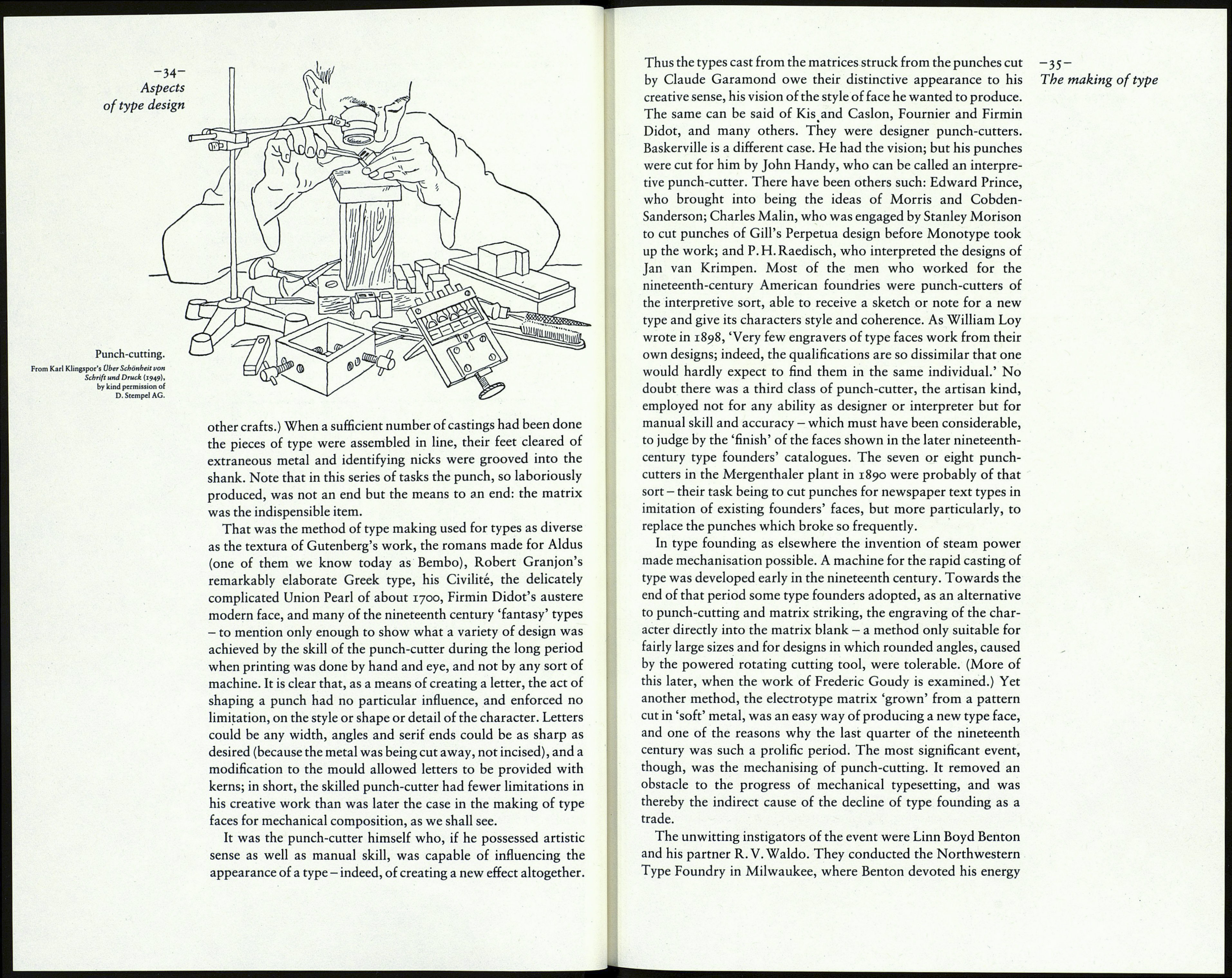
The punch was a short bar of annealed steel, the end of which
was to be shaped to the form of the character. For any letter that
contained an interior enclosed space, such as В, O, a, g, the
punch-cutter would first make a counter-punch to the shape of
the interior white area - hence the term 'counter' for that part of a
letter. The counter-punch would be driven into the face of the
punch, and then the outer profile of the letter would be formed by
filing away the unwanted metal; slow painstaking work, with
many pauses for the checking of the size of the letter and the
thickness of its strokes with a variety of specially-made gauges.
Gunter-
counter-
purtrij
iii
J:sssr
ill
i*1
The counter-punch.
When the letter was finished the punch would be held in the
smoke of a lamp or candle flame until it was blackened, and then
pressed on to paper so that its image could be compared with
other characters of the font. If it was satisfactory the punch was
hardened. It was then struck into a small bar of copper, which
thus became a matrix. It had to be justified, its sides rubbed down
to remove the displacement caused by the strike, its face lowered
until the depth of strike was correct. The matrix was then passed
to the type caster, a skilled workman whose tool was the mould,
the ingenious device in which the matrix was fixed so that the
letter was at the bottom of an aperture adjusted to the size of type
required. Molten metal was poured in to form the piece of type.
(As A. F. Johnson pointed out in his Type Designs, the mould was
the essence of Johann Gutenberg's invention in printing, not
punch-cutting or the press, both of which were already known in
