-26- an inch less than five inches - as to be quite convenient in relating
Aspects type area to paper area. The Didot system does not correspond at
of type design all well to metric measure. The advent of electronic typesetting
has been thought by some people to provide the obvious oppor¬
tunity to abandon both systems and to universalise type measure¬
ment by making it strictly and entirely metric. Enthusiasm for
this view is not yet total. It is strongest in continental Europe,
where the discrepancy between the Didot system and metric
linear measure is, presumably, a nuisance to the designer of
printed matter. In Britain, a consequence of membership of the
European Economic Community has been official encourage¬
ment for the replacement of imperial measure by metric, but it
makes only slow progress in the graphic arts. Some typographers
are keen for metric type measure; others recognise its con¬
venience in calculation but find the millimetre too small a unit for
easy measurement on the layout pad by comparison with the pica
em and the half-em. In the United States metric measure has as yet
few advocates in the printing industry. It seems possible that the
use of the Didot system will decline more rapidly than the
American; but both systems are still quite deeply embedded in
typographic practice and are likely to be with us for some years
yet.
The point system of type measurement has been used in these
pages rather than metric sizes because the books that have been
quoted and the type specimen catalogues that the reader may
consult have all used either American or Didot sizes. But for those
who need to know the metric equivalents the table on the pre¬
ceding page will be useful.
3 : Types for study
Not long ago it was taken for granted that the people most inter¬
ested in type faces were those who used them, or actually created
them: typographers, publishers, printers and, of course, type
designers themselves. But in recent years another set of people,
quite different from those with direct involvement, have devel¬
oped an interest in printing types. They are the academics - the
mathematicians, computer scientists, psychologists, even philos¬
ophers - who have found it worth their time to theorise about the
nature of letter forms as a human creation, one of the things that
other animals do not have. Actually, the interest of some of them
began a fair time ago, in the 1950s, when a good deal of work was
done on the subject of legibility which echoed and amplified
experiments done in earlier times. (It cannot be said to have had
much influence or practical effect.) More recently, academic -27-
interest has broadened. Psychologists study the recognition of Types for study
letters as an aspect of illiteracy. Philosophers examine the role of
letters in the visual representation of meaning. And some sci¬
entists are now actually engaging their minds with the design
aspects of letter forms, using a computer not simply to produce
design variations more quickly but to create them de novo - if not
by immaculate conception then by a sort of artificial insemin¬
ation. Test-tube type faces, so to speak.
These studies and experiments now being conducted in univer¬
sities and institutions may in time produce benefits to a wider
field than the academic circles in which they are performed; but
they are not the subject of this book, which is written from within
the class of those whose profession it is to put information,
opinion or persuasion into print or on to television screens and
visual display terminals. Their knowledge of types usually begins
with technical or design school training. It develops with work¬
ing experience, and it is the range ofthat experience that nurtures
the perceptions about types which become almost innate in the
typographer and type designer, but which are not present in the
academic observer, because of the difference of vocation. As
some academic writings show, the absence of practical ex¬
perience of type gives rise to a tendency to treat all types as equal
and similar in nature, purpose and function. In short, there is a
failure to recognise the different roles of type faces. In particular,
there is sometimes a lack of understanding of the fundamental
difference between types designed for display and types meant for
text. The difference can be expressed as a maxim: text types when
enlarged can be used for headings; display types, if reduced, can¬
not be used for text setting.
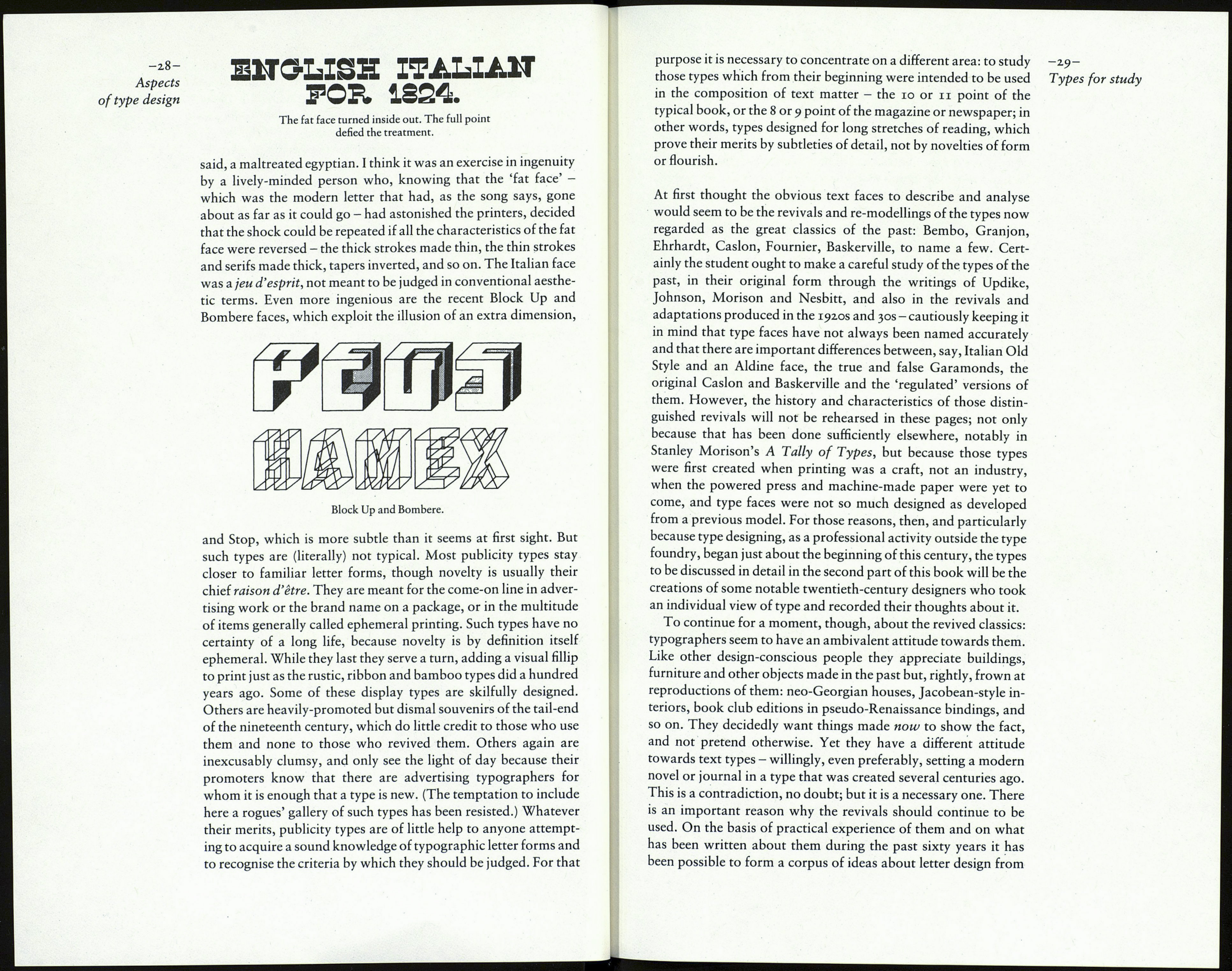
Croissant, Frankfurter, Pinball, Shatter and Stop are a few of
the scores of display types which have been issued by the makers
of dry-transfer ('rub-down') lettering sheets and headline type-
on-film machines. In some of them ingenuity is the prime charac¬
teristic. They are the latest in a class of type that has quite a long
history. The earliest I know is the so-called 'Italian' face which in
Battle of tue Wile
on
Real JVater.
An early use of the fat face, which began to be used on theatre
posters in 1807.
England was first seen in the catalogue issued by the foundry of
Henry Caslon II in 1821. T.C.Hansard thought the type was a
'typographic monstrosity', and a modern writer has called it 'rep¬
rehensible'. It has been misunderstood. It is not, as some have
