-i8- hoped at first that a 'small cap' routine in the computer pro-
Aspects gram, by which the capitals would be automatically reduced in
of type design size, would produce a tolerable effect. It did not. The letters
came out too cramped and too light. Manufacturers who take
quality seriously now provide correctly drawn small capitals in
selected book faces.
Stem. Some writers use 'stem' for any vertical stroke in a letter. In
this work the term is used of one stroke only - usually, but not
always, the one that a scribe would write first: thus, the upright
in E and p, but not the vertical strokes in N, which are secondary
to the diagonal stroke.
Swash letters are the fancy alternatives in the italics of some book
types, Garamond and Caslon, for example - though in the latter
the swash letters, according to Caslon s Circular for Summer
1890, 'do not belong to the original founts; the first Caslon
deeming them superfluous, discarded them. They have been
recently engraved . . .' They are generally more of an affect¬
ation than an asset. They were available in mechanical typeset¬
ting but seldom used, because they had to be inserted into the
line by hand. They have almost disappeared in modern practice.
Titling. Capitals and numerals usually made to occupy all the
body size. Thus the capitals of Perpetua Titling 258 are larger
than those of Perpetua 239, size for size. The capitals of the
Times Tidings are actually smaller than those of the normal
roman and bold. See the essay on Times Roman.
TTS stands for teletypesetter, a method used chiefly in the
American newspaper industry by which news agency reports
are transmitted by wire or radio in punched code form, decoded
by the receiver in an outlying newspaper office, and converted
into punched tape which then drives the operating unit on a
Linotype keyboard for 'no hands' typesetting. The method re¬
quires the use of type faces made to a simplified 18-unit system.
Some of them appear in current lists of digitised type faces.
Unit system. A measurement formula to enable the widths of all
the characters in a font to be expressed as whole numbers. The
main unit is usually the width of the em of the type size, divided
into smaller units: 18, 36, 54, 96 units to the em are some of the
systems in use.
Weight. In this book the terms light, bold and heavy are used to
express variations from the normal weight. They are reasonable
equivalents to the German leicht, halbfett and fett, which occur
in the essay on the types of Rudolf Koch. In modern practice
Book, Medium and Black, with Extra and Ultra as supplemen¬
tary adjectives, are frequently used as additions to the scale of
weights - not always appropriately. 'Book' is hardly the right
term for Futura, a sans-serif face not used for book compo¬
sition. And help is needed to understand just what is meant by
'Erbar Extra Medium'.
x-height. The distance between the baseline and the x-line, the -19-
level of the top of the lowercase x. It usually refers to the height The vocabulary
of the lowercase as compared with the capitals, though in a of type
normal seriffed face nearly all the lowercase letters are slightly
taller than the x.
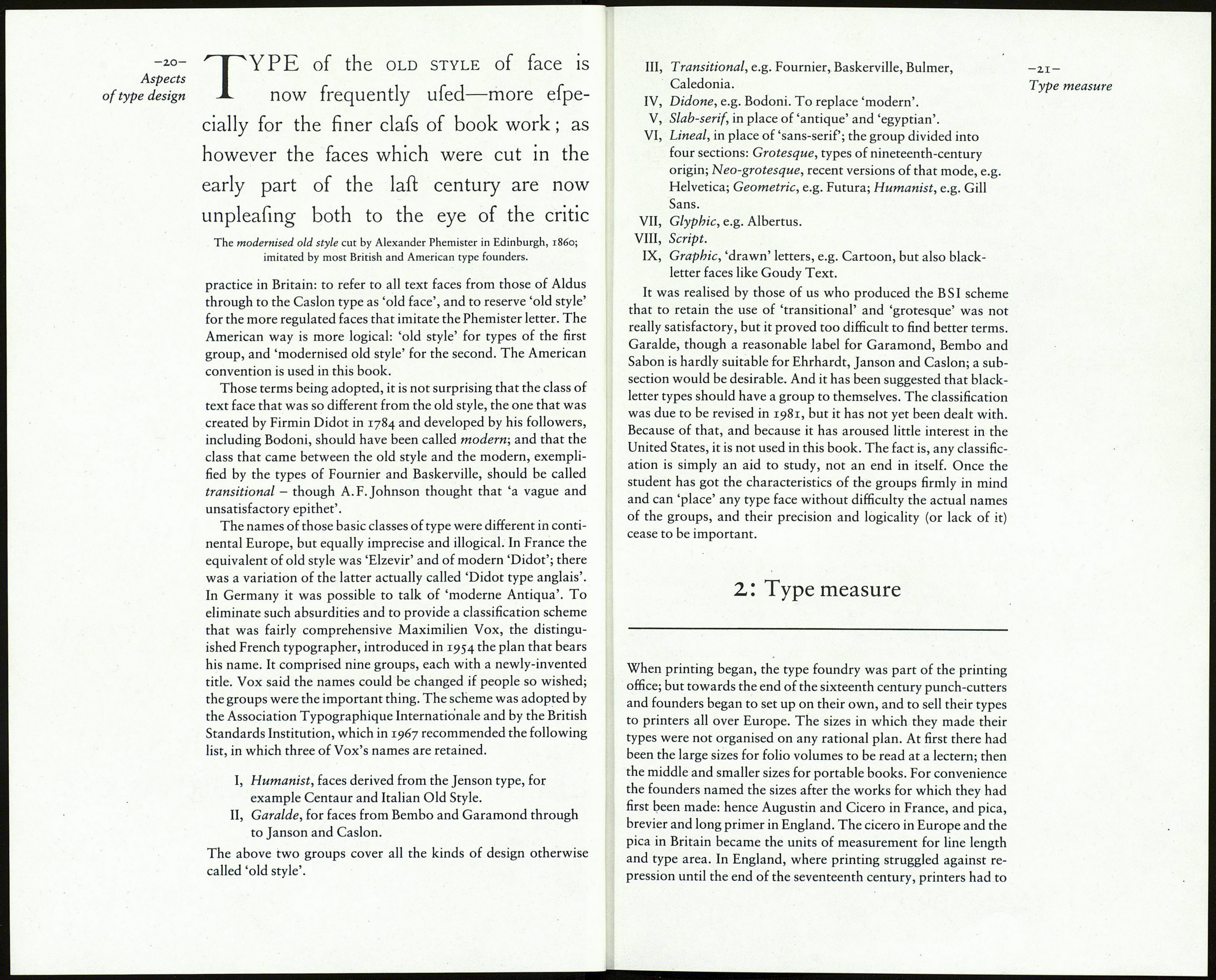
The classification of type designs is an unresolved problem. In
i860, when the Miller & Richard type foundry of Edinburgh
introduced the new face created by Alexander Phemister they
said it was superior to 'old style' types (meaning Caslon's face in
particular). Yet they named the new face 'Old Style', to the
confusion of printers in Britain, who were forced to invent a new
term, 'old face', for Caslon and the earlier book types. But all was
not clear. John Southward, a respected writer in the printing
trade, clarified the matter. In his Practical Printing (second edi¬
tion 1884) he wrote, 'The words "Old Face" and "Old Style" are
at times used indiscriminately to the faces imitating the ancient
founts, and to those which are a modern modification of them. It
may, however, be desirable ... to call the one "Old Face" and
the other . . . "Old Style".' And that has been the general
ABCEGHJKMPQRSTW
abcdefghij klmnopqr s tuvwxy z
ABCEGHJKMPQRSTW
abcdefghijklmnopqrstuvwxyz
ABCEGHJKMPQRSTW
abcdefghij klmnopqrstuvwxyz
ABCEGHJKMPQRSTW
abcdefghij klmnop qr stuv wxyz
The three basic styles of seriffed faces.
Old style, represented by Bembo, с. 1495, and Janson, с 1685;
Transitional, Fry's Baskerville, e. 1768;
Modern, Walbaum, с. i8io.
