-2o6- picking on any of the new types as being uneconomical, instruc-
Some designers and ted Lardent to keep the bold face narrow, and Lardent (if it was
their types he) observed the requirement too faithfully.
The narrowness of the bold face, especially in the lowercase,
should have set a limit to the amount of weight on the strokes.
But Times Bold is too heavy, and the weight is not properly
distributed. Too much weight was given to the main strokes and
not enough to the thin strokes and serifs. This means that in h, m,
n, u and b, d, p and q the interior white is tall and narrow, which
emphasises the verticality of the main strokes. The result is a
harsh 'picket fence' effect. A little less weight on the uprights and
a little more on the horizontals would have achieved sufficient
contrast in a less staccato manner. Against this cramped
lowercase the capitals as we know them look noticeably wide. It
is now forgotten that at the beginning Monotype announced two
versions of the bold capitals. They were described as follows in
the presentation pamphlet: 'The Times New Bold-face No. i is
used in three sizes of upper and lowercase, 55, 6, 7. In these sizes
the capitals are wide but the lowercase is condensed. It is de¬
signed for use with the New Roman.' 'The Times New Bold-face
No. 2 in 7, 9, 11 and 12 point consists of capitals which are
condensed equally with the lowercase.' Actually eleven of them
were unchanged. The condensed capitals in the No. 2 version
were C, M, О and Q, three units less than the first version, G, N
and S, two units less, and D, H, J, L, P, T, U and V, one unit.
These condensed letters sorted better with the lowercase than the
No. 1 version; but they would have made a poor effect in a line set
entirely in capitals. They were, of course, a plain acknowledge¬
ment of the fact that something had gone wrong in the design
process, and were a forlorn attempt to improve matters. They
continued to appear in the Monotype catalogue as Series 345 for
many years, but only in the original four text sizes. The over-
wide No. 1 capitals have always been the ones in general use, and
have been imitated by most other manufacturers.
The style of the Times Bold lowercase is another puzzling
matter. In this age of type-on-film it is an accepted thing that any
new type design, other than a script or fancy letter, will be made
in a variety of weights (more than are really necessary, it often
seems). But that was not the case in 1931 when the Times Roman
types were being created. There were very few old style types
with a properly related bold companion; but there were enough
of them - the bold version of Monotype's Garamond, Horley,
Plantin and Baskerville, for instance - to serve as a general guide
as to how such a task should be handled. And the Bold Face Series
53, so familiar at that time as a working companion for various
old style faces, would have been a good model for an effective
partner to the new roman. So why was it decided to design the
bold face with some of the characteristics of the modern style -
vertical stress, and flat head serifs in the lowercase? It may be that -207-
when the whole project had advanced to the stage of designing Stanley Morison's
the bold version Morison lost a little of his confidence in 'old Times Roman
style' as a suitable style for a newspaper text type, even for a
paper as distinguished as The Times, and turned to the modern
for plainness and lack of bookish characteristics. This disparity
in style between the rom;m and the bold was evidently something
the German Linotype company thought should be eliminated. In
the version of Times Roman they issued in 1935, first called Neue
Romanisch but then named Toscana, the bold lowercase was
Bierbaum, Otto Julius. Sonderbare
Geschichten. 3 Bde. München, Paul
Müller 1908. 8°. Orig.-Halbpergbde.
Dabei: Derselbe. Irrgarten der Liebe. Mit
Buchschmuck von Hnr. Vogeler. Leipzig,
Insel-Verlag 1902. Kl. 8°. Orig.-Lederbd.
Derselbe. Stilpe. Roman aus der Frosch¬
perspektive. Derselbe. Die Schlangen¬
dame. Roman. 2 Bde. 8°. Berlin, Schuster
& Loeffler 1906. 8°. Original-Leinenbde.
The Neue Romanisch bold face (1935).
redesigned in the 'old style' mode. The idea of harmonising the
bold with the roman was logical; the actual execution, especially
the character spacing, was not well done. The type soon disap¬
peared. The designers of recent types in the Times Roman style,
such as Life and Concorde, have been more successful in achiev¬
ing the desired compatibility. For that matter, the Jubilee news¬
paper type of 1953, for which I was responsible, was an earlier
attempt to obtain that result.
It is now appropriate to turn to the other types in the Times
Roman family.
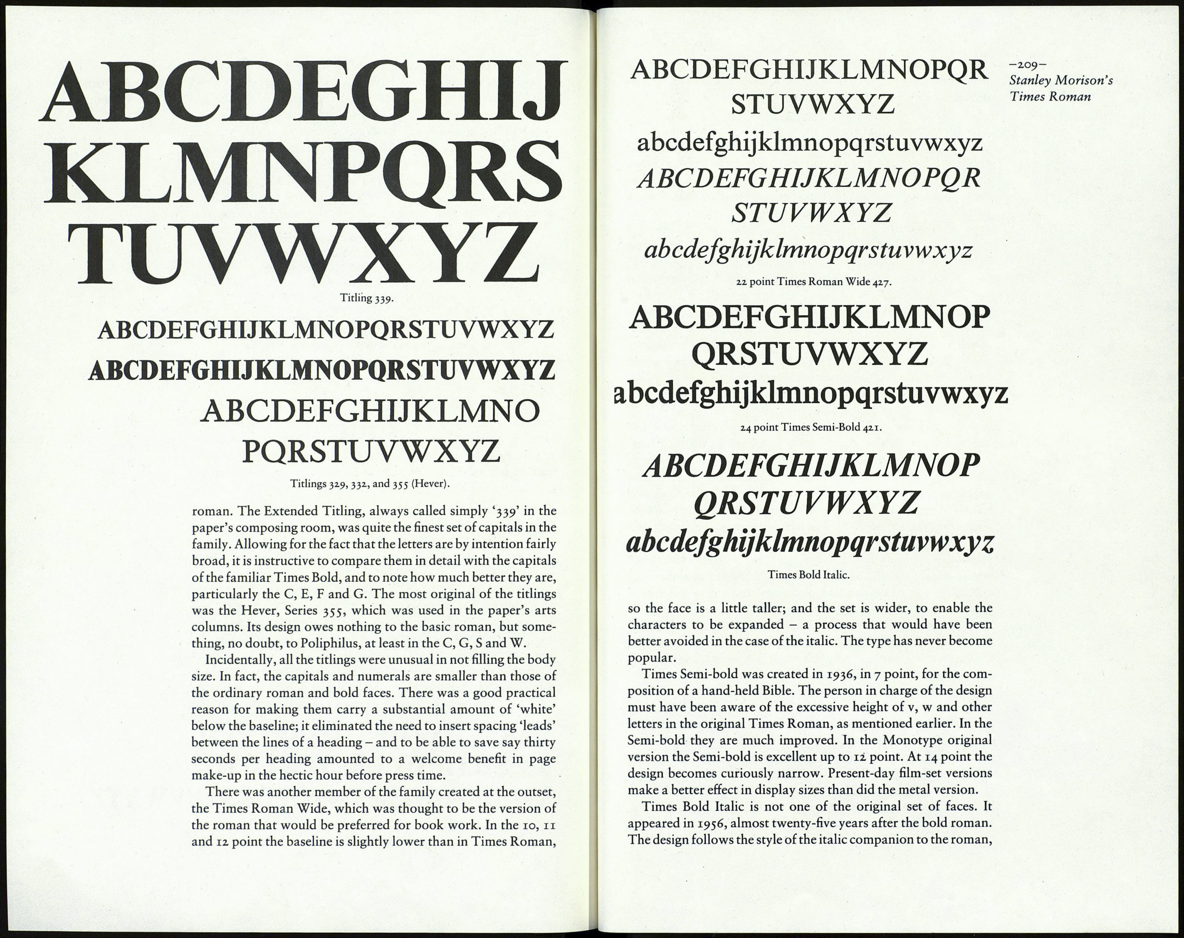
The five titling faces, which had an important role in the re¬
designing of The Times in 1932, were of various weights and
widths to suit the degrees of emphasis to be given to news items.
The design of four of them was derived from the capitals of the
text roman. The 24 point size of the Heavy Titling Series 328 was
the first to be worked upon. A 1937 specimen sheet shows (by a
composing-room error, no doubt) in the 24 point only, the serif-
less G and S that can be seen in Lardent's original drawing of the
FARM GARDEN IS BATHED
IN SHADOWS AND BY THE
ABCDEFGHIJKLMNOPQRSTUVWXYZ
24 point Times Titling 328, showing the G and S as first made,
and as actually issued.
