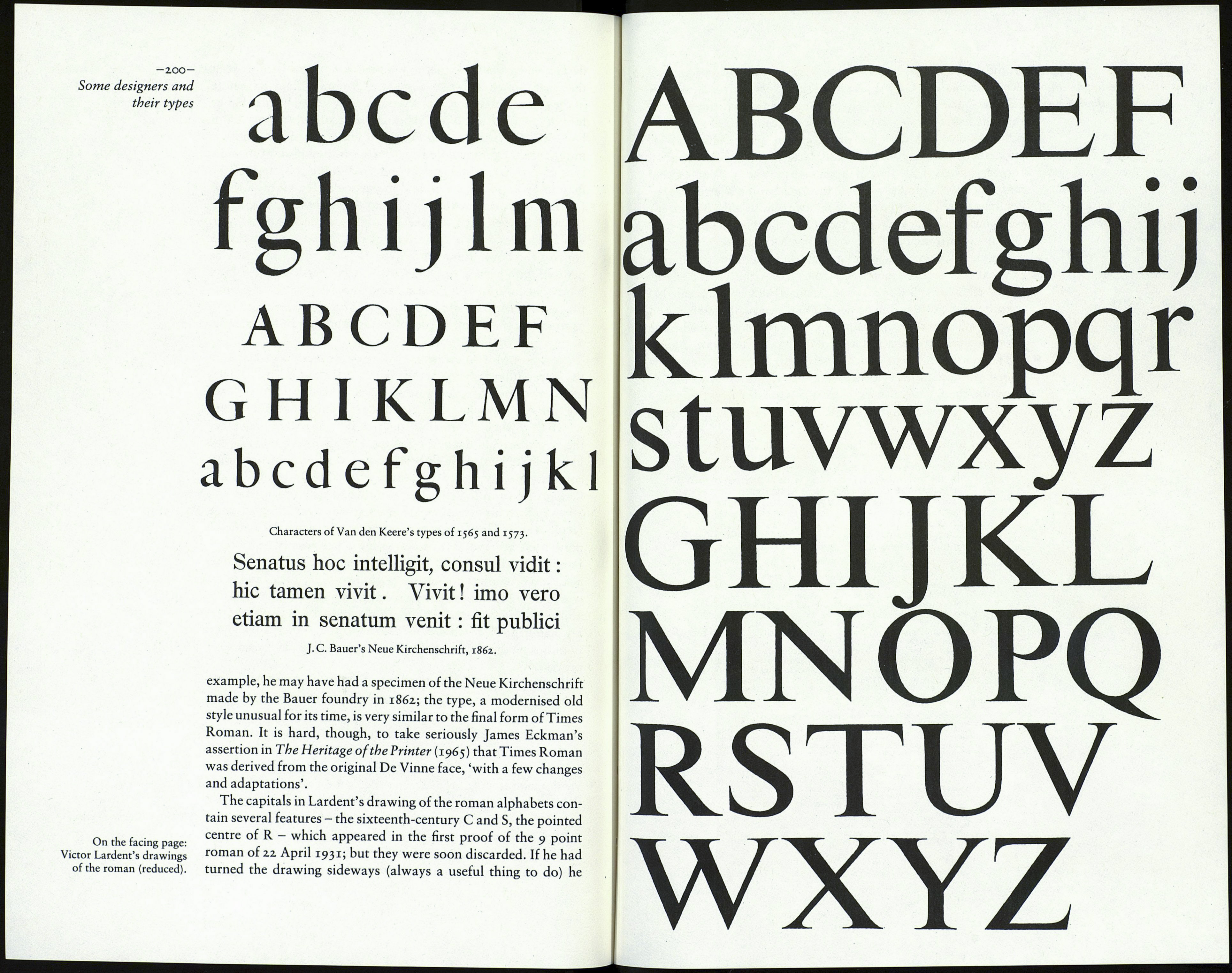
ABCDEFGHIJKLMNOPQ
ABCDEFGHIJKLMNOPQ
RSTUVWXYZ
RSTUVWXYZ
abcdefghij klmnopqrstuvwxyz
abcdefghijklmnopqrstuvwxyz
Monotype Plantin no and Times Roman 32.7 compared.
will be less at 7 and 9 point than it is at 12 point. Monotype's
published dimensions in the 12-point sizes of Plantin and Times
Roman show a difference of only .0004 inch (.01 mm).
Those details may not be conclusive evidence in themselves;
but the variations are so small and the similarities so many as to
support my view that Lardent was instructed to work to the
proportions of Plantin no, especially the character widths, as
closely as possible, to ensure that the 'economy' of Plantin (that
is, its characters per line) was maintained in the new type; and
that the best way for him to do that was to use specimens of
the Plantin no - possibly photographic enlargements, and even
copies of Monotype's working drawings - as the actual basis for
his own drawings.
At this point it will be useful to recall the origins of Plantin no.
To do that we should look first at a type that preceded it: Imprint,
a type of some importance in the history of English type design.
Imprint came into being in 1912 because J. H. Mason could not
find a suitable type for the journal which Gerard Meynell, Mason
and others intended to publish. Mason was a former compositor
at the Doves Press, a self-taught scholar and a man of taste. His
part in the development of Imprint was to suggest a new type,
modelled on Caslon Old Face, with a larger x-height and with an
italic harmonising more closely with the roman than does the
Caslon italic. He would scrutinise trial proofs and pass judge¬
ment on the development of the new face. It was probably Fritz
Steltzer, head of the Monotype drawing office, who was respons¬
ible for the actual design work. Thus Monotype were the first of
the composing-machine makers to produce an original type face
'in the house'; and it was a very good one. In her enlargement of
Morison's introduction to A Tally of Types (second edition)
P.M. Handover wrote that the example of Imprint encouraged
Monotype to create another type in the following year, to be
developed by the same method. There was probably more to it -199-
than that. James Moran suggested that Monotype had taken note Stanley Morison's
of the commercial success of a type recently issued by the Shanks Times Roman
foundry, a kind of bold Caslon, called 'Plantin' Old Style ('in
honour of, perhaps, rather than 'in imitation of). Monotype
may have thought it would be good for business if they too had a
type of that name, and sensibly referred to the collection of the
Plantin-Moretus Museum, and in particular the Granjon Gros
Cicero. I think it possible that the text pages of the catalogue, the
Index Characterum of 1905, served as the source of the new type,
which was designated Plantin Series no. There was certainly a
copy of the book in the Monotype plant in 1923, when it was
perused with a view to producing a 'true' version of the face.
Note that Imprint and Plantin came into existence by the same
process: the substantial remodelling of a type of exalted origin so
as to satisfy the requirements of modern mechanical techniques
of type making and printing.
No doubt Morison was well aware of Steltzer's central role in
the successful realisation of the Imprint and Plantin types. In fact,
in the previous five years or so he had been able to observe
Steltzer's ability at first hand, in the development of several types
which Morison had himself instigated. "Why then did he not place
the preparation of the new types for The Times directly into the
hands of Steltzer, with such instructions as to the desired out¬
come as were necessary? There may have been several reasons.
Perhaps he surmised that it was going to take much trial and
effort to turn his general sense of what was wanted into a satis¬
factory reality, and therefore decided that the work had better be
done close at hand, not in a drawing office twenty miles from
London. And it is possible that because Morison was keen to
achieve a prominent and lasting position on The Times and had a
strong desire to impress the editor and manager with his creative
ability, he saw that that ambition would be well served by
arranging for the new types to take shape in the newspaper's own
premises, with Lardent, their own man, involved in the creative
process.
The reducing of the thin strokes of Plantin no and the sharp¬
ening of its serifs could not have been as simple a task as it
sounds. How much to take off, and just where to start and finish
the process in each letter, were matters for thought - assisted, it
seems probable, by a study of existing examples. No doubt the
incisive look of the recently-completed Perpetua was kept in
view. Charles Bigelow has reported Mike Parker's suggestion
that Morison may have taken note of two types cut by Hendrik
van den Keere, in 1565 and 1573, both in the Plantin Museum They are shown overleaf,
collection and both notable for their large x-heights. Indeed,
Morison may have cast his net quite widely for any type which
would provide useful ideas about stroke and serif weight. For
