requirement is that the connection of
text block and single as well as double
page has to remain intact through the
diagonals. The diagonals guarantee a
harmonious placement of the text block
on the page."
Other examples of good placements
and proportions can be found in Albert
Kapr's layouts, as shown in Figure 382.
Kapr is somewhat more tolerant when it
comes to the requirement of aligning the
lower right and the upper left corner of
the text block with the diagonal of the
page. Especially when he designs for
narrow formats, he finds deviations from
this rule advantageous.
The classic proportions are not the
only possible ones. The handlettered
book can benefit from extremely wide
blocks (Figure 383) or extremely narrow
ones. Even asymmetrical arrangements
are right for certain situations.
Beginners usually depend on models
and examples, but the experienced de¬
signer will find his or her trained eye a
more reliable guide. In determining the
size of the margins it is important to
consider that approximately Vu inch (3
millimeters) will be trimmed off the top,
bottom, and outer sides of the page dur¬
ing the binding process. Binding will
also reduce the width of the inner mar¬
gins by about У32 inch (1 millimeter), de¬
pending on the type of binding process
used.
Close relationships exist between
margins, line spacing, line length, and
letter size. In a justified text, the length
of the line is identical to the width of the
text block, but in a large format the text
can be arranged in two columns (Figure
384).
Limit the number of words per line in
a handlettered book to eight to ten. This
determines more or less the height of
the letters: you will establish the precise
dimensions through several trials. If no
specific page size is given, you can also
3
6
normal spacing
narrow spacing
_______3
5
3
2 — 5
6
382 Page layout variations by Albert Kapr.
wide spacing
normal spacing
4
3 6
8
182
383 Very wide margins.
384 Page layout with two columns of text.
reverse the process, start with a particu¬
lar size letter and deduct the line length,
line spacing, and all margins from this
unit. It is often necessary to combine
both approaches in one project.
Another factor that has impact on the
margin width is line density. Loosely
spaced lines require wide margins, while
dense layouts need less space around
them. Allow large letters narrower mar¬
gins than small letters.
Designing the Text Block7
Chapter Openings and Endings. Many dif¬
ferent design elements can be used, but
within one book there should be con¬
tinuity. The most common way to differ¬
entiate a chapter from the rest of the text
is to start it lower on the page. (The dis¬
tance from the top of the page to the
first line is called sinkage.) The white
space can occupy as much as one-fifth to
two-thirds of the entire text block.
Headings and initials are other im¬
portant design features of the chapter
opening. Align the headings with the
text or the top of the text block, and
leave a little extra space to the beginning
of the text. The headings can be cen¬
tered or flush left; the latter is the most
frequent choice for handwritten texts. If
the text has subheadings, leave three to
four line spaces between blocks and
place the subheading somewhat below
the middle in the empty space. Accord¬
ing to Kapr, "The headings represent
the fusion lines of the text. They are the
skeleton to which tendons and muscles
of the body are attached." Size, color,
and letter style for headings are dis¬
cussed in Chapter 1 and at the beginning
of this chapter.
Past centuries brought us a fascinat-
7. This section is based on material from Albert
Kapr's Buchgestaltung (Book design). Dresden: VEB
Verlag der Kunst, 1963.
ing and ever-changing variety of initial
capitals. Today we still use ornamental
initials, but with restraint when it comes
to size and decoration. Choose a style
that harmonizes with the rest of the text,
and refer to Chapter 1 for more details.
If both the first and the last column of
a text appear on the same spread, the
final column should preferably be longer
than any white space at the end of the
first page. Arrange the columns of the first
page accordingly: you may have to make
several layouts to solve the problem.
Paragraphs. Indents mark the beginning
of a new paragraph and make it easier to
read the text. In a normal-sized line in¬
dent two or three letters, in longer lines
indent more. Indents are of special im¬
portance in handwritten books since the
text is usually not justified, which makes
paragraphs hard to discern. Line spaces
can separate paragraphs, but tend to dis¬
integrate the text block and may look
worse than a somewhat irregular left edge.
The first paragraph of a chapter or a
paragraph after a subheading needs no
indent because the preceding line space
separates it from the rest of the text. A
flush-left beginning of a new paragraph
is also easier to reconcile with a heading.
It is, of course, possible to ignore this
rule for special design purposes. You
could start paragraphs with colored ini¬
tials; if they are small they can be part of
the line, but they can also occupy space
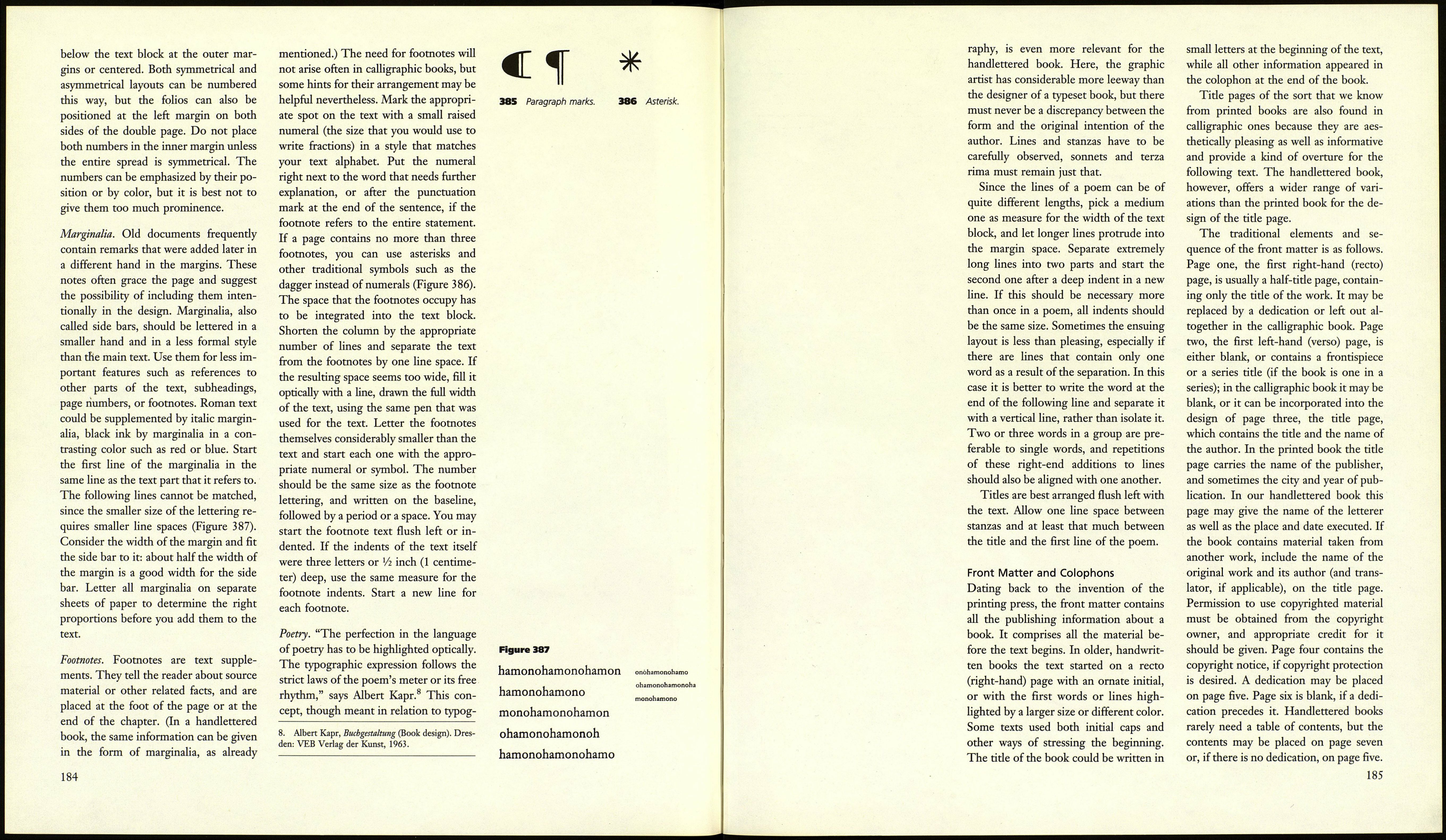
in the margin area. Do not overlook par¬
agraph marks, even though they may
seem a litde old fashioned (Figure 385).
Page Numbers. Since the handwritten
book is likely to be used in ways differ¬
ent from conventional books, page num¬
bers, or folios, are not strictly necessary,
unless the volume is very thick. Page
numbers are most frequently placed
183
9132711576��
001067
