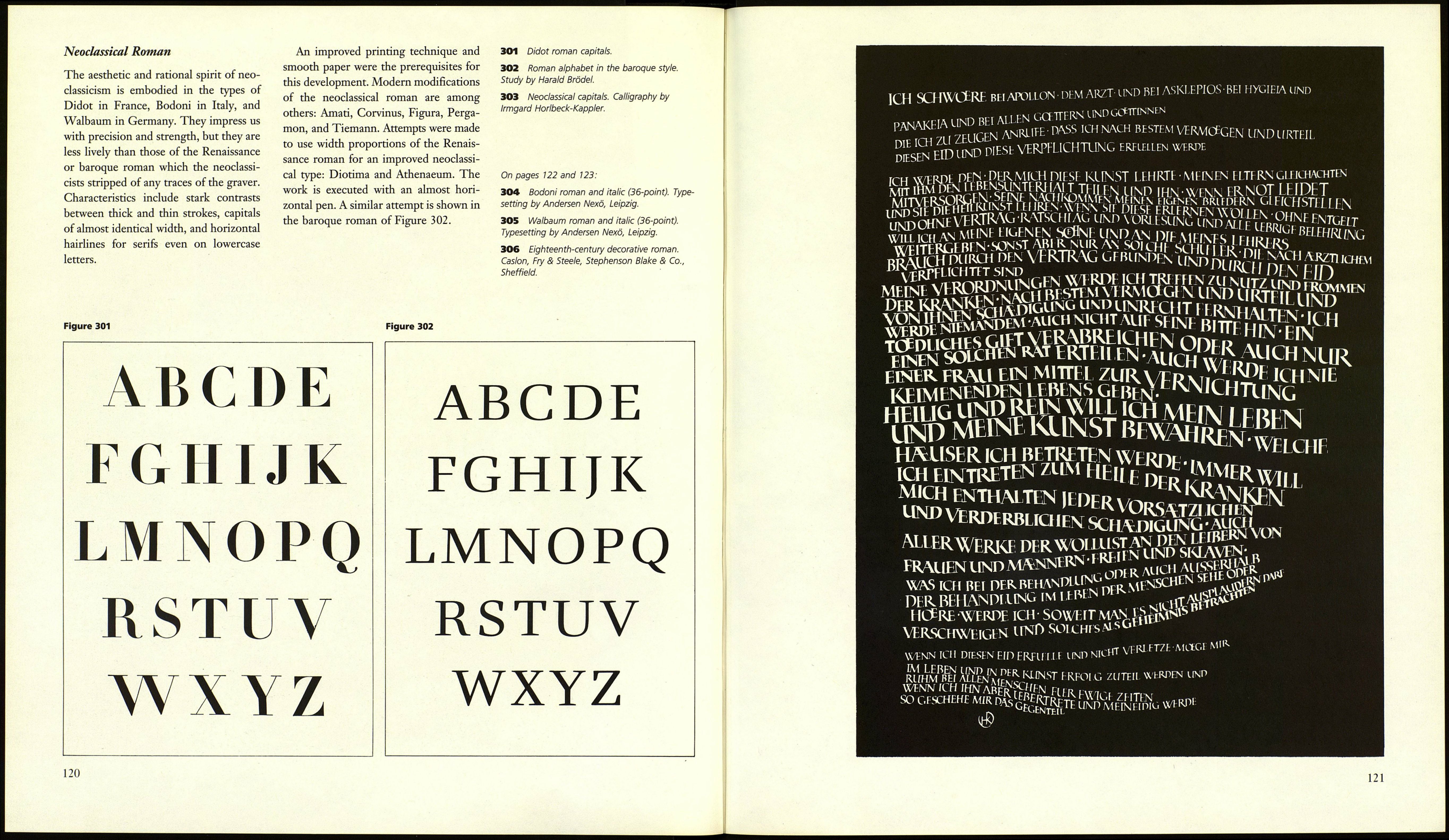
ABCDEFGHIJKLMNOP
QRSTUVWXYZ
abcdefghijklmnopqrstuvwxyz
12345678go
297 Bembo italic (36-point). The Monotype
Corporation. Typesetting by Andersen Nexö,
Leipzig.
ABCDEFGHIJKLMNO
PQRSTUVWXYZ
mnopqrstuvwxyz
1234567890
298 Garamond italic (28-point). Typoart Dres¬
den. Typesetting by Typoart Dresden.
ABCDEFGHIJKLMOPQRST
UVWXYZ
ahcdefgkijklmnopqrstuv
wxyz 12345678QO
299 Faust italic (28-point). Designed by Albert
Kapr. Typoart Dresden/Institut für Buchgestal¬
tung, Leipzig. Typesetting by Hochschule für
Grafik und Buchkunst, Leipzig.
118
300 Baskerville roman and italic (36-point). D
Stempel AG Frankfurt/Main. Typesetting by
Andersen Nexö, Leipzig.
ABCDEFGHIJKLMNOPQRSTUV
WXYZ 1234567890
abcdefghijklmnopqrstuvwxyz
ABCDEFGHIJKLMNOPQRSTUVW
XTZ 1234567890
abcdefghijklmnopqrstuvwxyz
FROM THE BAROQUE TO THE
NINETEENTH CENTURY
Baroque Roman
The form canon of the baroque roman
stands between that of the Renaissance
and the neoclassical roman. There is
little resemblance to commonly known
baroque style elements. The face of the
Renaissance roman underwent impor¬
tant changes during the seventeenth
century. There were practical, which is
to say technical, reasons, one of them
the new use of the graver. The typefaces
of the Hungarian Nicholas Kis (creator
of the face erroneously called Janson),
and the Dutchmen van Dyck and Fleisch¬
mann are darker and less elegant than
their French predecessors, but they are
very legible and usable. Ascenders and
descenders are reduced in favor of a
larger x-height, the thick/thin contrast is
heightened, round serifs are straight¬
ened, and the points exaggerated. The
stress of the round forms is steeper too.
English modifications of this type were
created by Caslon and Baskerville at the
beginning of the eighteenth century,
French ones at the end of the eighteenth
century by Grandjean for the Imprimerie
Royale and by Fournier. Grandjean's
Romain du Roi has importance as a
transition to the neoclassical type.
Among modern typefaces Times and
Imprimatur should be mentioned.
119
