instead of pointed ones (Figure 190).
The following hints will make the
learning process easier. Draw each letter
on a small card, and arrange them into
words. The right stroke widths and pro¬
portions can be found more easily this
74
way. Start with H, M, and О to establish
size, stroke width and the shape of the
serifs. Follow with A, N, U, G, B, R, and
S. Only when the appearance of these
key figures pleases you should you go on
to the rest of the alphabet. Never lose
sight of the organic character of your
movements. Most of the chiseled in¬
scriptions were originally drawn onto
the stone surface with brush and paint.
It is a good idea to practice the letters
first with a reed pen in a corresponding
width. Let the movement come freely
from your elbow and shoulder joints.
Only your pinky braces your hand
against the writing surface. A letter
height of 2 inches is a good choice. The
ratio of basic stroke width to the letter
height is 1:10 in the middle and 1:9 in
the upper and the lower part of the shaft
(Figure 191). Small adjustments of these
measurements can be made according to
personal preference or to accommodate
special conditions of the work. Make the
horizontal strokes half the width of the
basic stroke, the thin diagonal strokes
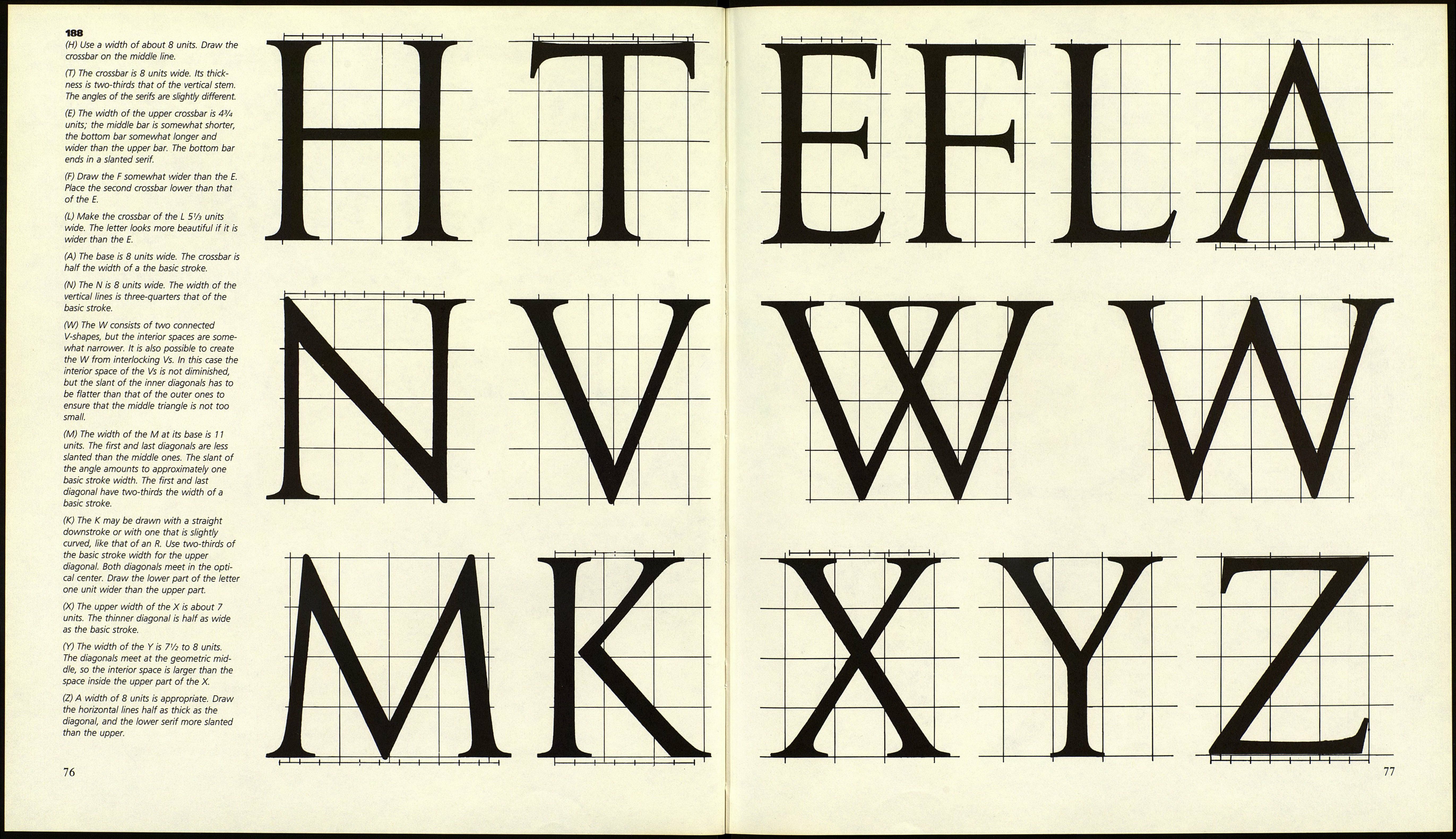
about two-thirds of it. Figure 188 offers
help with the construction of the letters.
One unit corresponds to one-tenth of
the letter height.
75
