Italie
Lowercase Letters
To learn how to write an italic script is
a much simpler task than most people
imagine: it usually involves just a modifi¬
cation of the script taught in school. Fig¬
ure 144 shows the handwriting taught in
German schools, which resembles that
taught in the United States and else¬
where. Historically, it developed from
the humanist scripts of the Renaissance
(Figure 145).
We start with lowercase letters, be¬
cause they determine the character of
this alphabet. In the beginning use a
broad flat-edged pen, and try a flat or
round brush later on. If the angle be¬
tween the edge of the nib and the base¬
line is chosen correctly, a particularly
rhythmic and dynamic image results
from the change of thick and thin
strokes.
The round forms of the italic are
based not on a circle, as was the case
with roman letters, but on a slanted oval.
This produces slender letters of very
similar widths. While the basic con¬
struction of roman letters consists of
connecting round and straight elements
that remain isolated from each other,
italic script consists of a flowing up and
down movement. Avoid isolated strokes
wherever possible: your lettering speed
will increase.
Practice the basic elements first.
1. Make downstrokes at an angle of
75 to 80 degrees, upstrokes somewhat
steeper (Figure 146). Set a distance be¬
tween the basic strokes that is neither
too narrow nor too wide.
2. Make upstrokes in one movement,
as shown in Figure 147. The upstroke
can be smoothly connected to the down-
stroke (1) or overlap it slightly (2). The
overlap should cover approximately half
the x-height. Variations can be made ac-
58
yiBCDSFQHJJKL
MyVOPQRST
uvu/xyz
/CL /Ô/C Al /j^Xfr  Л^ /k
Im п/crjayCjTApÀM
VWXAfrZ
1234567890
144 German school script, 1968.
145 Italian Renaissance italic by Palatine
■ /
&ßtiranomgiii cofömucrfo л .Мм
M i[ßw7tfl(ldto tuffiu?à Ca Cctm>,
jLa аишгШс'сЯСа U£oaun M'irne
датба m (¡ftoJitmmminaarr,
jaßata (a metà- шугто Ттиеф > £/
cçftjcjjuintt'(айп'дапее,'сож'УаЫ.
' i rnnmmm.'trnnnn mtl.
ja Cettrra ■ o.ßßina compia. с. ¿У/Г
Jem am ші trattò al¡piatito шпшо. >
г ' с о о > о > о о о -
[a^j.Jicommáa>cv'C4a¿Cio./. &-*
uraßßtu со (7гашф ■ [ ■ t&ttaoÚ ¡áfual
mm lufßt'.J.'&uatpofßrma со-
mc'ßutiio ûfa.li.jtyertm) cIJeT
jirmajno UC'hßß mflßjiu aL
töta tkfßyo-j) .yer cMjar? сГЪ->
Ja (rtmljißmatuäaaim^laS.uccta
cHcvuof'eßaz'aJictto, &neï(mr faflw
ßuwfjamtr'algufa, arie nßßnßaW
nt'ffne1.
la/.t.Jijtmj/ia af7a¿úb a%?jma>,
timfm còfomuajo. i. ttßafatyur a T
Jajltoytd Cauri Mi faim wp.
'iii i¡ iji í í i y.
\aCtttm-i.$M'kß&Ca.i У-
~vuo(¿íaucref'iCCuo corpo h mézb tfeC'liofh
la/. C.rßmctymatiimtz'iaiCa daß an
. í. a fmfâcoïtadtito cm¿ía. i.
'CCCCCÍC С С CJ
^i.m.t/. n.ßßhidpano aT7aaßo/
Ь Ну
cording to personal taste. Make arches
not too roundly, but certainly never with
points or broken lines. Figure 148 shows
wrong forms.
Make upstrokes short, and match
them to the size of the nib (Figure 149).
Make sure straight lines with rounded
ends do not deteriorate into S-curves
(Figure 150).
3. Ascenders usually start with a serif
similar to the beginning of the n (Figure
151). If an inverted arch form is used, it
should start at the waistline, which is the
upper limit of the x-height (Figure 152).
Figure 153 shows wrong forms.
Ascenders with reversed arch forms at
the entrance stroke can sometimes be
seen. Such forms should be left for more
formal modifications of the italic (see
Humanist Italic, page 112).
Descenders are considered to start at
the middle of the x-height. The letters j
and p can be written with an upstroke,
even if no connection is possible (Figure
154). Ascenders and descenders can be
no longer that those of roman letters,
but caution is advised: do not use ex¬
treme forms; aim for harmonious ratios.
4. In oval forms consisting of an arch
and an inverted arch, such as an o, the
upper element should be rounder than
the lower one. The lower part can be al¬
most pointed (Figure 156), but it should
never look like those in Figure 157.
In the letters a, d, p, g, and q the axis
of the oval is more slanted than that of
the stems (Figure 158). In a, g, and q,
the stem can be drawn slighdy higher
than the arch (Figure 160).
Up-and downstrokes of v and w show
a somewhat modified slant.
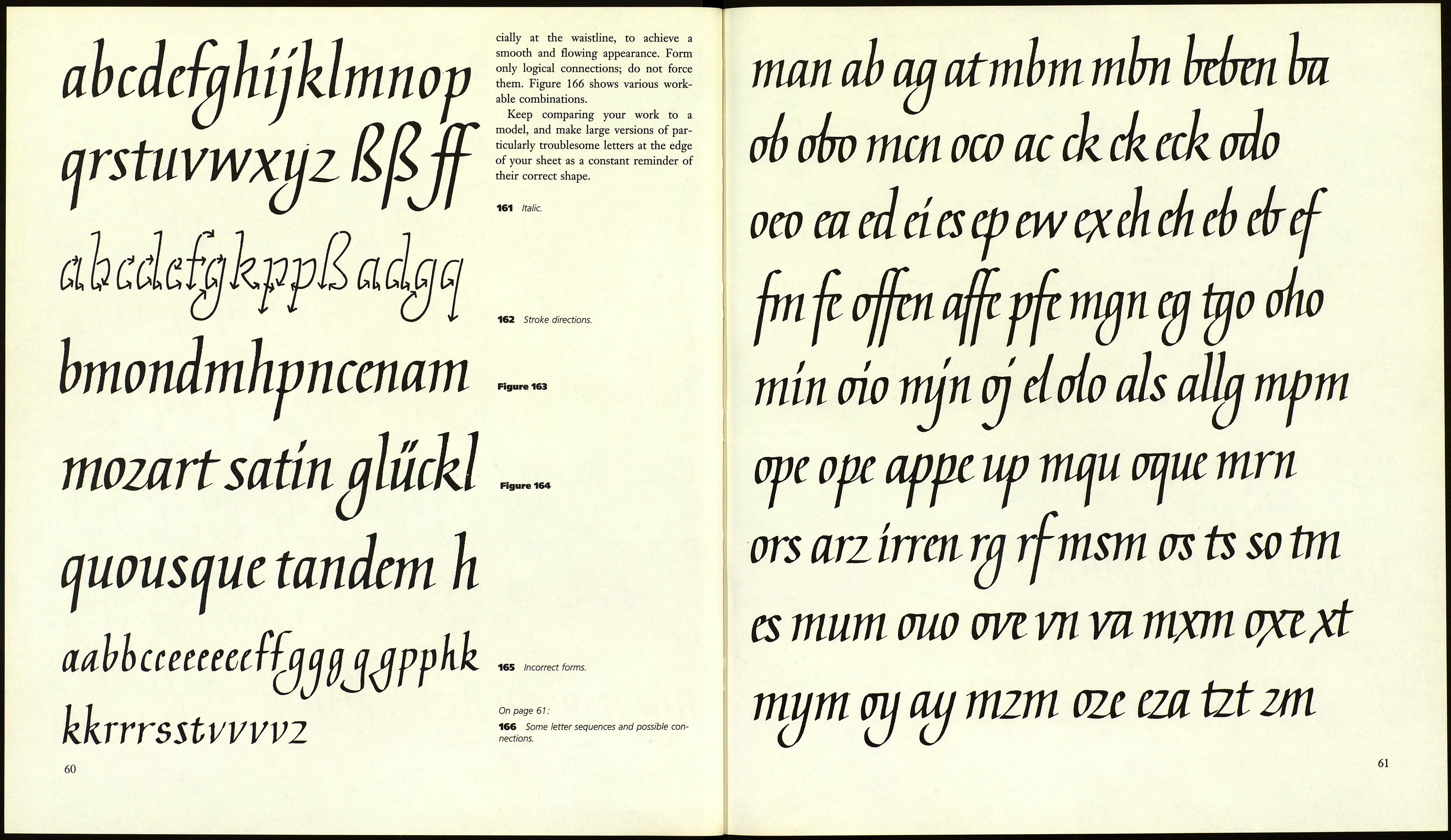
All letters are made up of these ele¬
ments. Practice them often. Start with
m, n, h, and u, and add one letter at a
time (Figure 163). Connect the letters
with each other wherever possible, espe-
Г f f T III III III
too steep too severe
rr rnnuh
Figure 146 Pen angle
right too steep too flat
Slant
right
ТГ
munh
Figure 147
7. two separate strokes
2. one stroke
mnnmmn rn
Figure 148 Incorrect forms.
too pointy too round arch broken
too wide too narrow loop instead of
covering stroke
П111П11 ПИ llll
149 Right wrong
150 Right wrong
hdl eh llnlrd
Figure 151
Figure 152
153 Bad beginnings and connections.
"ИЧШШЗ
154 Right.
155 Deformed descenders.
0СС0СС 9W0OOO
156 Right.
157 Wrong.
W аа i
Figure 158
159 Incorrect forms. Figure 160
59
