^^^J
Figure 105
H
Figure 106
Figure 107
Figure 108
Figure 109
итпллл
VIVIVIVIV
XIXIXIXIX
I0000I
ssssssss
Lettering with a Round-ended Nib. Before
you start work, it is important to find
the right ratio between stroke width and
letter height. The measurements given
on nibs are not necessarily accurate and
should be checked (Figure 105).
A ratio of one to ten seems best for
first exercises. If you use a pen that
makes lines Vu inch (2 millimeters) wide,
choose a letter height of гА inch (2 centi¬
meters). Next you have to determine
the amount of space between the lines.
Not all the hints given in Chapter 1
will be relevant to the beginner, but it is
advisable to choose a distance of slightly
more than half the letter height (Figure
106) at first. Subsequently one of two
methods can be used: letter groups of
three or four lines each with different
line intervals and choose the spacing that
looks best, or cut out the lines and
rearrange them until the right spacing
is achieved.
Determine your margins on an exer¬
cise sheet and draw guidelines on it (see
The Work Space, page 33, and the sec¬
tion on Documents and Addresses, page
175). Consider the relationship of the
text block to the margins (Figure 108). it
is not necessary to aim for justification —
alignment of the lines at the right margin
— and the lines certainly should never be
squeezed into a block of predetermined
size. An unaligned and somewhat resdess
right margin is usually more pleasing
than letters and spaces that have been
stretched or compressed to fit exactly
into the full measure of the line. Both
the left and the right margin, however,
should carry the same weight optically.
Use the basic form elements of the
capitals as components for ornamental
exercises. This will familiarize you with
your pen, and you can experiment with
distances between the elements. Let
round and pointed shapes protrude
slighdy from the guidelines (see Figure
22). Combine the rows to design areas,
and aim for a dense texture on the page
as well as for even gray values over the
entire area (Figure 109).
Figure 111 shows the proper direction
of each stroke. To make the learning
process as simple as possible, practice
letters with similar elements as a group.
Start with those that consist only of ver¬
tical and horizontal lines: I, E, F, L, T,
and H. Remember the remarks about
the optical middle of objects in Chapter
1, and place the crossbars accordingly.
The only exception to this rule is the let¬
ter F: its short middle arm can remain in
the geometric middle of the vertical.
Next comes the group of letters that
contain diagonals: A, V, N, Z, M, X, W,
Y, and K. Make little dots at the desired
endpoints of the diagonal lines and con¬
nect them later, but try to write the
letters as unencumbered by such con¬
struction help as possible. Difficulties
usually arise with M and W. The two
outer lines of M are neither exacdy ver¬
tical, nor are they as slanted as the two
outer lines of W. The M is not an in¬
verted W! In the letter W the left-and
right-slanting diagonals should be paral¬
lel to each other. The space inside the Y
is frequently too small; make it slightly
larger than the space enclosed by the
upper portion of X.
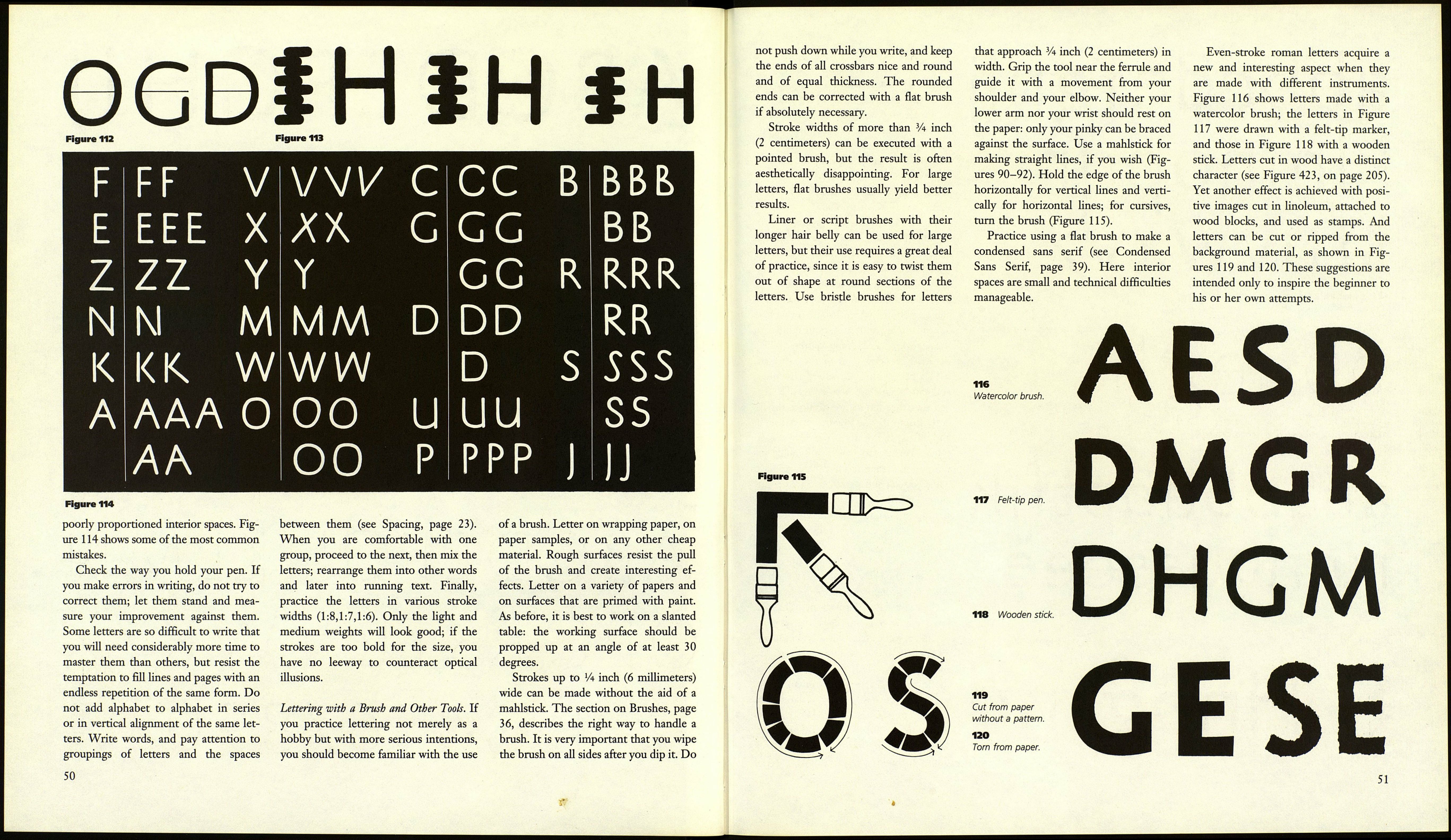
The third group consists of letters
that are roughly a circle in form: O, Q,
C, G, and D. None of these letters
forms a perfect circle; the upper halves
appear larger (Figure 112).
The last group is made up of В, P, R,
J, U, and S. The crossbar of the В lies in
the optical middle; the interior spaces of
R and P should be larger than those of
B, which brings the crossbars of R and
P into the geometric middle.
Keep comparing your letters to mod¬
els or established proportions. Faulty
designs usually attract attention through
48
ABCDEFCHIJ
KLMNOPQ
RSTUVWXYZ
1234567890
110 Sans serif even-stroke roman.
111 Stroke directions.
ABCDEFGHKLMN
OPQRSTUVWXYZ
1234567890
