■i
1
ашШіі
щ\
Tîl .ЦТ! fil Fl !Ì1
ш
ПшПѵП
шш
щщЗД
WE
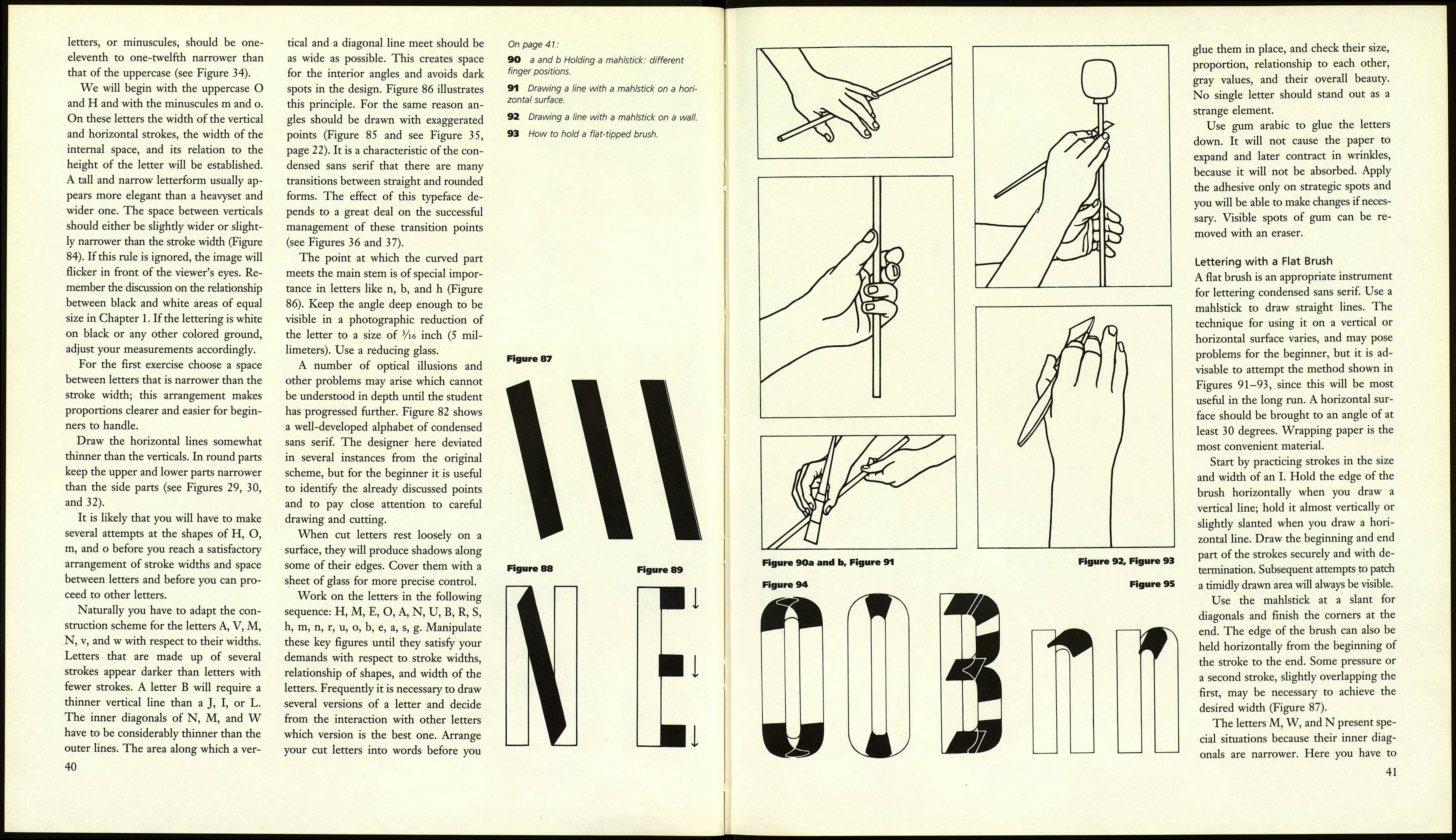
82 Condensed sans serif alphabet by Heinz
Schumann.
38
Figure 83
Figure 84
Figure 85
llllllll
w
Figure 86
wrong
right
EXERCISES
Condensed Sans Serif
Condensed sans serif is frequently used
in design projects, because its propor¬
tions can be varied freely to allow many
decorative effects. Its basic form is sim¬
ple and can be adapted to different tech¬
niques. It is easy to master and therefore
a good choice as first project. The basic
scheme of its construction is the trans¬
formation of round forms into straight
lines with rounded corners (Figure 83).
Drawing and Cutting
Our first project is to draw the letters,
cut them out, and paste them back onto
paper. Chose white, black, or colored
paper, which should be heavy enough to
withstand handling but light enough
to produce a clean edge when it is cut.
Black paper should have a light back side
that will allow you to see pencil lines.
The outline of the letters can be drawn
in one of two ways. A mirror image of
the letter can be drawn directly onto the
back of the paper, or the original draw¬
ing can be made on tracing paper and
transferred to the back of the paper in
mirror image or to the front of the paper
as a direct copy. If you choose the latter
method, check to see if erasing will leave
marks on the surface of the paper, a
danger especially when light-colored
papers are used. Useful measurements
for these exercises are as follows:
height of uppercase letters: 2 Ѵг inches
(6.5 centimeters)
x-height of lowercase letters: 13Л inch
(4.5 centimeters)
Since the condensed sans serif ascen¬
ders are short, its uppercase letters, also
known as majuscules or versais, do not
have to be shorter than the ascenders, as
is common in classical roman letters.
The stroke width of the lowercase
39
