► PTL Adigo | display typeface ■ іг fonts
Normal One ■ Two ■ Three, Medium One ■ Two ■ Three,
Bold One ■ Two ■ Three * Expertsets
HHBCDEFGHIDKLMNOOPQRSTUUUmHVZ О
äbcdePghijklmnöpqfsbuuujHyzßfi ©OD
ШВ1М7В8ВсШ;4%@<-^
geometrical 805 Headline Enpression
Uleighb Uariabions Requirements Ш
idiosyncratic posters Economical !
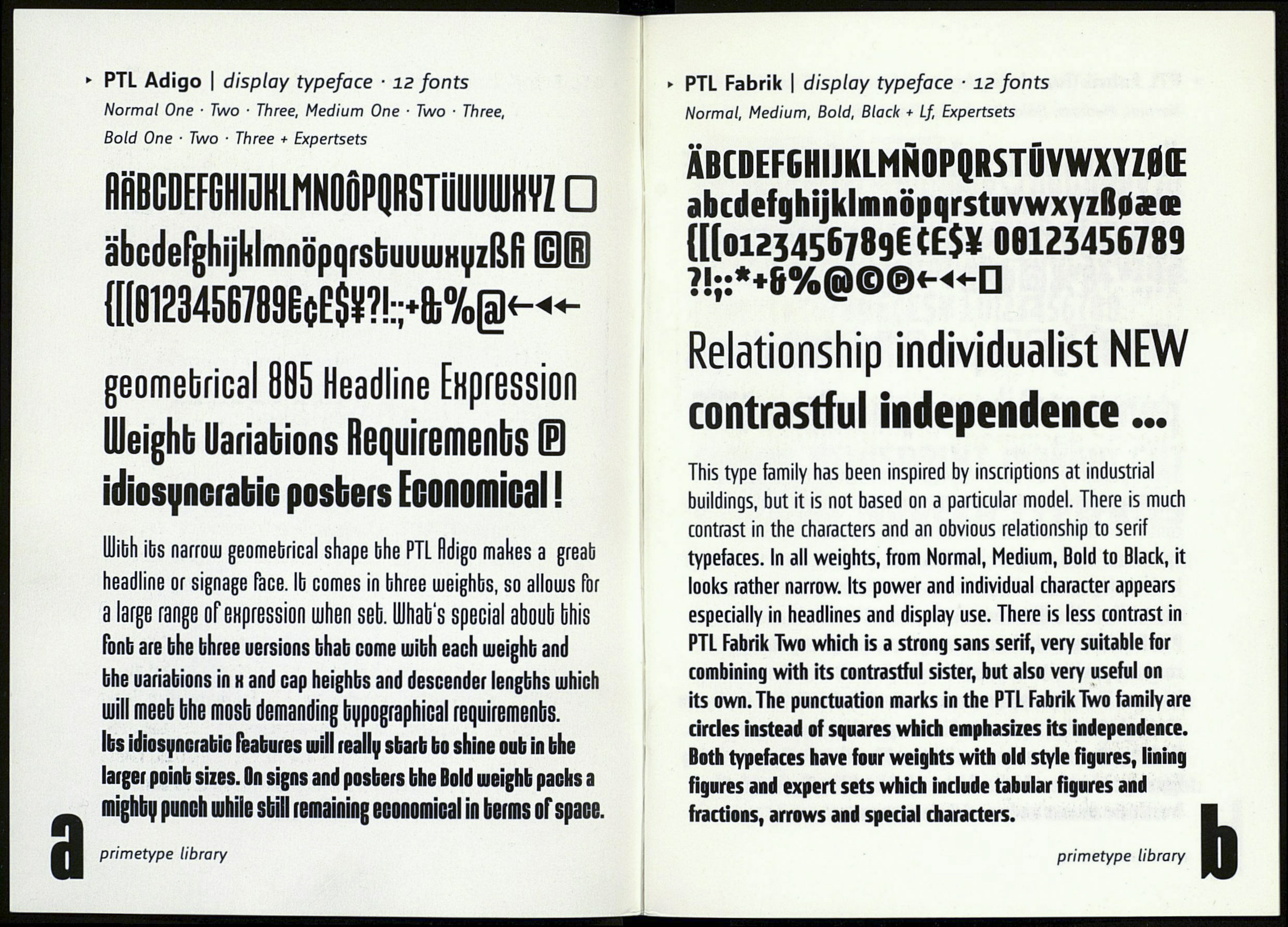
UUibh ibs лаггош geomebrical shape bhe PTL fldigo makes a greab
headline or signage Tace, lb comes in bhree lueighbs, so allouus for
a large range ofeHpression ujhen set. LUhab's special aboub bfiis
ГопЬ are bhe bhree uersions bhab come uiibh each uieighb and
bhe uariabions in н and cap heighbs and descender lengbhs uihich
шіІІ meeb bhe mosb demanding typographical requirements.
Its idiosyncrabic features mill really start to shine out in the
larger point siies. On signs and posters the Bold uieight packs a
mighby punch шіміе sbill remaining economical in berms of space.
primetype library
► PTL Fabrik | display typeface ■ 12 fonts
Normal, Medium, Bold, Black + Lf, Expertsets
\ ABCDEFGHIJKLMNOPQRSTUVWXYZ0Œ
abcdefghijklmnöpqrstuvwxyzfloaece
{[(0123456789! tE$¥ 00123456789
?!;:*+6%@©©«-«-D
Relationship individualist NEW
contrastful independence...
This type family has been inspired by inscriptions at industrial
buildings, but it is not based on a particular model. There is much
contrast in the characters and an obvious relationship to serif
typefaces. In all weights, from Normal, Medium, Bold to Black, it
looks rather narrow. Its power and individual character appears
especially in headlines and display use. There is less contrast in
PTL Fabrik Two which is a strong sans serif, very suitable for
combining with its contrastful sister, but also very useful on
its own. The punctuation marks in the PTL Fabrik Two family are
circles instead of squares which emphasizes its independence.
Both typefaces have four weights with old style figures, lining
figures and expert sets which include tabular figures and
fractions, arrows and special characters.
primetype library
