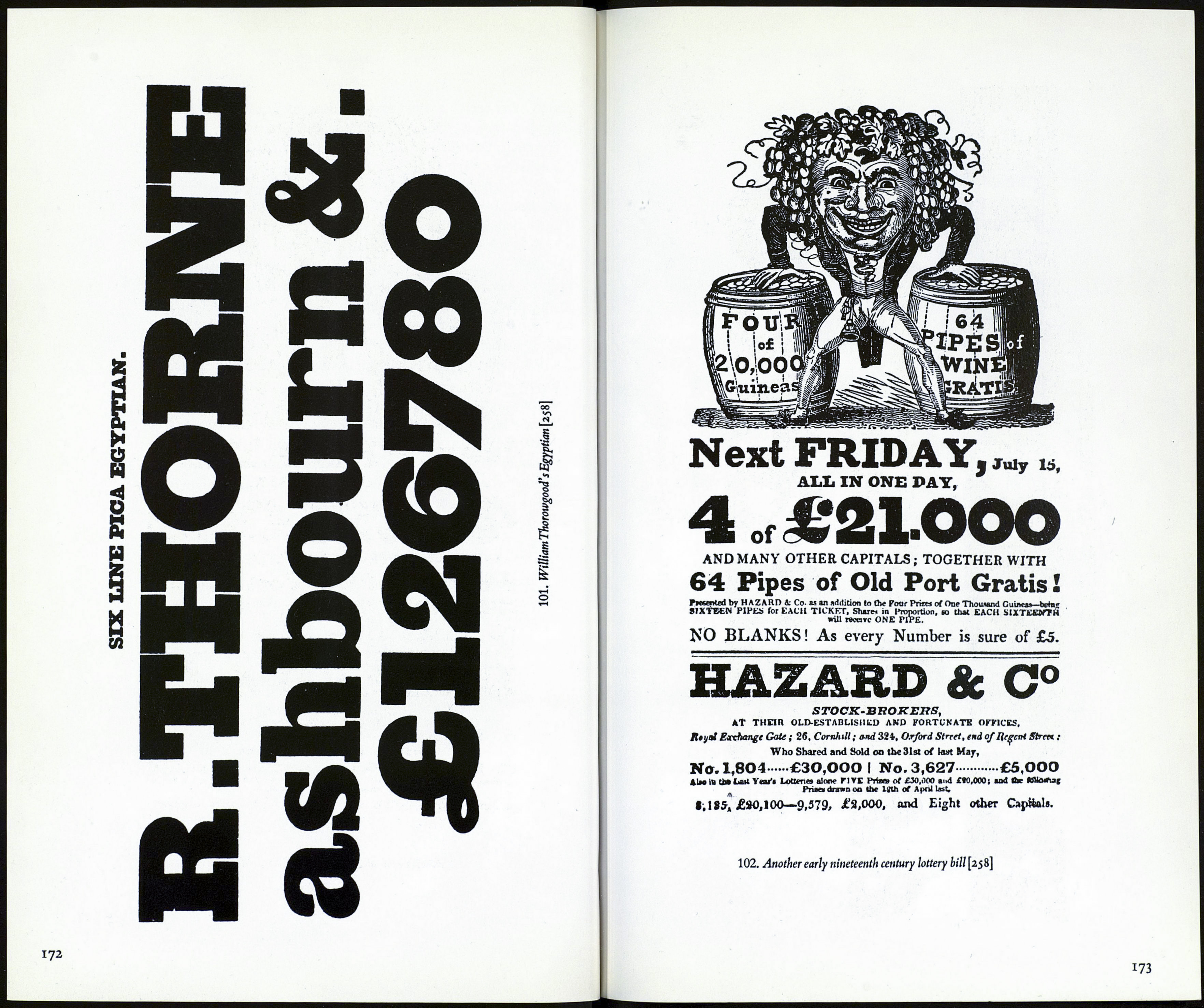
Antique or Egyptian
seriffed letter itself remain a mystery. It is not known whether the
originators were signwriters or typefounders.
The distinctive features of Egyptian (or Antique) types are (i) the
slab serifs (unbracketed or bracketed) often of the same thickness as the
stems of the letters though in some of the early Egyptians the designers
made their lower-case letters follow modern-face patterns (2) the lack
of any differentiation between the thick and the thin strokes in some
designs. In others differences in stem thickness are apparent, e.g. the
thinning of curved forms where they meet vertical straights, e.g. as in
the lower-case a, d, g.This thinning is very noticeable in some of the ear¬
liest Egyptian designs (3) the descenders, & the ascenders are often very
short (4) the stress is vertical^) a uniformity in the width of the capitals.
All the earliest Egyptians (or Antiques) wereverybold types but type¬
founders in our time have cut them in weights ranging from light to
Extra Bold.
When the Egyptians appeared Hansard in his Typographia referred
to the new letter as 'a typographical monstrosity.' But extravagances
based on them called Italian or French Antique followed in which the
heaviest strokes are horizontal. Contemporary versions of these types,
now called reversed Egyptians, are Figaro (Monotype), Hidalgo (Am¬
sterdam), Italienne (Fonderie Typographique Française).
Some contemporary antiques or egyptians
Beton (Bauer), Egyptian Expanded (Stephenson Blake, originally
Miller & Richard), Expanded Antique (Stevens Shanks, formerly
V. Figgins), Karnak (Ludlow), Memphis (Stempel), Rockwell
(Monotype).
Reversed Egyptians, that is egyptians with the serifs thicker than the
main strokes: Figaro (Monotype), Hidalgo (Amsterdam), Italienne
(Française), Playbill (Stephenson Blake).
171
