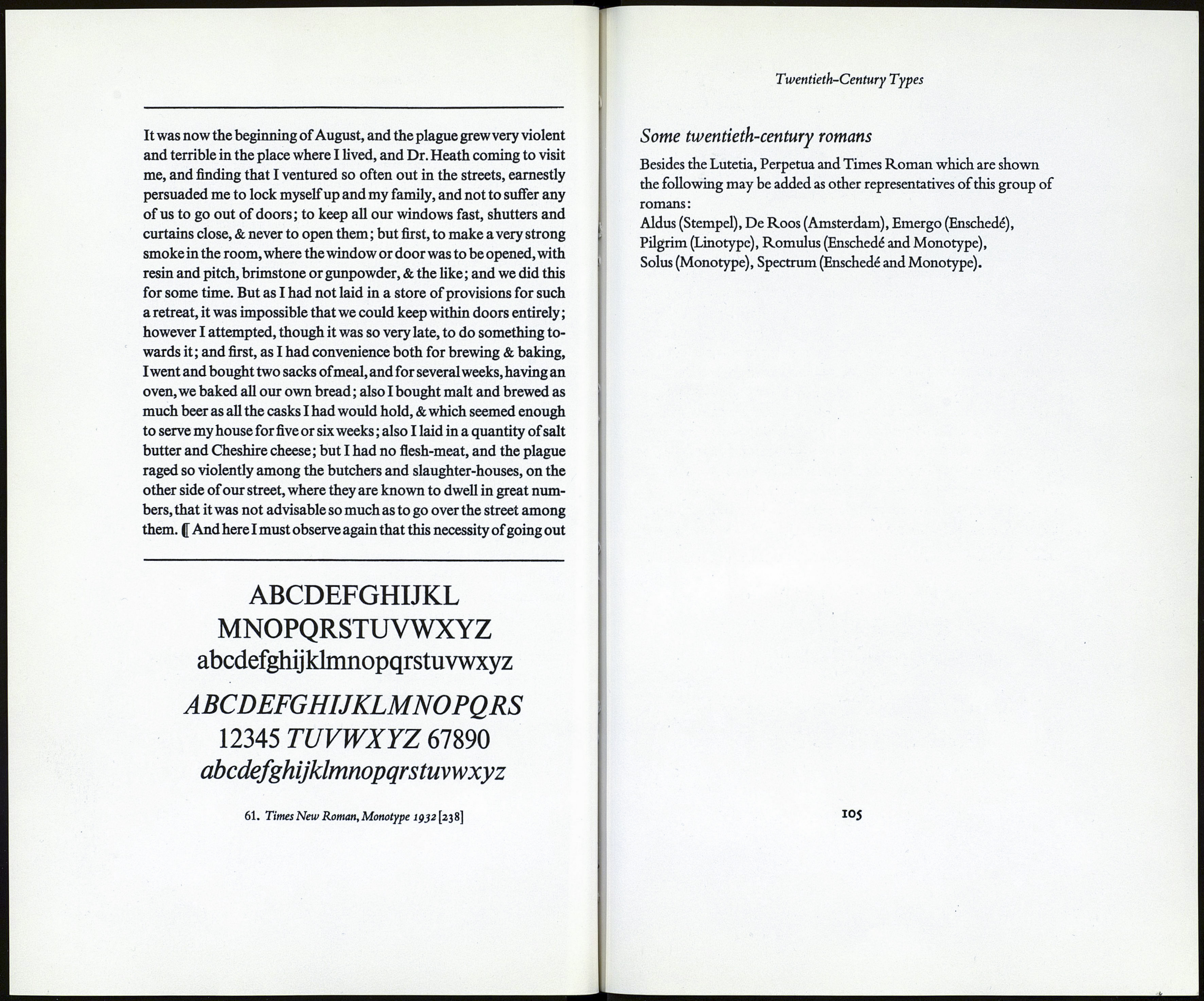
ABCDEFGHIJKLMNO
PQRSTUVWXYZ
abcdefghijklmnopqrstuvwxyz
1234^67890
Cutting a punch by hand means cutting on steei, with the
appropriate gravers, chisels, or other tools, an exact model of the
letter or other symbol in the mind of the punch-cutter or the
designer for whom he is working. In addition to the 'face'of the letter,
i.e. the actual printing surface of the punch, the punch-cutter is respon¬
sible for the right shaping of the punch seen in section. The 'bevel' must
be right both from the point of view of the printing impression and the
strength & quality of the type-metal in which the type will be cast. With
these limitations and considerations in mind, the punch-cutter is at lib¬
erty to cut letters of any shape that pleases him or the designer ; and if the
punch-cutter & the designer are the same person, so much the better...
Until recent years all letter punches were hand cut, and the printing
types derived from them, especially the faces cut before the industrial
era.. .show a liveliness and variety otherwise unattainable. Moreover,
pantographic enlargement or reduction is withhand cutting impossible,
and each size of type has to be cut as though it were a new design.
Punch-cutting by machine involves substantially the following pro¬
cedure : the designer, according to his experience and skill, draws the let¬
ters to be cut to an enlarged size (say one or two inches high).The drawing
is thenagain enlarged, by reflectingitthroughalens on toasheetof paper
ABCDEFGHIJKLMNO
PQRSTUVWXYZ
abcdefghijklmnopqrstuvwxyz
60. Perpetua,Monotype ідгд-іс)-}о\гуі\
Twentieth-Century Types
ods of inking and the hand-made papers used would have obscured the
result. Finely cut serifs, not the hair lines of Bodoni, but cut to a point,
are characteristic of some of the latest types. Smaller serifs too, especial¬
ly in the upper case, are favoured. Future generations will perhaps hold
that printing types of the past were overweighted with serifs. The in-
scriptional capitals of the Trajan column, a famous model of roman let¬
tering dating from the second century A.D., have small serifs, and have
served as a basis for the design of more than one modern series.'1
Germany, France, Italy, Switzerland, Spain and the U.S.A. have all
produced versions of twentieth-century faces. In terms of numbers
Germany leads in this field but there is no doubt that the design of the
most successful of these twentieth-century faces cut specifically with
book composition in mind—that is to say types which the best of our
English printers would want, and would feel happy to use—has so far
been concentrated in this country and in Holland.
Characteristics of twentieth-century romans
STRESS OR SHADING
Sometimes oblique, sometimes vertical, or nearly vertical, but not
with mathematical verticahty of stress.
MODELLING,OR GRADATION FROM THICK TO THIN STROKES
Gradual. Never abrupt.
serifs(feet)
Small and sharply cut, not as hairlines, but cut to a point. Often
noticeably smaller in the upper-case than heretofore.
OTHER DISTINGUISHING FEATURES
The capitals in some designs reflect in their varying widths the
general proportions of those on the Trajan column. Capitals often
unobtrusive. Many of these twentieth-century romans are space
savers, that is economical of space in setting.
■In a guide то prbsent-day types. Paper and Print. December 1932.
ЮЗ
