44 Art in the Alphabet.
They are more likely to be all of one family if we
derive them from one source. But there is no
reason why we should not cross the breed in
lettering, if thereby we can improve the stock.
An alphabet, however, should not look hybrid.
The artist is free to do what he can ; but the test
of success is that his creation should look as if it
must be so, and could not have been otherwise.
Why, it is asked, should any one trouble himself
about hand-drawn lettering, when he has ready to
his use type, which is so much truer and more
perfect ? Truer, perhaps, it may be, in the sense
of being more mathematically exact, but it is not
necessarily so truly uniform in effect ; for the
unyielding letters of the type-founder come
together as best they may, and if they come
awkwardly he can't help it. The writer can, and
indeed he should.
There is no denying that many an artist who
ventures to introduce lettering into his design,
does it ill, does it so carelessly, or is so easily
satisfied with very indifferent penmanship, that
of the two evils hard and fast letterpress would
have been the lesser. None the less true is it that
an artist who has been at the pains to learn to
write, can, if he aim at what pen or brush will do,
and refrain from entering into foolish and ineffectual
rivalry with the printing press, do what that cannot
do, and do better.
Looking at an early printed book, you are
Art in the Alphabet. 45
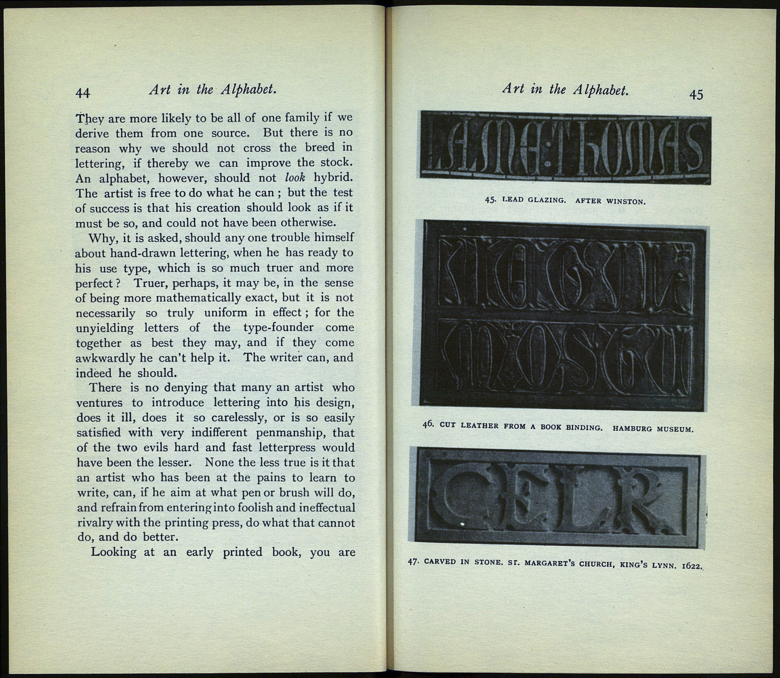
45. LEAD GLAZING. AFTER WINSTON.
-"> V
\ П ' '
46. CUT LEATHER FROM A BOOK BINDING. HAMBURG
MUSEUM.
47- CARVED IN STONE. ST. MARGARET'S CHURCH, KING'S LYNN. IÔ22.
