36
Art in the Alphabet.
ends. Historically, we arrive at that in Lombardie
and other writing as early as the 8th century (60).
Anticipating this dilation, the penman eventually
made strokes in which the elementary straight line
altogether disappears (68). Further elaborating,
he arrived at the rather sudden swelling of the
curved back of the letter, familiar in work of the
13th century and later (73, 87). With the forking
of the terminations, and the breaking of the out¬
line in various ways (20), we arrive at fantastic
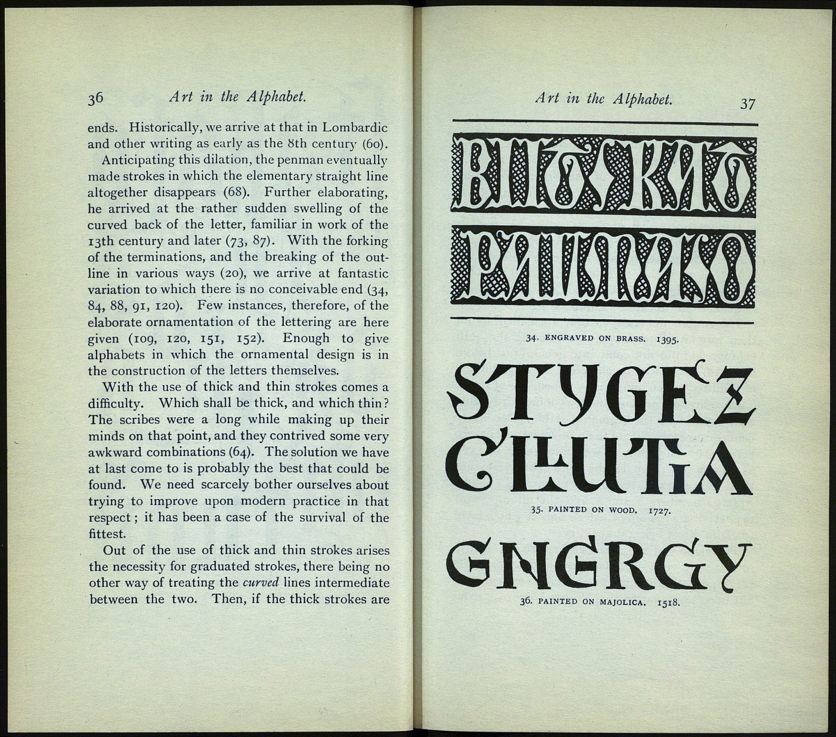
variation to which there is no conceivable end (34,
84, 88, 91, 120). Few instances, therefore, of the
elaborate ornamentation of the lettering are here
given (109, 120, 151, 152). Enough to give
alphabets in which the ornamental design is in
the construction of the letters themselves.
With the use of thick and thin strokes comes a
difficulty. Which shall be thick, and which thin?
The scribes were a long while making up their
minds on that point, and they contrived some very
awkward combinations (64). The solution we have
at last come to is probably the best that could be
found. We need scarcely bother ourselves about
trying to improve upon modern practice in that
respect ; it has been a case of the survival of the
fittest.
Out of the use of thick and thin strokes arises
the necessity for graduated strokes, there being no
other way of treating the curved lines intermediate
between the two. Then, if the thick strokes are
Art in the Alphabet.
34. ENGRAVED ON BRASS. I395
STyGEZ
СІШТ1А
35. PAINTED ON WOOD. 1727.
GNtìRCiy
36. PAINTED ON MAJOLICA. I518.
