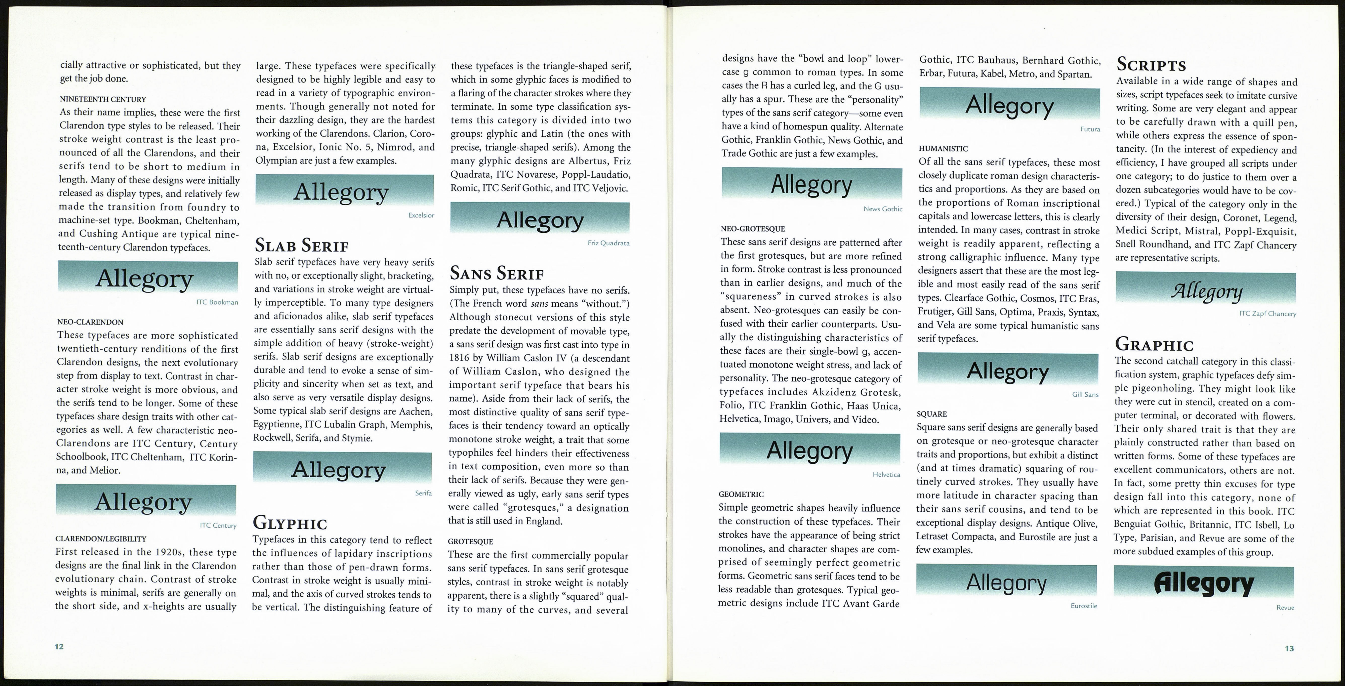
A System of Classification
Most text typefaces can be classified into
one of two groups: those with serifs and
those without. Over the years, in order to
further categorize typeface design traits,
several more definitive systems were devel¬
oped, some with over a hundred different
categories. While two broad categories of
type are inadequate for understanding the
full extent of typographical development
and diversity, hundreds can be self-defeat¬
ing. In what is hoped to be a reasonable
compromise between the two extremes,
the system of classification that follows uti¬
lizes nine basic groups, some of which have
been subdivided further for added clarity.
While there may be some differences
between this and other type classification
systems, as well as disagreements concern¬
ing the placement of a typeface or two, the
intent here is to provide a set of working
guidelines for the typographic communi¬
cator—with an emphasis on the word
“guideline.” The good news is that few
things typographical can be rigidly defined,
fostering the potential for healthy debate
and leaving those who relish the finer
points of type unimpeded by an inflexible
system of standardized models.
Old Style
The first roman types, old style faces were
created between the late fifteenth and mid¬
eighteenth centuries, or are patterned after
typefaces that were designed during that
period. In these designs, the axis of curved
strokes is normally inclined to the left, so
that the weight stress falls at approximately
eight and two o’clock. The contrast in
character stroke weights is not dramatic,
and hairlines tend to be on the heavy side.
Some versions, like the earlier Venetian old
style designs, are distinguished by the diag¬
onal cross stroke of the lowercase e. Serifs
are almost always bracketed in old style
designs, and head serifs are often angled.
VENETIAN
These are the first of the old style faces,
created in Venice around 1470. They gen¬
erally take their style and proportions from
handwritten letters drawn with an oblique¬
ly held broad-nibbed pen. A dead giveaway
for Venetian old style designs is the diago¬
nal cross stroke of the lowercase e; almost
every example has one. Venetian old style
faces also have very minor contrast in
stroke thickness and their serifs are heavily
bracketed. Some typical designs are Bauer
Text, Centaur, Cloister, Cloister Old Style,
Deepdene, Kennerly, and Italian Old Style.
Allegory
Deepdene
ALDINE
Aldine old style designs are based on the
original work of Aldus Manutius during
the early 1490s. During the sixteenth cen¬
tury these models were adopted and emu¬
lated first in France, then throughout
Europe. (It is probably one of the first
typefaces to have undergone widespread
duplication—sort of the Helvetica of its
day.) These typefaces generally have more
contrast in stroke weight than Venetian
old style designs, and the crossbar of the
lowercase e is almost always horizontal.
Serif bracketing is also obvious, but usually
not as pronounced as in earlier designs.
Among Aldine old style designs are
Bembo, Garamond, Goudy Old Style,
Palatino, Sabon, and Weiss Roman.
Allegory
Bembo
DUTCH
In the Netherlands, the larger x-height,
darker color, and enhanced contrast in
stroke weight of the German blackletter
were melded with Aldine design traits,
resulting in Dutch old style designs. This
style first appeared in the mid-sixteenth
century, but continued to be developed and
refined well into the twentieth. These are
heavy types that tend to be exceptionally
legible and readable. Caslon, Concorde,
Janson, and Plantin are just a few examples.
Allegory
Janson
REVIVAL
There are two catchall categories in this sys¬
tem, one of which is the revival group of
typefaces. These may display a predomi¬
nance of old style design traits, but are gen¬
erally not patterned after any particular
type of the period. Many times, in fact, they
share several design influences. As with
other old style designs, however, character
stroke width and contrast are relatively
conservative, weight stress is inclined, and
serifs are bracketed. The revival category
includes designs such as ITC Benguiat,
Cooper Black, ITC Galliard, ITC Gara¬
mond, Italia, Raleigh, ITC Tiffany, Trump
Mediaeval, ITC Weidemann, and Windsor.
Allegory
Cooper Black
Transitional
The style for these typefaces was established
in the mid-eighteenth century, primarily by
the English printer and typographer John
Baskerville. His advancements in paper-
making and printing allowed much finer
character strokes to be reproduced and
subtler character shapes to be maintained.
While the axes of curved strokes are usually
inclined, they generally have a vertical
stress. Weight contrast is more pronounced
than in old style designs, though the serifs
are still bracketed and the head serifs
oblique. These typefaces represent the tran¬
sition between old style and modern
designs, incorporating characteristics from
both categories. Included in this group are
Baskerville, Caledonia, Fairfield, Perpetua,
ITC Usherwood, and ITC Zapf Interna¬
tional, as well as many others.
Allegory
Baskerville
Modern
The work of Giambattista Bodoni in the
eighteenth century epitomizes this style of
type. Modern type designs, when they were
first released, were referred to as “classical.”
Early on, however, it became apparent that
these were not updated versions of classic
type styles, but altogether new ones. As a
result their designation was changed to
“modern”—which they in fact were at the
time. Here, contrast between thick and thin
strokes is abrupt and dramatic, and the
axes of curved strokes is vertical with little
or no bracketing. These tend to be highly
mannered designs that are obviously con¬
structed, rather than drawn. Moderns are
plagued by the dreaded typographic disease
of “dazzling,” in which the strong vertical
stress creates a “picket fence” appearance
that tends to vibrate on the page. These are
the aristocrats of type: beautiful to look at,
though somewhat unapproachable.
DIDONE
Setting the standard for all other modern
type designs, Didone typefaces were creat¬
ed during the eighteenth century, or are
directly descended from those designs.
Didones normally have slightly heavier
hairline strokes than twentieth-century
moderns. Some have slight, almost imper¬
ceptible serif bracketing; however, most do
not, and the serifs themselves are generally
not much more than simple hairlines
tacked on to the ends of vertical strokes. In
many cases, stroke terminals end in a ball
shape rather than the type of end stroke
created by a broad-nibbed pen. Typical
Didone designs include Bauer Bodoni,
Bodoni, Didot, and Torino.
Allegory
Bauer Bodoni
TWENTIETH CENTURY
These typefaces were created during the
twentieth century, and while they may
share many design traits with Didones,
they were generally not intended as
revivals of those earlier designs. Twentieth-
century moderns also tend to be more styl¬
ized than their predecessors. ITC Fenice,
Franklin Antiqua, Linotype Modern, ITC
Modern No. 216, Berthold Walbaum Book,
and ITC Zapf Book are among the many
twentieth-century modern type designs.
Allegory
ITC Fenice
Clarendon
This style of type first became popular in
the 1850s. Like the Didones before them,
Clarendons have a strong vertical weight
stress, but this is their only similarity. While
Clarendon designs have obvious contrasts
in stroke thickness, they are not nearly as
dramatic as in the Didones. In addition, ser¬
ifs in Clarendon designs are normally heavy,
bracketed, and usually square-cut. These are
the typographic workhorses: robust designs
that can tackle virtually any task with pre¬
dictably successful results. They aren’t espe-
11