The lowercase z is more or less
a scaled-down version of the
capital letter, though its pro¬
portions are a little wider. Type
designers should ensure that its
base is wide enough to optical¬
ly support the stroke and
counterbalance the top hori¬
zontal. The bottom hairline
should also be slightly heavier
than its top counterpart.
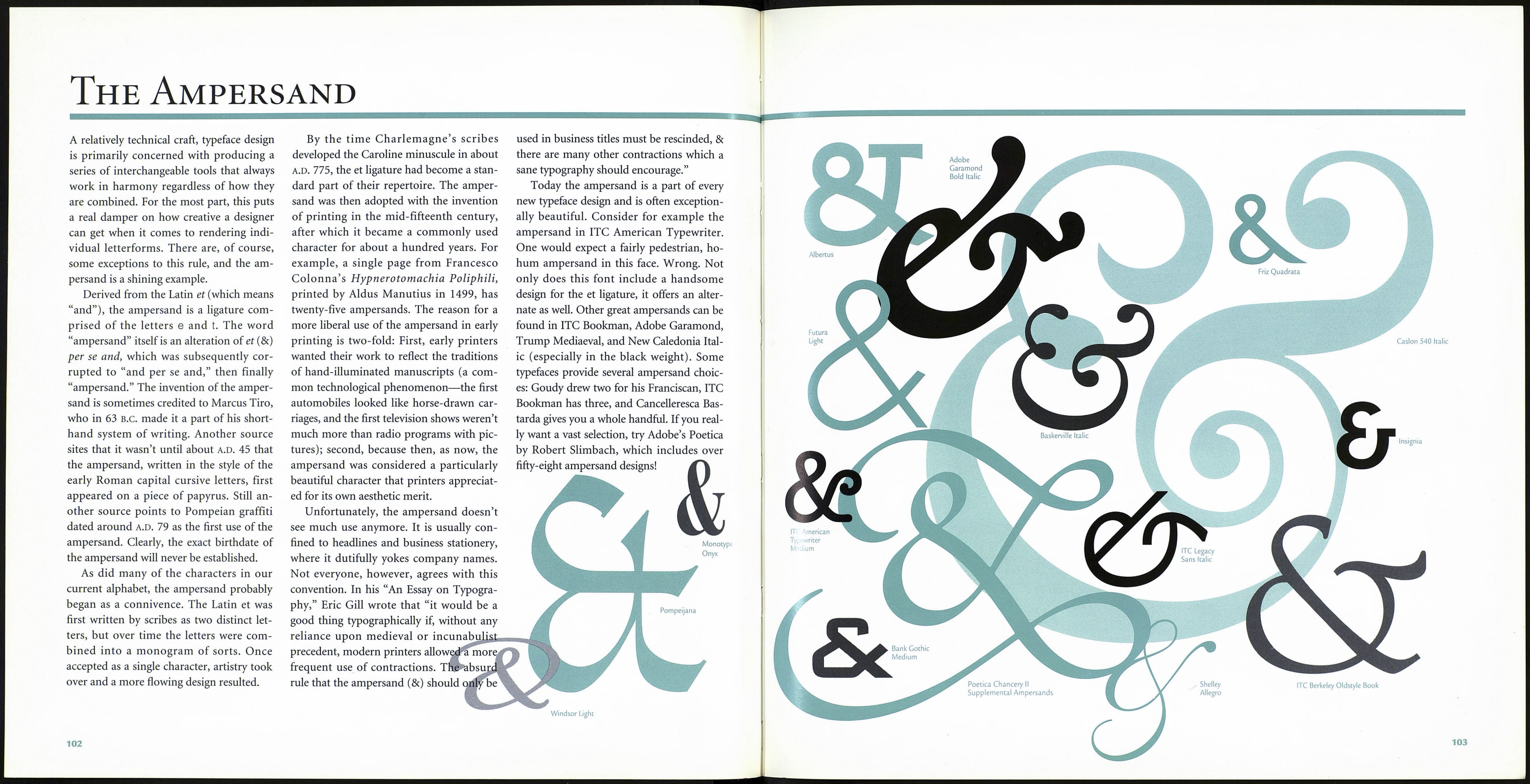
Caslon 540 Italic
Letraset Fashion
Compressed
ITC Mona
Lisa Recut
Industria Inline
Letraset
Mekanik
Poetica Chancery II
Supplement
Hobo
ITC Grizzly
Nuptial Script
ITC Ozwald
Letraset Dolmen
*