шшшшюкваашЁавш
Ariadne
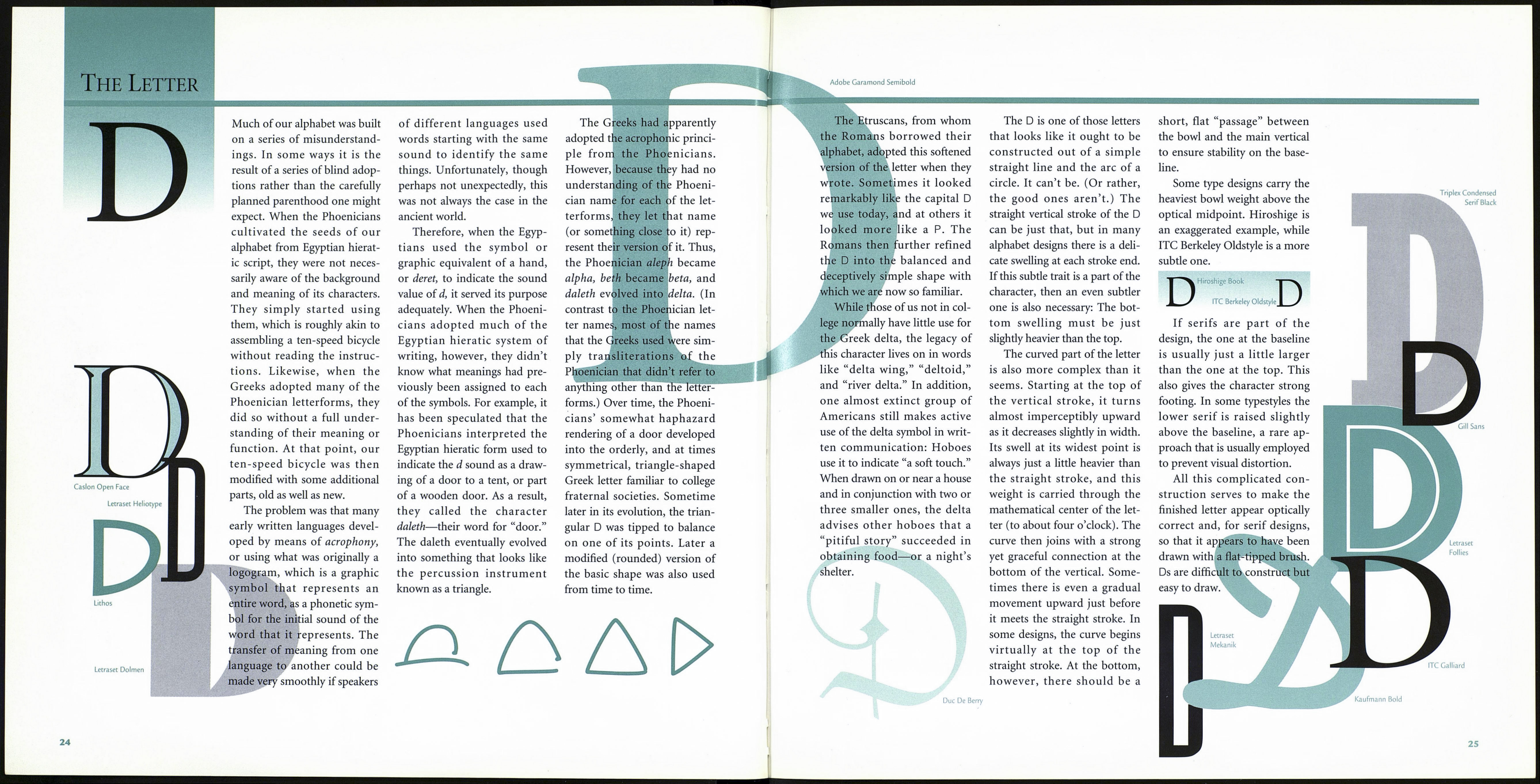
Futura Light
Smaragd
For much of their history, the
letters С and G evolved as the
same character. The Phoeni¬
cians called it gimel, which
means “camel,” and used it to
indicate the sound roughly
equivalent to the g sound in
the word “gate.” They drew the
Л
character with two quick diag¬
onal strokes, creating some¬
thing that looked like a very
broad inverted V with one
stroke shorter than the other.
When the Greeks began to
use the Phoenician gimel in
their writing, they took many
liberties with its original
design. First, they reduced the
angle between the two strokes
so that the new letter resem¬
bled an upside-down capital L
GoudyText Lombardie Capitals
with the arm extending to the
left. Then they reversed it so
that the short stroke was on the
right side. This trend toward
design-reversal was a common
Greek approach to the Phoeni¬
cian letterforms they adopted.
In fact, several characters met
<
with this fate. The reason prob¬
ably lies in the fact that the
early Greeks, for some time,
wrote boustrophedonically
(from the Greek word boustro-
phedon, which means “turning
like oxen in plowing”). Al¬
though the Greeks initially had
observed the Phoenician cus¬
tom of writing from right to
left, later they wrote and read
the characters of alternate lines
in opposite directions, which
meant that nonsymmetrical
letters were reversed in alter¬
nate lines. By the sixth century
b.c. the Greeks had abandoned
the boustrophedonic style of
writing in favor of the practice
of reading and writing consis¬
tently from left to right, but by
that time many letters had been
ITC Kabel Ultra
permanently inverted from the
original Phoenician designs.
As they had done with other
Greek letters, the Romans soft¬
ened the sharp angle of the
gamma to a curve, and the re¬
sulting form looked very simi¬
lar to our C.
С
The Romans used this letter
to indicate both the unvoiced
stop с (as in “cat”) and voiced g
(as in “gate”) sounds, and in
time they distinguished the two
sounds graphically as well. The
unvoiced stop continued to be
expressed by the original С
design, and a barb was added
to the bottom terminal to indi¬
cate the voiced g sound.
Thus, the gimel evolved into
both the С and the G. The С is
not only the third letter of our
alphabet, it is also the first to
share the same design for both
capital and lowercase versions.
Charlemagne
Lunatix Light
22
If you think of the С as an О
with part of its right side miss¬
ing, you should take a closer
look. Imagine instead that the
letter is being fashioned from a
bar of iron, so that as the two
arms of the resulting horseshoe
are pulled apart, its top and
bottom would be flattened
slightly. This gives the С a firm
foundation on which to rest
and helps propel the eye for¬
ward as it moves across a page
of text. The bottom terminal
also normally extends just a lit¬
tle beyond the top one to give
the character optical balance.
The width and height of the
С should be approximately the
same. As with other round
characters, a typeface’s С should
also be a little taller than the
height of its H. This, and a
slight increase in stroke weight,
ensures that it will not look
comparatively light or small. In
some designs the С is also
imperceptibly shorter than the
О because the open space on
the right side of the letter tends
to exaggerate its size slightly.
Stencil
In a roman alphabet whose
С is designed with serif termi¬
nals, the top serif is drawn larg¬
er than the bottom. It should
be noted that in many type-
styles, including Raleigh and
Bernhard Modern, the С has
no bottom serif. Generally, the
weight stress of the main curve
falls a little below the midpoint
of the bowl.
Baskerville
Bernhard Modern
In sans serif typefaces there
is a subtle thinning of the stroke
weight at the top and bottom of
the character, usually with the
top being slightly thinner tha:
the bottom.
ITC Machine
Monotype Onyx
.. .
Copperplate
Gothic 31
Cosmos
Extra Bold
Barmeno
Bold
News Gothic Oblique
23
