Adventure and Art
Art Library
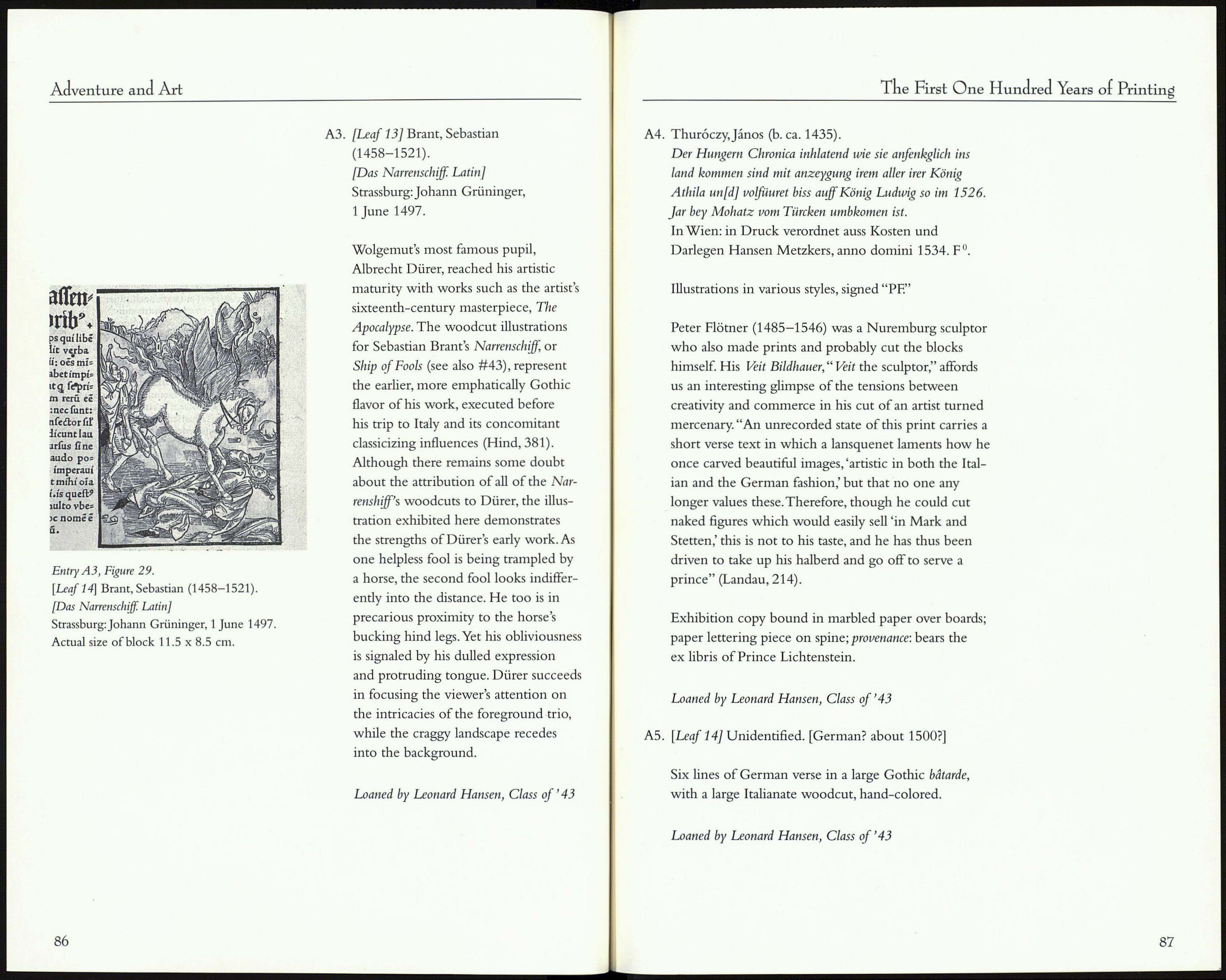
Illustration
The ten illustrations exhibited here demonstrate a vari¬
ety of illustrative approaches and engraving methods
favored by the first artists and artisans of the printed book.
It is difficult to generalize too broadly about illustration
during the period under consideration, as it was an era of
rapid innovation and varied production. One can however
note that scholarly study of the earliest illustrated books
focuses on several interrelated characteristics. Early wood¬
cuts tend to be simple in design, meant to achieve maxi¬
mum legibility and swift "readability" of the image; the
image sometimes symbolizes, rather than iterates or hypos-
tatizes, a specific textual element. Contrary to modern
practices, a woodcut might be printed multiple times
within a text and represent two or more different cities
or personages (as in Schedel's Liber chronicarum—#A1),
different saints or martyrs (as in the Legenda Aurea-#31),
or different scenes in an imaginary narrative (as in Dante's
La Commedia—# 18). While a modern audience might find
this nonrepresentational approach to illustration inadequate
or disconcerting, Renaissance readers understood that
illustrations gestured toward realities underlying the par¬
ticulars of the text, and lent historically separate events a
degree of relationship, constructive coherence, and intelli¬
gibility. Perhaps they also accepted that the expense and
beauty of a woodcut justified its redundancy.
Al. [Leaf 11] Schedel, Hartmann (1440-1514).
[Liber chronicarum]. Liber cronicarum.
Nuremberg: Anton Koberger, 1493.
German book illustration profited from a highly
organized relationship between publisher and artist.
Hartmann Schedel's liber chronicarum, or Weltchronik,
serves as a prime example. Painter Michel Wolgemut
and Wilhelm Pleydenwurff cut 645 wood blocks to
form a suite of over 1,800 illustrations in the final
84
The First One Hundred Years of Printing
text. Many views of town and cityscapes are included,
though Arthur Hind notes that there exists "only a
beginning of a faithful topography in the views"
(Hind, 375). Certainly, faithfulness could not decently
be claimed when a woodcut illustrating Maguncia
(i.e., Mainz, the birthplace of printing), also must
illustrate Lyon, Bologna, Naples, and several other
European cities as well. As Dale Roylance notes, such
duplication remained acceptable in a period hovering
between the late Gothic and early Renaissance due to
"a lingering medieval regard for symbol over reality"
[i.e., material actuality] (Roylance, 14). (See also #4.)
A2. [Leaf 12] Bible. German. 1483.
[Nuremburg: Anton Koberger, 1483]
Hand-colored woodcut illustration from the Book
of Exodus (see #30).
The effective simplicity of early German book illustra¬
tion is evidenced in a leaf from the German Bible
(Bible. German. 1483) of Anton Koberger. In a scene
from Exodus (7: 8-10), Moses and Aaron are sent by
God to deliver the Israelites from Egypt. As Aaron
throws down his staff in front of the pharaoh, it imme¬
diately becomes a serpent. In the accompanying illus¬
tration, the primary characters, Pharaoh, Aaron, and
Moses, are positioned frieze-like across the picture
plane, and are identified by label. Despite the elaborate
architectural backdrop, the scene is minimally land¬
scaped, drawing attention to the human participants
and the radically transforming staff. "Vivid hand-
ground colors so characteristic of the fifteenth cen¬
tury" serve to set the woodcut starkly apart from the
surrounding text (Roylance, 12).
85
