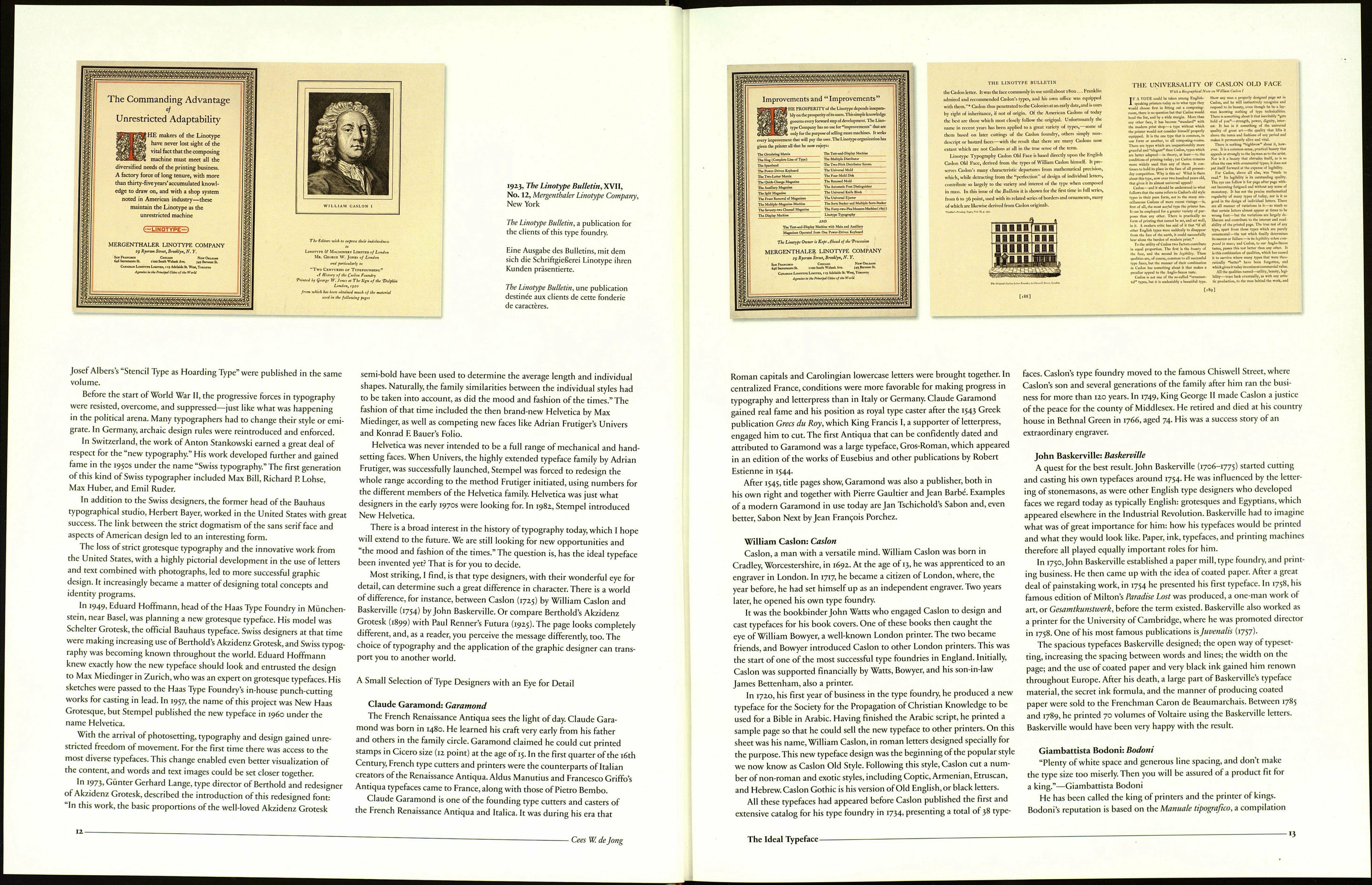
1923. The Linotype Bulletin, XVII,
No. 12, Mergeu thaler Linotype Company.
New York
An initial T, a clear accent on the page—
the perfect beginning to any page.This
one is based on the work of William
Caslon.
Initialen setzen klare Akzente - ein per¬
fekter Auftakt für eine Seite oder einen
Absatz. Diese T-Initiale entstammt dem
Werk William Casions.
Une lettrine T, un accent net sur la
page—rien de tel pour un début. Celle-ci
est basée sur le travail de William Caslon.
• Cees W. de Jong
INTRODUCTION
The Ideal Typeface
by Cees W. de Jong
What kind of character should letters have, and which aspects
ofthat character should their content convey? Is the customer a newspaper,
are you designing a letter on your own initiative, just "for fun," or does
a company need a new house style for its communications strategy?
New innovations have introduced radical changes in typography and
printing, which had seen only slight modifications since the 15th Century.
Craftsmanship was steadily supplanted by machinery, and the increasing
demand for printing required more and improved equipment. Work¬
manship became less important, as supervisors and assistants could now
perform tasks that in the past had required hundreds of skilled workers.
Our script has evolved from the flow of writing. Naturally, this eventually
prompted the development of the serif in printed letters. The amazing
thing is that typography developed for hundreds of years internationally,
but only with serif typefaces. The first examples of the new sans serif style
did not appear until 1816 in England.
In the 19th Century, there was a general degeneration of appreciation
for typography, design, or quality in printing material. Printers produced
pages with numerous type sizes and combinations of any typefaces available
in the shop. Except for an occasional superficial imitation of traditional
typography, there was little indication of any concern for page organization
or well-designed typefaces.
In 1951, M. R. Radermacher Schorer, in his Bijdrage tot de Geschiedenis
van de Renaissance der Nederlandse Boekdrukkunst (Contribution to the History
of the Dutch Printing Arts), gave a dismal summary of the period: "When
we compare the 19th-century book to the incunabula, the type is pallid
and without character, often damaged and badly printed; the arrangement
is confusing; the color is faded; the paper is of bad quality; the spine is
covered with gold stamping without beautiful ornaments ... and thicker
paper is used to make the book look larger than it actually is."
Drastic changes in typography and technology occurred in the 19th
Century. For 400 years, the lead setting system had limited the options;
the arrival of new technology changed typography, design, and printing.
New styles and traditions emerged.
After the Arts and Crafts Movement of William Morris and, later, Peter
Behrens, developments were divided into the subjective-expressive and
functional, or elementary, schools of thought.
The expressive position is reflected in the work of Rudolf Koch,
who sought the path of innovation in returning to individualism and
preindustrialization.
In January 1898, two companies, Berthold and Bauer & Co. of Stuttgart,
presented the Akzidenz Grotesk font in advertisements in the Deutscher
Buch und Steindrucker. The font was therefore already more than 20 years
old in the heyday of Constructivism, when movements such as De Stijl,
Bauhaus, and Dada adopted the face to great effect. It was present at the
birth of "Swiss typography" as its major typeface. Akzidenz Grotesk still
has a highly visual quality, reminding us that type does not have to be
uniform to be readable and attractive; on the contrary, it is the differences
between characters that make them legible.
Functional typography was developed primarily by designers in the
Soviet Union, Germany, Hungary, and the Netherlands. There was a desire
for a better social, cultural, future-oriented design that reduced ornamenta¬
tion and the choice of typographical elements. Sans serif typefaces, lower¬
case letters, and asymmetrical spacing were major characteristics of this
"new typography."
Eric Gill was commissioned by Bristol bookdealer Douglas Cleverdon
to paint a sign with sans serif lettering. Stanley Morison, artistic adviser to
the Monotype Corporation, who was visiting Cleverdon, noticed the sign,
and became convinced that Gill could design a similar sans serif face for
Monotype. Until then, Gill had used only capitals. As usual, the first draw¬
ings of the lowercase letters were quite different from the face that was
finally cast. However, when Gill Sans first appeared, toward the end of the
1920s, it was not exactly what the British print establishment had been
waiting for. Its muted reception in the year 1928 was similar to that of Futu¬
ra in Germany the year before; Paul Renner's design had been called a fash¬
ion that would soon be forgotten.
Futura is a timeless, elementary typeface. In i925,Jan Tschichold pub¬
lished a special edition of Typographische Mitteilungen entitled "Elementary
Typography." It was here that he first formulated his attempts to create a
new typography."Of the typefaces available, the grotesque or block faces
fulfilled the needs of the new typography best, as they were simple
in design and easy to read."
At the same time, Paul Renner's design for a new grotesque style based
on Constructivist principles was in progress. Renner based Futura on
simple, basic forms: the circle, the triangle, and the square. However, his
affinity with books and typography prevented him from casting aside
tradition in favor of a new dogma. The first samples of the new style made
their appearance in 1925.
In 1926, Bauhaus leader László Moholy-Nagy wrote in Bauhaushefl 7:
"Since all existing grotesque book styles lack basic style, grotesque still
has to be created." Herbert Bayer's essay "Attempt at a New Typeface" and
The Ideal Typeface
и
