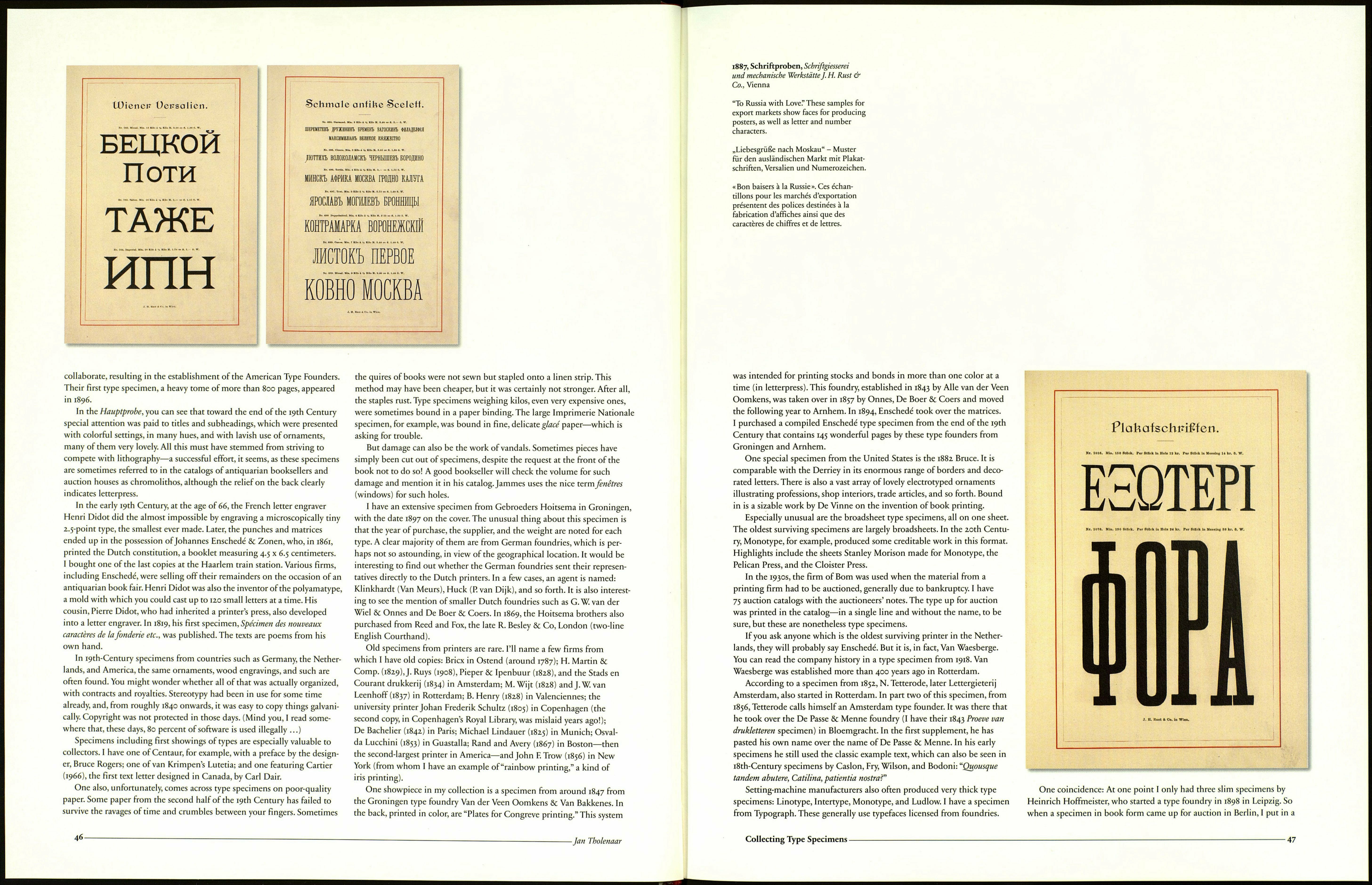
Plohafhönde.
Nr. 1085. Per Stück fl. 1.50.
Nr. 1084. Per Stück fl. 1. —.
J. H. Rust & Co. in Wien.
44-
-Jan Tholenaar
1887, Schriftproben, Schriftgiesserei
und mechanische Werkstätte}. H. Rust &
Co., Vienna
Press, and Philippsberger Werkstatt, not forgetting Charles Whitehouse
of Edition Seefeld. This last press issued, for example, a sheet of Jan van
Krimpen's Romanee, with a beautiful classic design, hand-printed on a
Kniehebelpresse on mold-made paper with a rough surface. The paper was
moistened before printing, and the result is fabulous: The small, narrow
10-point italics are incredibly sharp, really black, and yet not too bold. What
makes it special is that almost three-dimensional effect, the relief you don't
get with offset. It brings it home to me that the disappearance of lead was a
heavy, irretrievable loss to the art of printing.
Naturally, the marginal Dutch printers should not be omitted here:
De Vergulde Maatlat, Eric van der Wal, Ter Lugt Pers, De Vier Seizoenen,
Willem Muilenburg,Triona Pers, Exponent, Elze ter Harkel, Tuinwijkpers
(Rosart), Castanha Pers (Garamond), and Drukschuur Blaricum. One highly
original example is De Dwarsbomen (Gert van Oortmerssen). The basic
item is made from hard material, and the separate spine, which weighs a
kilo, is cast in recycled lead type. The Surrealist artist Johannes Moesman
also designed a typeface, Petronius. It was first used in 1975 in a type speci¬
men. I don't know whether this typeface has ever been used again.
The Curwen Press, the renowned printers of The Fleuron, commissioned
Oliver Simon to compile and design a type specimen in 1928. The speci¬
men is expensive, not so much because of the limited edition (135 copies)
but because it is so exceptionally beautifully made, with austere, classic
design and hand-molded paper with its own watermark. The ornaments
and such were specially made for Curwen by artists such as Claud Lovat
Fraser, Paul Nash, and Percy Smith. The typefaces were designed by artists
such as Rudolf Koch and Jan van Krimpen.
Theodore Low De Vinne (1828-1914) was a well-known New York print¬
er, author of various books on printing, and cofounder and president of the
first syndicate of American master printers. I'll mention two specimens of
his that I own. He was still associated with the printer Francis Hart when
he published a 96-page specimen in 1878, Specimens of Pointed Texts and
Black Letters. Black letters are what we call gothic letters, and pointed letters
are roughly the same thing—they were used for Bibles, but also circulars
and such. The specimen contains about 50 typefaces. The second is from
the De Vinne Press, from 1891. It contains some 144 pages of book type and
would be a boring book, in itself, were it not for the fact that each page fea¬
tures different initials, for which no effort or cost has been spared: varying
sizes and designs, most of them in two colors and gold.
Along the same lines is a small-format specimen from 1903, featuring
nothing but book typefaces. It was published by the Copenhagen printer
Martius Truelsen in an edition of 1,500 "maskinnummeredé" copies. I was
often in Copenhagen and always visited the antiquarian bookseller Busck.
I bought the specimen there in 1979 and, a few years later, I bought a sec¬
ond copy. The book has 176 pages, is bound entirely in leather, and is blind-
stamped. The quires are not sewn but stapled, and staples can rust. But the
inside is beautiful. Each double page is different, with a decorated header
to the left and an initial at the beginning of the text, which together form
a whole, often pure Art Nouveau. There are wonderful (anonymous)
designs in three or four colors and different colors on each page. A total
of perhaps 300 colors were used.
My copy of the 1902-03 Boktryckeri calendar (with the signature of the
printer-publisher, Waldemar Zachrisson, and the dedication "Hommage à
Mr. Theo L. De Vinne") features a printed photograph of Martius Truelsen.
He tells how he was orphaned at the age of 15 and, from then on, had to
fend for himself. At the age of 30, with a few hundred crowns he had earned,
he started his own business, and, in 1903, by the age of 50, he was running a
printing firm with a workforce of some 50 men. In addition to my two
copies of the Truelsen specimen, I have boxes full of fantastic duplicates.
I'd like to mention a few other nice pieces from my collection. Signa¬
ture, new series, number 5, discussed type specimens. It said of a 1939 speci¬
men from Shenval Press,"printed in superbly black ink, an all too excep¬
tional virtue these days." And I agree wholeheartedly there; black can be
beautiful.
A 200-page 1934 specimen from Imprimerie Darantière in Dijon, printed
in an edition of 800 copies, features a continuous novel, running through
all kinds of fonts, large and small. The pages are beautifully laid out with
spacious margins and printed in black and red. What a shame that support
colors like that are no longer used these days. One specimen from Buch¬
druckerei August Hopfer only uses quotes from Goethe. Both specimens
are a pleasant change from the stock pattern of endlessly repeated texts.
My 1835 specimen from the Boston Type Foundry is quite old by Ameri¬
can standards. It contains more than 200 pages, printed on one side. Half
are devoted to ornaments (wood engravings), including household items
and cattle, and there are foldouts with steamboats and paddle steamers,
sailing ships and horses with coaches.
At the end of the 19th Century, 11 major American foundries decided to
Collecting Type Specimens -
45
