We manage to nab a к from the crowd for questioning. It is all
we can do to suppress our disgust at this form. Nevertheless,
we have a case to solve! A closer examination of this character
reveals features that call for a review of the third fundamental
of typographic jurisprudence: TECHNOLOGY.
Suspicious stair-step
construction of squares
Noticeable absence of serifs.
No variation in stroke thickness.
height-to-paper
beard (bevel)
shoulder
shank
set width
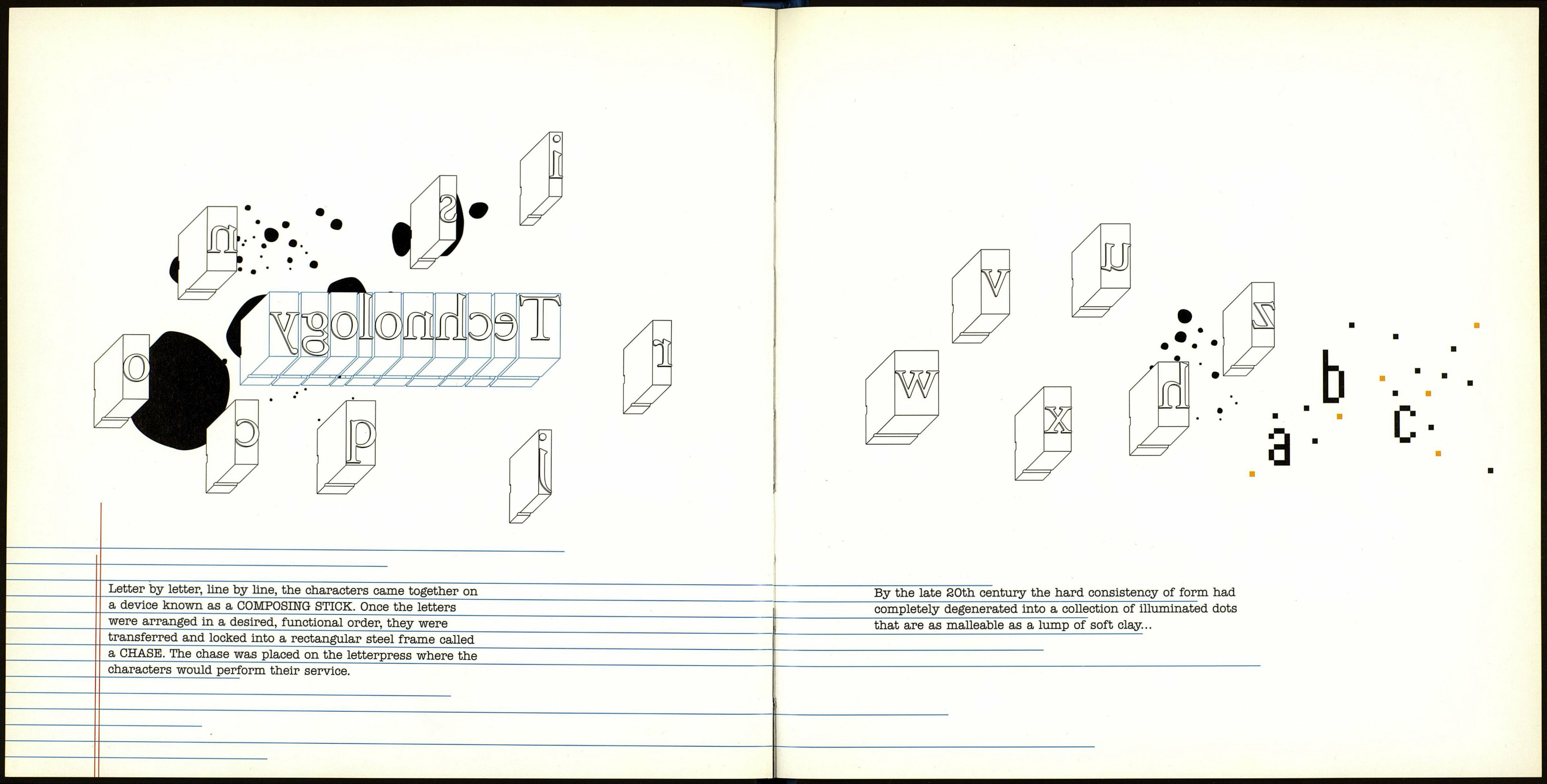
For centuries after Gutenherg, the typographic world was
made of strong characters carved from hard labor and acute
craft. Each face of type had an unalterable integrity, cast
timeless in a metal block that framed its domain. The
letterform once stood high and proud on its shank, waiting
for its call to service into the lines of other troops whose
universal goal was to press forth a clear message.
These characters were material representations of abstract
symbols such as letters, each with a specific style and size.
The physical structure of the cast metal, three-dimensional
block, including the character’s face, was known as a SORT.