The Use of so that they appear to be in the same plane (a,
Gold & fig. 117).
Colours in
Initial
Letters &
Simple
Illumination
^Diagram of (a)
SimpCc, naturai
method, affittine
Fig. 117.
Such “flatness” is secured even more certainly
and effectively by using two colours (e.g. red and
blue) in the background—one inside and one outside
the letter (see Plate XII).
The curves of the gold letter may with advantage
slightly project, and so break the hard, square outline
of the background.
The letter should not have the appearance of
being “stuck on,” as it is apt to if the background
is large and empty, or if the ornament passes behind
the letter (b, fig. 117).
In the case of letters with projecting stems or
tails : the tail may be outside the background (a,
156
fig. 118), or the background may be prolonged on
(¿i М(Ь.) Ш (с.)ШйИ (Х)
Simple Badajmu/idsjvr taxied Letters.
Fig. 118.
one or both sides of the tail (b and r), or the whole
“field” may be enlarged to take in the complete
letter (d).
There is no limit to the variety of shapes which
backgrounds may take—symmetrical or asymmet¬
rical, regular or irregular—provided • they fit the
initial or the ornament (which may itself partially,
or entirely, bound them), are properly balanced (see
Plate XII, and p. 381), and take their right place
on the page.
ORNAMENT OF BACKGROUNDS
The ornament, as a rule, covers the background
evenly, and is closely packed or fitted into its place.
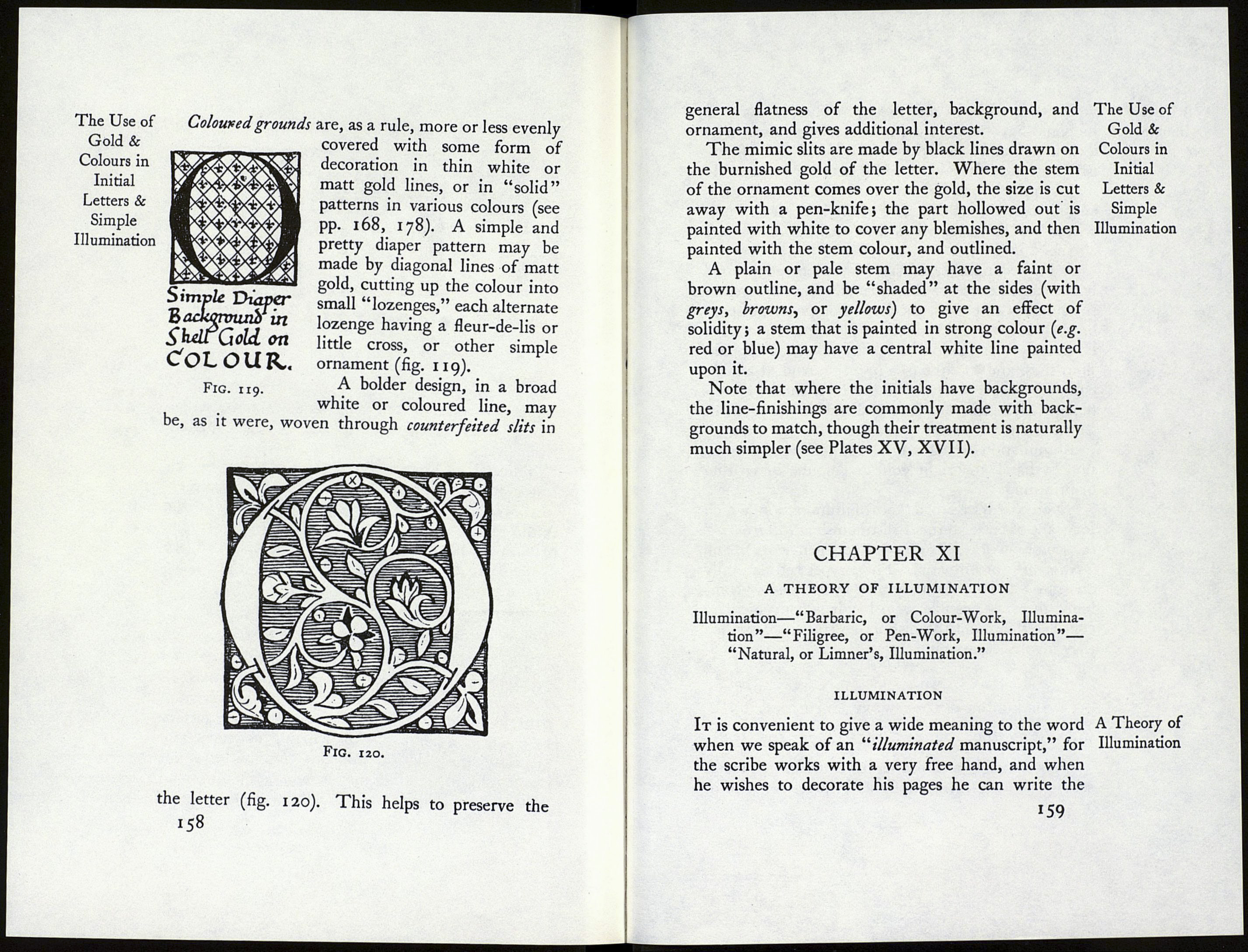
Gold grounds are generally thin, sometimes bearing
patterns in dots. These are indented in the surface
by means of a point (p. 138) which is not too sharp.
It presses the gold-leaf into tiny pits, but does not
pierce it. Gold grounds may be broken up into small
parts by coloured chequers (p. 181 ) or floral patterns.
*57
The Use of
Gold &
Colours in
Initial
Letters &
Simple
Illumination
