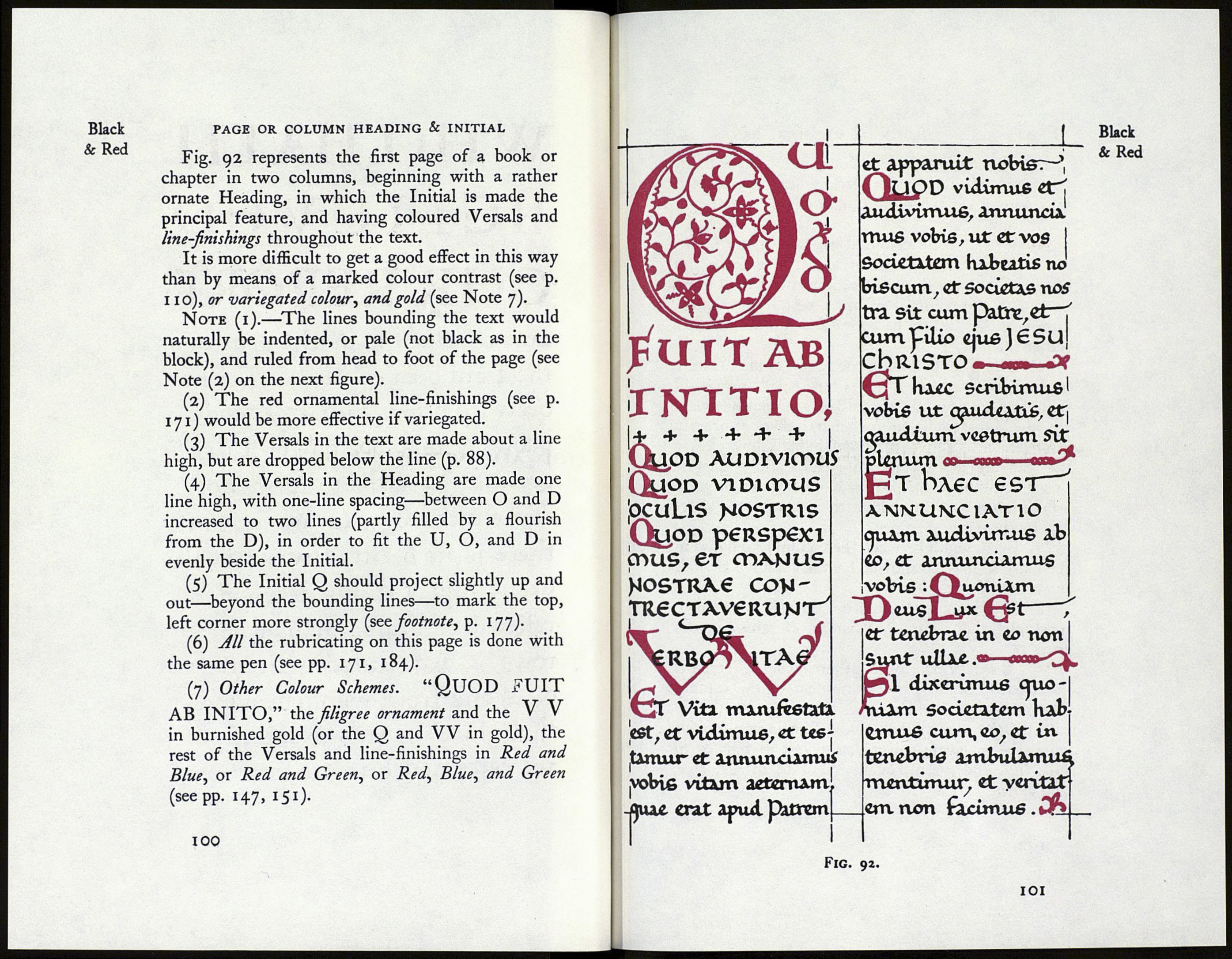
Black
& Red
PAGES WITH COLOURED HEADINGS
Fig. 91 represents the first page of a chapter (or
a book) with a Heading in red capitals.
It is convenient in practice clearly to distinguish
between the two modes of beginning—
[a) with an illuminated Initial-P^gr (see fig. 89),
or’
(h) with an illuminated Heading (see fig. 91).
The former may be treated as though it were a
decoration to the whole book. The latter is intended
more particularly to decorate its own page.
The Heading should therefore be proportionate
to the body of the text below it. About one-third
Heading and two-thirds text make a good propor¬
tion. A “Heading” occupying half, or more than
half, of the page is apt to look disproportionate, and
it would be preferable to this to have a complete, or
nearly complete,1 Page of coloured capitals.
Note (i).—The full effect of black and red is
obtained by an arrangement of the two colours in
marked contrast.
(2) The lines are used as a scale for the Heading,
the red capitals and interspaces each being one line
high. If a Heading so spaced appear too close to
the first line of black writing, another line space
may be left.
(3) The round Es are used to fill out the second
line, and the square, narrow E to relieve the crowded
third line.
(4) Other Colour Schemes.—The entire heading,
or the letters W, H, B, O, R, in burnished gold;
or the whole variegated (see p. 146).
1 An illuminated Page avili allow of a few lines of black text
at the foot (an arrangement very common in the elaborate
Initial Pages of the fifteenth century), but these should be quite
subordinate to the “Illumination.”
98
WHO HATH
веідеѵео
OUR REPORT
and to whom hath, the arm op
the Lord been revealed ? por he
qrew up before him as a tender
plant 7 61 as a root out of a dry
ground : he hath rio forra nor
comelmess ; & when we see him,
there is no beauty dut we should
desire him. He was despised, ó¿
rejected of men; a mart of sot's
Tows^
their foce he was despised, 6¿
we esteemed him rurt~.
Black
& Red
Fig. 91.
99
