Versal
Letters &
Coloured
Capitals
preserves the continuity of the interior curve, to¬
gether with the clean contrast of the thick and thin
strokes (see inside shapes, p. 217). The normal form
may be flattened or curved a little (b), but exaggera¬
tion in either direction produces a degraded form.
Part round letters, as D, P, and Q, may be begun
with a complete inner oval, or a nearly completed
О (to which the stem is added); this preserves their
interior symmetry (r).
The beauty and quality of Versal letters depends
very much on their freedom; touching-up or trim¬
ming after they are made is apt to spoil them; and
when good letters are made with a free hand, minute
roughnesses, which are due to their quick con¬
struction, may be regarded as shewing a good rather
than a bad form of care-less workmanship (see (c)
fig. 164).
SPACING & ARRANGEMENT OF VERSALS
(Allowing for the special treatment of Versals called for by
the extreme freedom and elasticity of their pen forms, the fol¬
lowing remarks apply generally to the spacing and arrangement o¡
coloured capitals in written pages.)
Versals accompanying Small Text are generally
dropped below the writing-line, so that their tops are
level with the tops of the small letters (fig. 86).
Sizes of Versals.—Letters which are of the same
importance—i.e. serve the same purpose—are usually
of like size and form throughout; and the more
important a letter, the more it tends to be elaborated
and decorated (see figs. 90, 92).
Special words in Text marked by Versals.—Where
coloured capitals are used throughout the text (fig.
92), the colours are usually varied (pp. 100, 151).
Line beginnings marked by Versals.—Where every
line of a page begins with a coloured capital, the
majority of the forms are kept rather plain (see (5)
p. 102). They may be effectively treated as a band
of simple or variegated colour (p. 102). This is a
common treatment for a list of names or a poem;
sometimes, especially if there are many lines, simple-
written capitals (p. 261) may be used instead of
Versals.
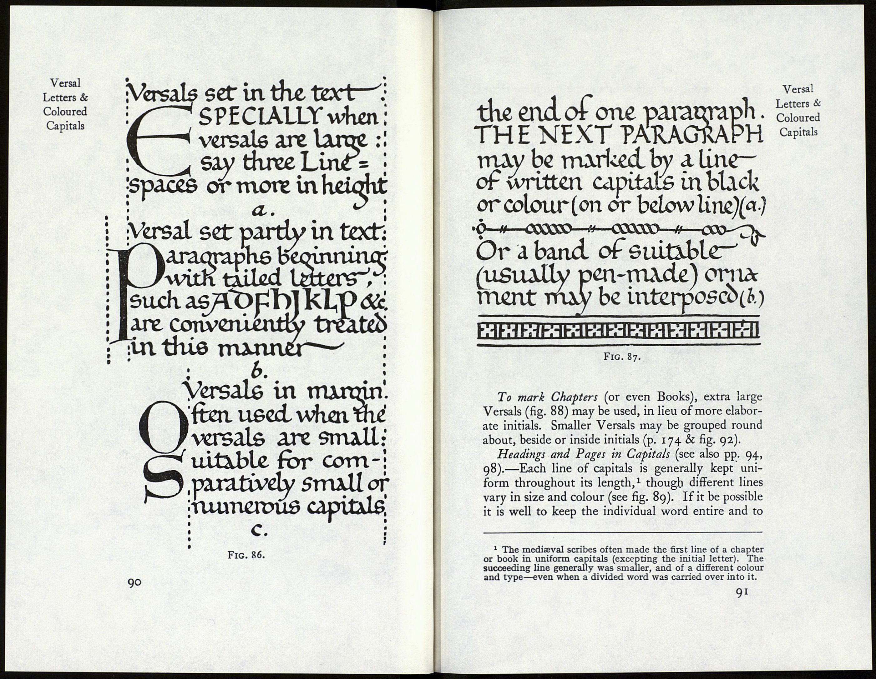
Verses or Paragraphs may be marked by Versals
set in the text (a), or part in margin, part in text (b),
or wholly in the margin (c, fig. 86). The marginal
capital is the simplest, and it has the advantage
of leaving the page of text entire; it may, how¬
ever, sometimes be desirable to break the continuity
by an inset capital, especially in cases of closely
written text, or of stanzas not spaced apart (see
p. 104). _ .
The first word of a paragraph, which is begun
with a Versal, is often completed in simple-written
capitals of the same colour as the text (a, fig. 86).
Various ways of marking Paragraphs.—{a) The
paragraph marks 4J, preferably coloured, may
be used instead of (or even with) Versals (comp.
fig. 95); (b) by one word or line (or several words
or lines) of simple-written (or buiit-up) capitals in
black or colour (see fig. 93); (c) by some suitable
ornament (see fig. 87); (d) in many cases it is well
to have spaces between the paragraphs or verses (see
p. 104).
Line-Finishings at the ends of Verses, &c. (pp.
171, 411), may be made with the Versal pens and
colours.
Versal
Letters &
Coloured
Capitals
89
